ESA - Externally Set Assignment
As we being a new set of work, we were told to pick one topic from 12. In order to decide which one I will do, I'm using the process of elimination as I will choose a top 3 and create a mind map to brainstorm what I could do for the project.
|
My top three were:
- Attached - Magnification - Ephemera |
I was able to brainstorm the possible words I could choose between. For attached, I thought of things that I could include in the image such as string. I also thought about the effect it has on the viewer or the meaning of what is being photographed. For magnification, I thought about techniques such as close ups of textures and also the manipulation of the lens of the photograph which creates a distorted effect. Finally for Ephemera, I noticed that there are lots of things I could come up with such as food, moments and people. After realising how wide spread this word is, I decided to make this how I will initiate this project.
|

After deciding that Ephemera was the right choice for this project, I began to brainstorm on what kind of things I could do. This is when I went to Pinterest and took images that reminded of ephemera. This consisted of things such as rotten food and flowers, collectives, food ect... During this research I took a look at a couple of artists such as Adam Hahn, Martin Parr, Andy Warhol and Mark Powell. These artists produce work that relate to my idea of ephemera and will help me produce a response and final project.
I also started to think of ideas that reminded me of ephemera such as things that signify good and bad luck as they are short lived however they determine the outcome of the rest of the day. I also thought about betting slips as they are filled out and then thrown away however it may turn out to very good luck. Covid posters is also something that I could respond as it is something that is lived for some time and only for some people however once everything is regualted, the posters will go down and restricting will not be required.
I also started to think of ideas that reminded me of ephemera such as things that signify good and bad luck as they are short lived however they determine the outcome of the rest of the day. I also thought about betting slips as they are filled out and then thrown away however it may turn out to very good luck. Covid posters is also something that I could respond as it is something that is lived for some time and only for some people however once everything is regualted, the posters will go down and restricting will not be required.

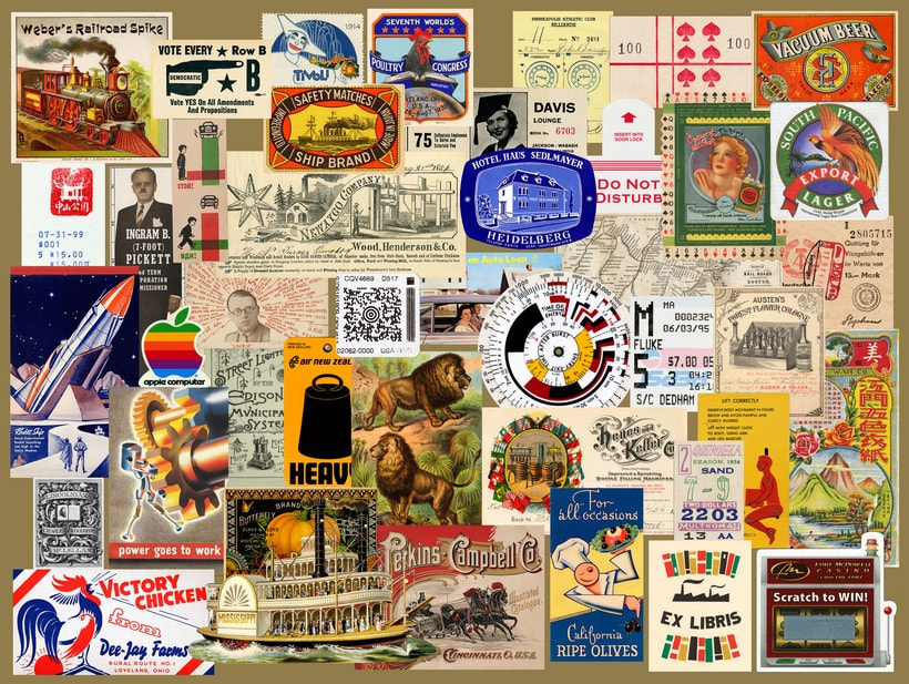
EPHEMERA
To begin my project, I went to exhibitions in Paris to gain inspiration on how I could inspiration to get started. In this task I was required to go to take photographs of the work in these exhibition that I thought could mean and relate to ephemera. Most of these linked in with ephemera as I looked for typology photography, tribute photography and other things that I came across that could be interpreted as ephemeric.
|
Maison Europeenne de la Photographie
In this exhibition, I saw the work of Zanele Muholi and Cedrine Scheidig which I thought were amazing pieces of work. Zanele Muholi focused on the representing people in South Africa that are part of the LGBTQ+ community. This was accompanied with a documentary where she explained her intentions and showed things that gay people had to face in South Africa such as discrimination and abuse creating an impactful film explaining it all.
Mathilde Denize
Denize's work was baed around her passion in textiles where she produced work that would be aimed for people to wear so you were able to see features such as sleeves however they were not to be worn. She then went further and developed her work by creating an abstract painting of them also including the features of a person. Deniz used a lot of different materials and texture in her work which i though linked in well with ephemera art.
|
Pompidou center
In this exhibition, there was a large amount of work from lots of artists. This allowed me to explore lots of different ways ephemera could be contributed. I saw typology work, ephemeric objects such as a piano which was smashed into pieces showing that it was once something that could be played and enjoyed but was then destroyed. There were also a number of typology work and old collective pieces that were preserved after a long time.
Bob Colacello
Colacello's work was based on his introduction to the Hollywood industry through his friend Andy Warhol. 'It just happened that' is a set of photographies taken of partied with those in the industry showing them outside of films and red carpets. These set of photographs matched to ephemera as tis was short lived by Colacello but the moments were captured by his camera and will be something he will never forget and is able to recall those moments through these photgraphs.
|
strand 1
Adam Hahn - Macular Degeneration
As I began to explore the project of ephemera, I researched issues that are considered ephemeric. This is when I came across the work of Adam Hahn where he focuses depicting people with Mascular Degeneration. This is one of the most common illness in the UK which then leads to blindness. Hahn had a personal connection to this issue as his own grandma suffered from this and he then wanted to do something in her memory.
Hahn takes portrait photography which symbolise the view of loved ones and then would edit the photographs to make them look blurry and dark, just like how a person who would suffer from MD would see the world. This creates an impactful intake on this work as it makes the viewer realise the privilege they have as they are able to see their loved ones everyday with no problem.
I thought this would be a good work to respond to as I could also put my own ideas into it and it brings awareness to an issue.
“When my grandma [Celia Kleinman] died two years ago, I wanted to do something in her memory. She had MD and so this was the inspiration.”
|

|


My response
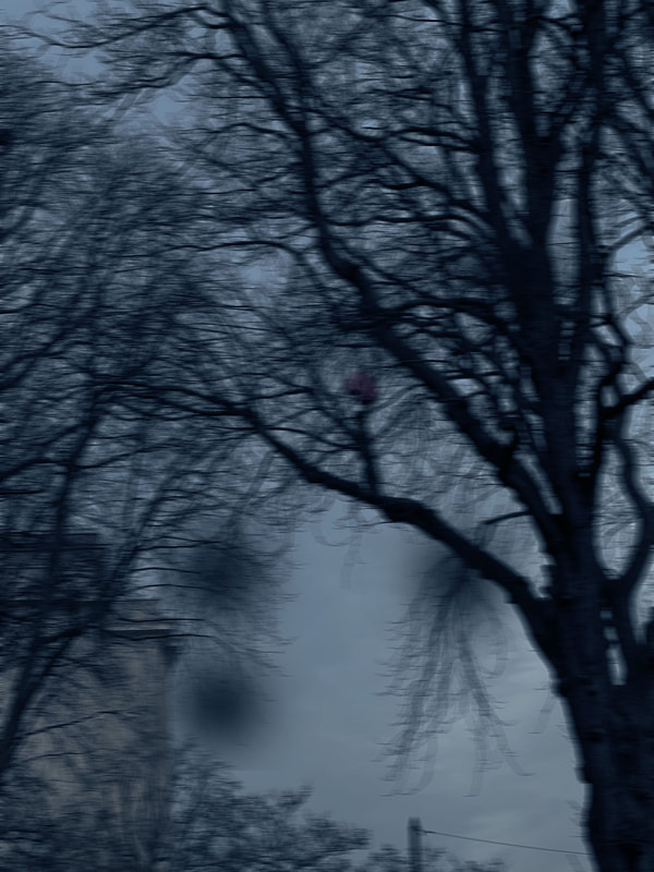
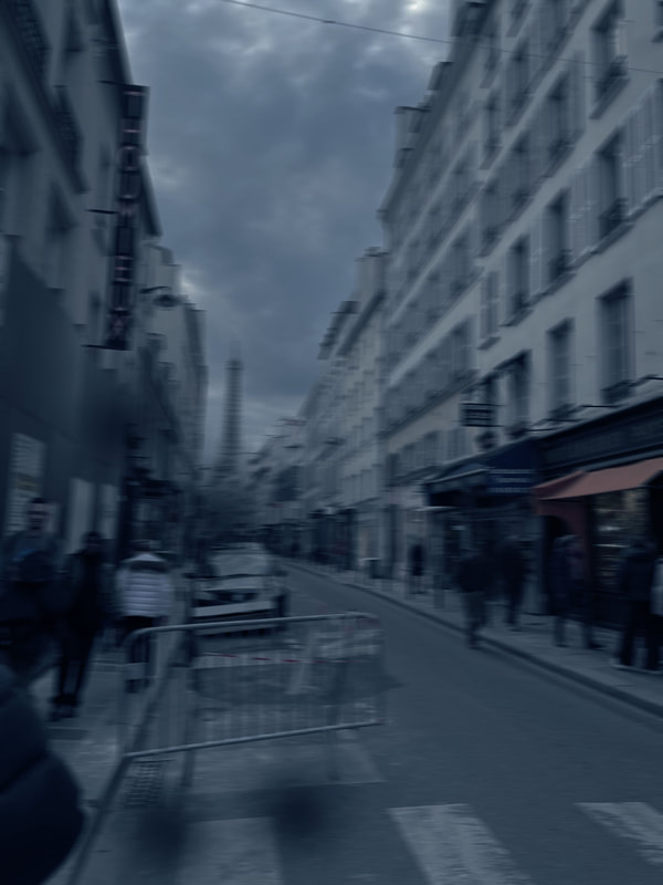
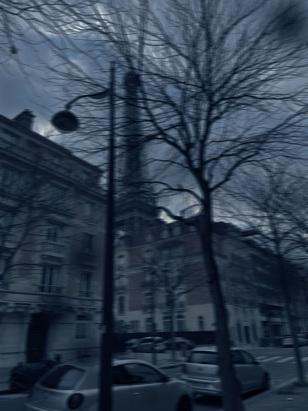
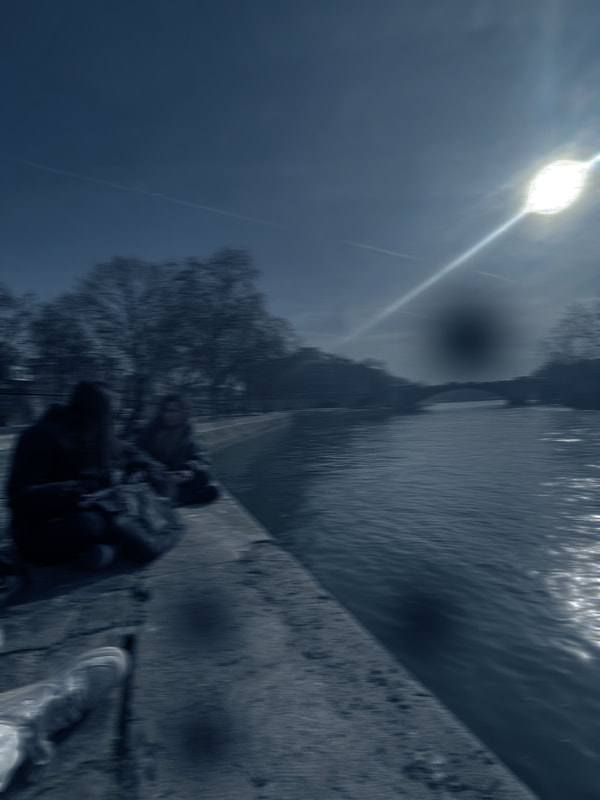
In my response I decided to take a different path on this and take photographs symbolising different interests. I took the opportunity that I was in Paris to take photographs of new views and places that people with MD may not be able to enjoy to their full potential. When I was taking this photographs, I made sure that you were able to see things that were easily identifiable but after adding a blur effect to it, it should look almost unrecognisable.
After taking the photographs, I went onto photoshop to lower the saturation and also add the blue tint that Adam Hahn uses in his photographs. This created a depiction of what they see. I also added some black dots around the photograph to signify the deterioration of the eye sight, almost leading to blindness.
These photographs consider factors such as being in social spaces which may cause anxiety which is why I believe the blue tint that Adam Hahn uses is a good touch to these photographs to represent the fear and caution those with MD face with everyday. I also included socialising with friends as they aren't able to see them properly but are still able to live a somewhat normal life however not to its full potential.
|
|
|
|
Artist and me
On the right, there is a photograph taken by Adam Hahn where you can see a portrait however the effects of MD are visible and makes it hard for the person to see who is opposite them. This is why in my response, on the left, I photographed a social event or gathering where there are other people. This has the same effect as someone with MD is impacted through social gathering which may cause low confidence and deteriorate social skills.

|

|
WWW
The subject I chose to photograph suited the theme as it shows something that is enjoyed by some but those with MD aren't able to enjoy it for long or any longer. I photographed a trip as this can be enjoyable from a short amount of time however for those with MD, it is very limited enjoyment. My composition helped to support my response to the theme by taking photographs of a place which is easily identifiable so the viewer knows what is going on yet, they feel like urge to want more, to be able to see the whole picture without the blur, which is something that isn't optional for those with MD. I then went on to edit these photographs to create effect which represented it well.
EBI
Although these photographs show the point of view of someone with MD, I don't think there is really a meaning to it. I would like to take a more meaningful aspect to it. Make it seem more like a journey or a day in the life of someone that suffers with MD where I show issues that they must tackle and skills they may learn due to their deprivation.
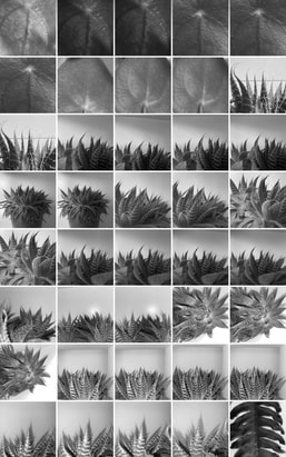
strand 2
Typology
For my second strand, I decided to look into typology photography as I was interested in taking photographs of collectives which can be considered as ephemeral. I thought typology would be well suited for this response as It would create a near set up of the photographs where there could be a large quantity of elements which may represent the past, trips or evolution.
When I began to research about typology, I wasn't looking for any artists in particular. In fact, I was just seeing the different ways they could be set up. For example I came across some where they were placed over each other, some where individual photographs but into collages and some were placed neatly on a blank sheet of paper where they would satisfyingly be fitting to each other.
When I began to research about typology, I wasn't looking for any artists in particular. In fact, I was just seeing the different ways they could be set up. For example I came across some where they were placed over each other, some where individual photographs but into collages and some were placed neatly on a blank sheet of paper where they would satisfyingly be fitting to each other.
|
|
|
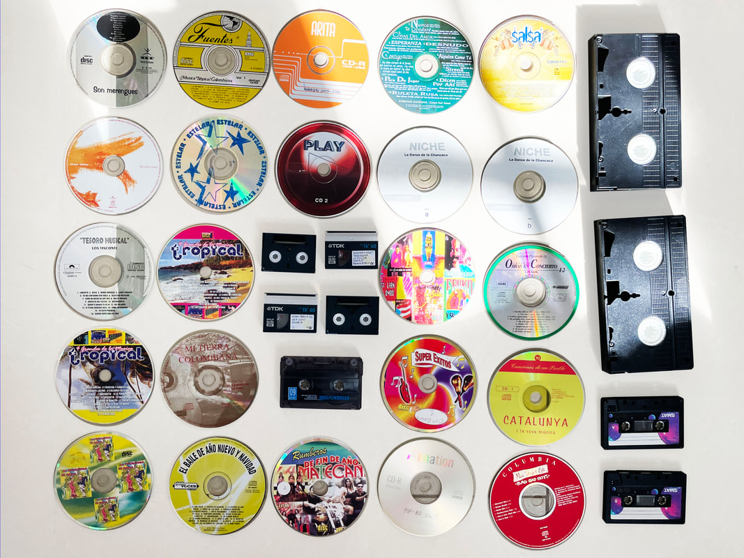
My response
For my response I gathered things around my house which could be placed with each other and neatly alined them next to each other. These items included train tickets from a trip to Paris, CDs and cassettes, photographs and souvenirs, all of which I believe fitted with ephemera. I managed to try and get the camera right above the items so they were all in the same perspective and size.

|
For this photographs I aimed to get the CDs to be nearly placed with each other and included cassette tapes which all created a square. Although the lighting wasn't the best, I tried to get the background to be a white as possible to it looked like a backdrop. I had no particular pattern in the CDs was I thought the mix of colours were interesting.
|

|

|
In school response
I decided to take another shoot when I was in school with the cameras there were in my classroom as they represent the past and future and I think placing them together, it created a successful response to my aim of ephemera. With this shoot, I also tried to be in a high angle but also experimented with some of the cameras being cut out of the image.
|
|
WWW
The subject I chose to photograph suited the theme as it consists of showing the contrast and development of camera which may have been short lived aka ephemera. My composition helped to support my response to the theme as it has the same style as typology and shows all of the camera neatly. I used a tripod to avoid camera shake and to get a straight down view and avoid a shadow. My images express my intentions which were to show the evolution of what was once short lived.
EBI:
The subject I chose to photograph did not necessarily fit the brief as it was not adequately lit which meant I had to go onto photoshop and make it brighter. Next time I should figure out a way for the light to shine onto the subject and for there not to be a shadow. I would also like for the photographs to be more consistent as they all look different because of the different backgrounds.
strand 3
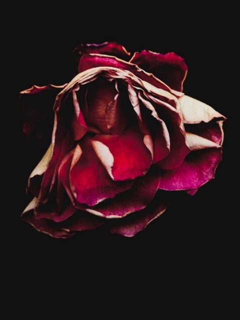
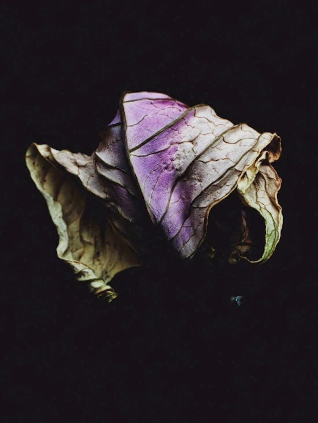
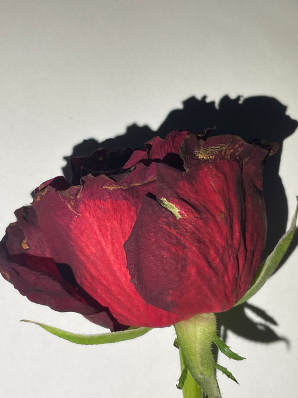
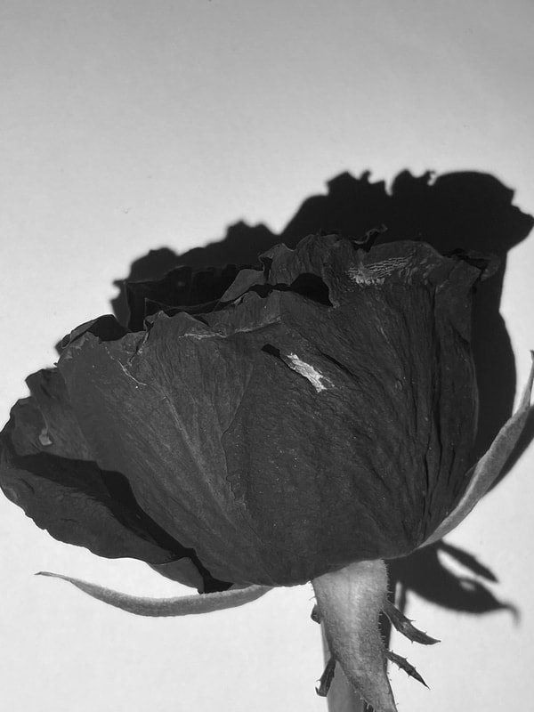
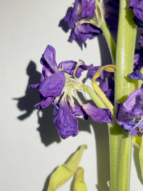
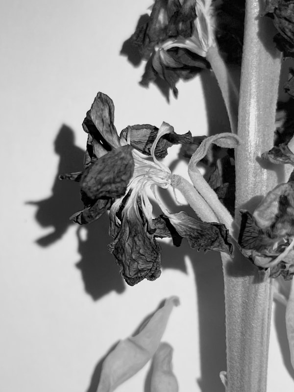
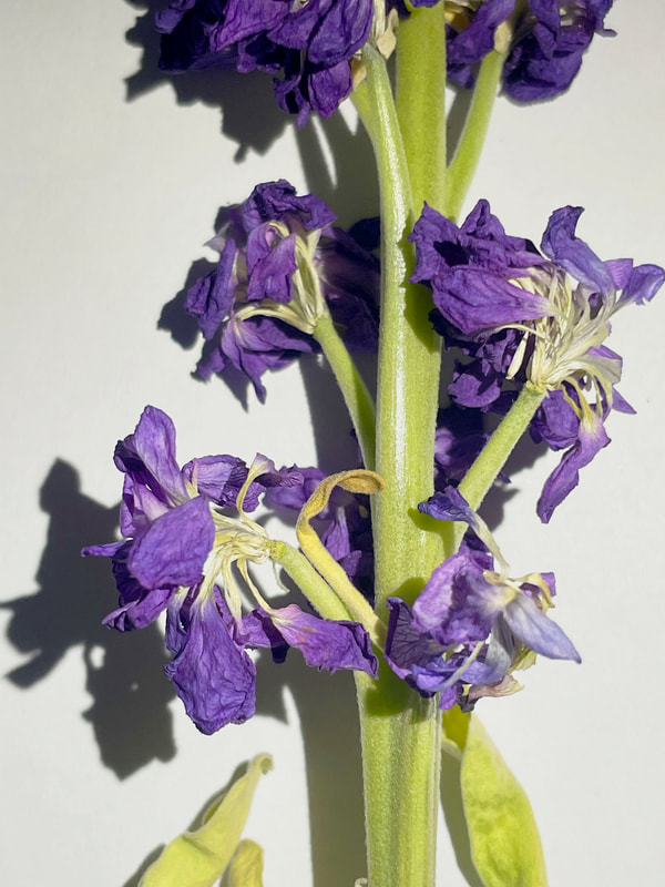
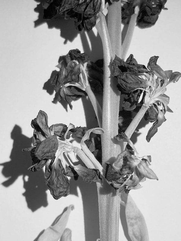
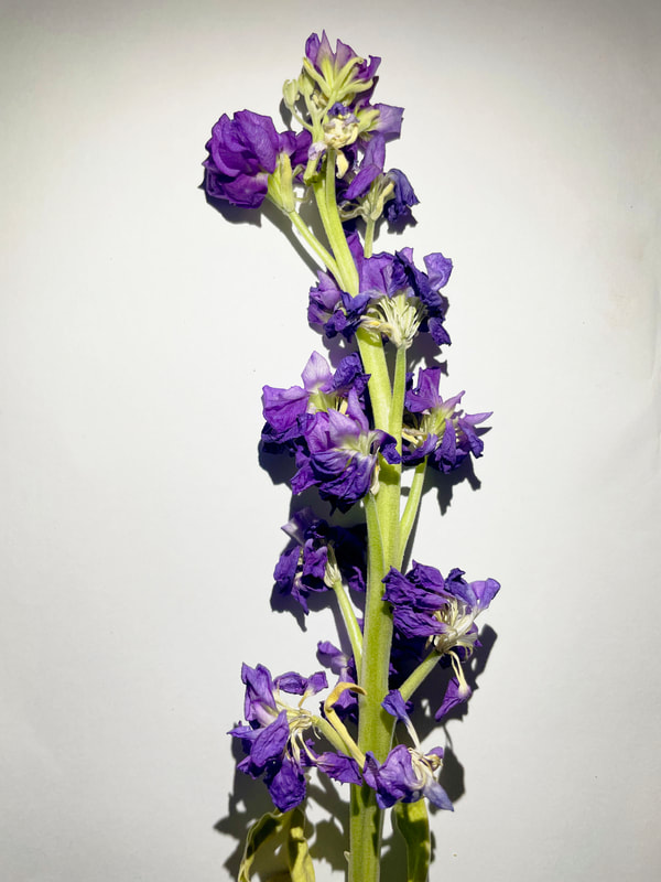
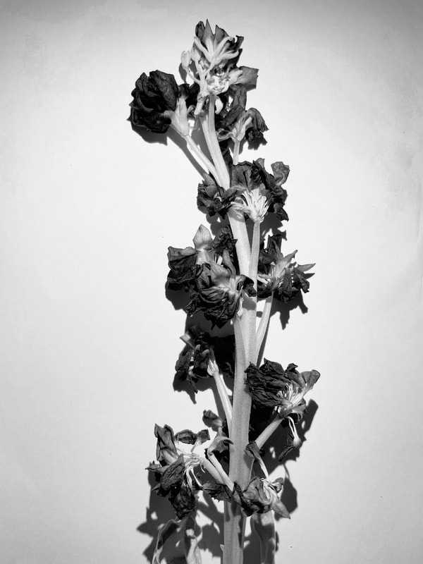
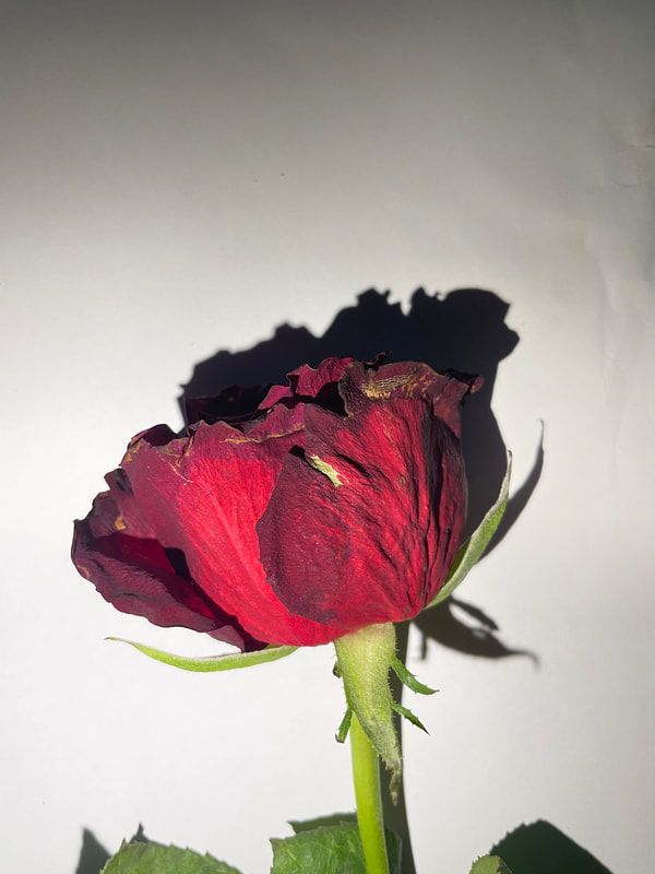
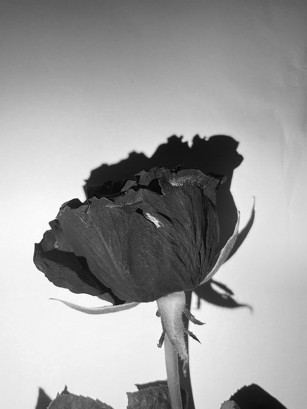
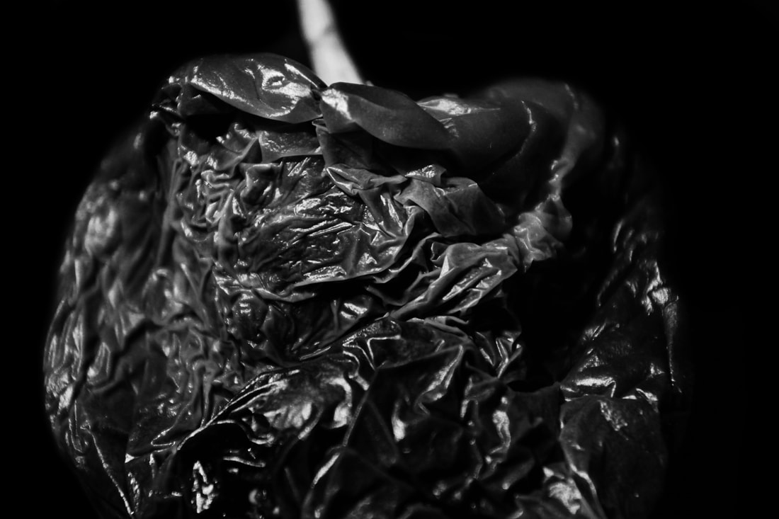
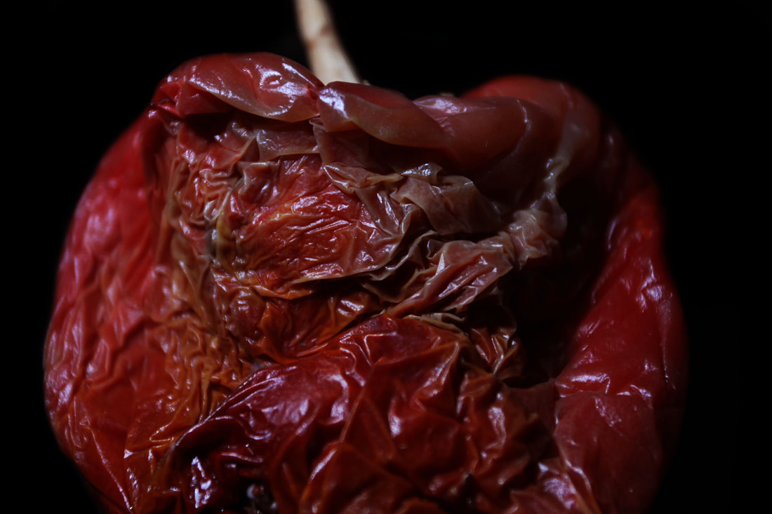
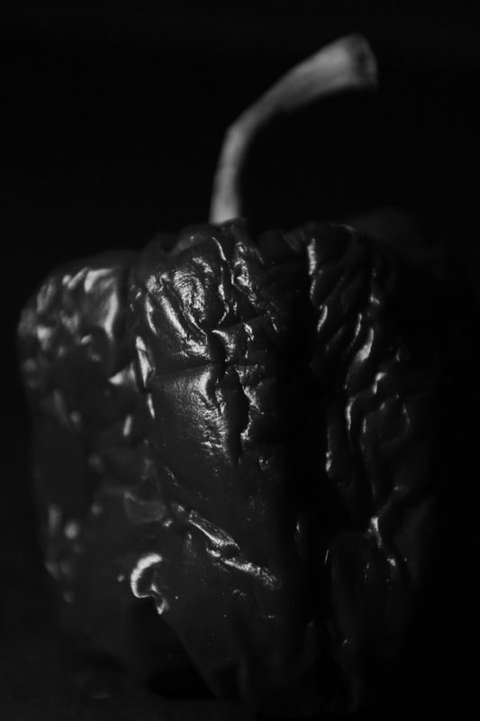
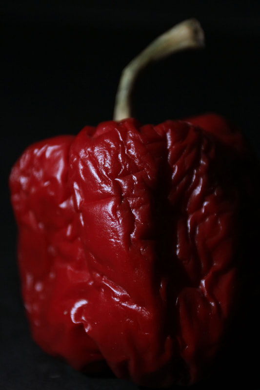
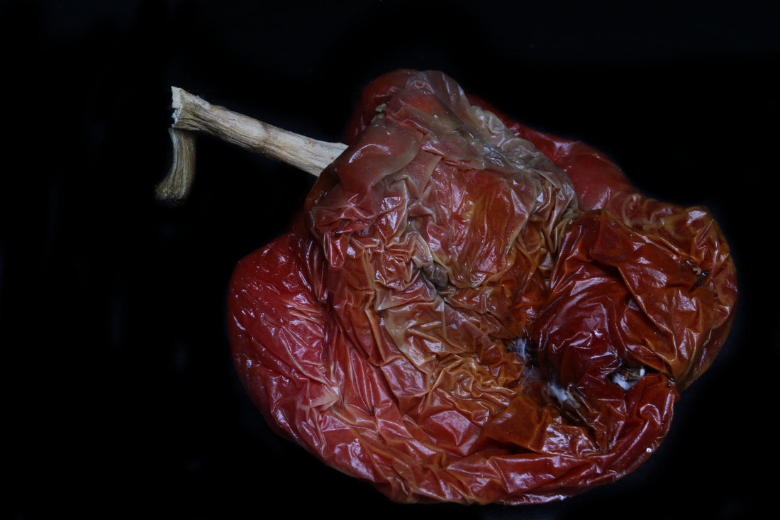
Billy Kidd - Decaying Flower
For my next strand in response for ephemera, I chose to do photograph dying or dead flowers as flowers are something that are enjoyed when gifted or bought with their vibrant colours and beauty. However, overtime they begin to die as they may not be in. the right conditions needed to survive. This is why I thought to photograph this as the sight of dead flowers makes you remember their beauty.
As I researched photographers hat photographed by idea of ephemera, I came across Billy Kidd. Billy Kidd's work mainly focuses on photographing decaying flowers and showing their beauty. He likes to photograph things he finds beautiful which other people dismiss. He doesn't this by photographing these flowers in front of a black background so that the colours are seen and the deterioration is noticeable.
I thought his work would be a successful work to respond to as he creates a successful pice of work and follows the concept of my idea.
|
|
|
My response
In my response I took photographs of dying flowers against a white wall. I made sure there was a bright flash so the camera is able to catch all the details of the petals and the sections that are disintegrating. In the use of a white background, this created a shadow which I felt like it distracted the image from the flower.
|
|
|
|
|
|
|
|
|
|
WWW
I was able to show the respond to the artist successfully and show the effects of age on a flower.
EBI
However I do not believe that this was a successful response as the intentions I was aiming for were not accomplished. The camera did not capture close detail of the flower's disintegration and I believe that next time I should use a black background.
development 1
Sam Taylor Wood - Still life
Out of the three strands I completed, I was most intrigued by the decaying flowers as It was a response, I enjoyed to complete and also one that turned out to be successful. This is why I wanted to carry on studio photography and began to research other artists that focus on the decaying and nature of time with things we enjoy. Through my research, I came across Sam Taylor Wood's work which I though would be a great development from decaying flowers and still fitted the ephemera theme.
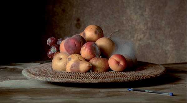
Sam Taylor Wood's work is focused on the moulding and neglect of fruit and even a rabbit. She took a bowl of peaches and placed them on a table and would photograph these peaches as they moulded, couple of times a day. This exposed the fur of mould and then later introduced maggots.
This time lapse video allowed me to see an artists' work of my idea and also allowed me to see what type of things are expected when photographing this kind of response.
Sam Taylor-Woods video piece, of what looks be a Vanitas painting from the 20th century, starts off with a bowl of fruit. The dim lighting, dusty earthy colours, and the composition from afar, you’d bet was a painting by some Dutch master. 
|

|
Contact sheet
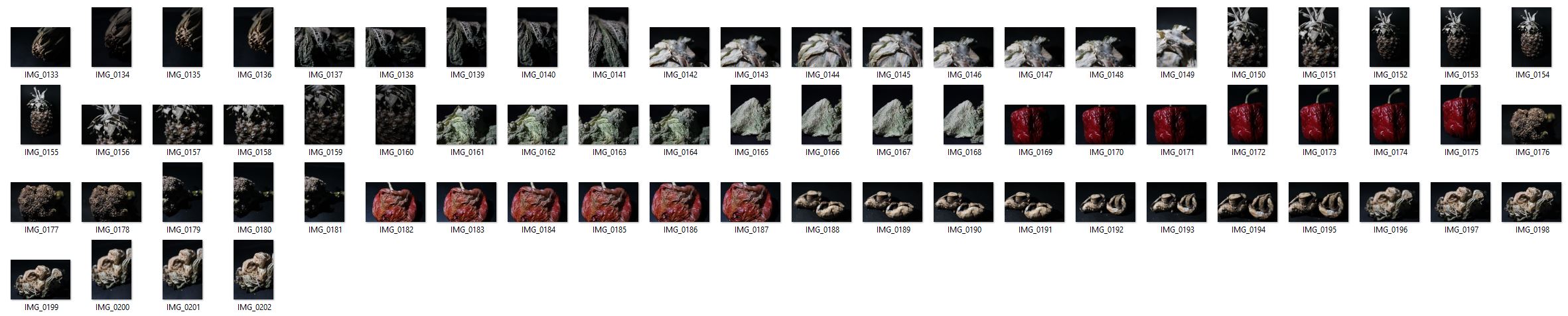
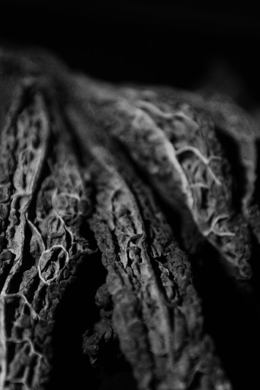
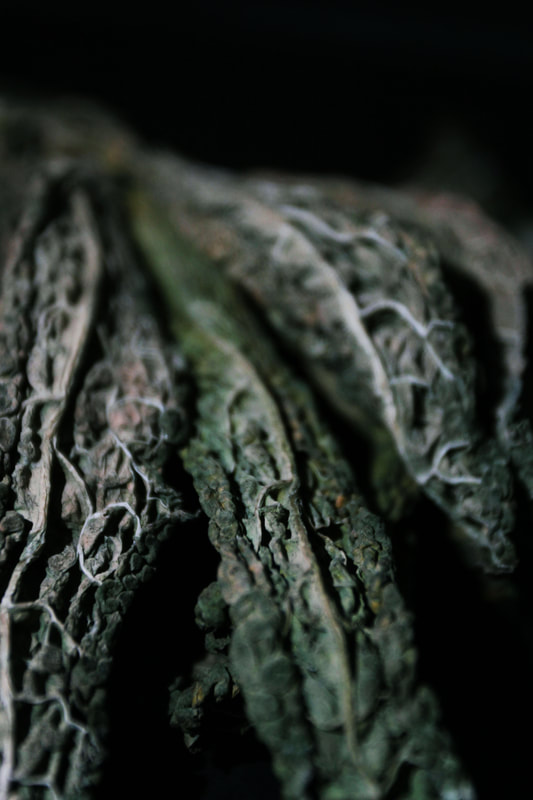
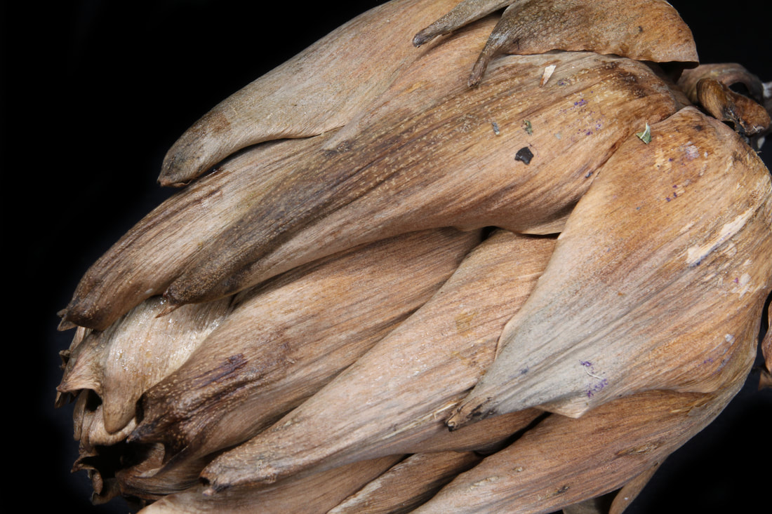
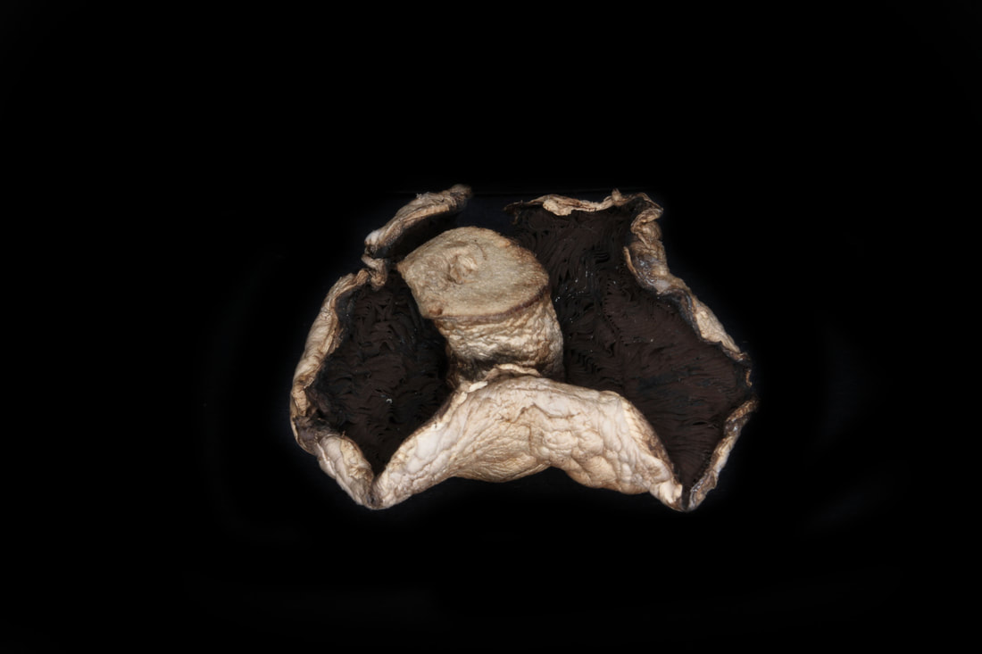
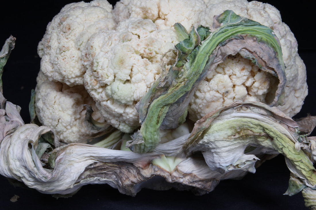
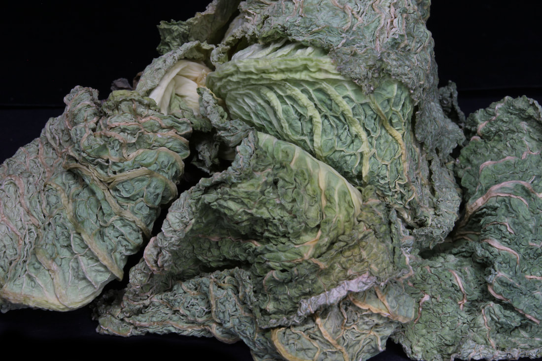
For these images I used the same technique as the previous shoot and tried to capture all the detail with the aid of a flash light and a black background. I also used a small aperture which lets less light in and focused more on the details. I chose to photograph things like dried vegetables and rotten patters to show texture caused by ephemera and age which turned out to be a successful link between by intentions and ephemera.
My response
In my final response, I took the final photographs and made a couple of adjustments, such as making the colour pop more so the contrast between the sections which are dried the sections which helped succeed my intentions. I also turned them into black and white to show the depth of the textures. I also exaggerated the editing as I believe that these photos could have shown greater detail.
I made sure that the subject, the rotten veg and fruit was the main topic of the image. I did this by adjusting the aperture and also making it very close up to the camera.
I made sure that the subject, the rotten veg and fruit was the main topic of the image. I did this by adjusting the aperture and also making it very close up to the camera.
|
|
|
|
|
|
|
|
|
|
WWW
The subject I chose to photograph suited the theme as it represents ephemera in food through the decomposition caused by time. My composition helped to support my response to the theme by showing and highlighting the subject and point of the photograph, it being the texture and colours. I managed the exposure very well. My aperture settings were low in order to get a detailed photograph. My images express my intentions which were to show the contrast between the old and the new as we know of these vegetables to look very different than what they look like in these images.
EBI
For my second response, I would like to go in greater detail. I would like to find a way where I am able to show the fruit in greater detail. Next time I will experiment with the camera setting and research ways where the camera is able to capture all textures to achieve and succeed my intentions.
second reponse
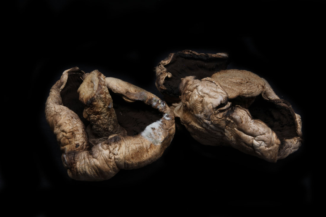
Contact sheet
While I took these photos I made sure to consider the detail of the fruits and that the mould was visible and almost exaggerated. I did this by following these step: made sure there was a low shutter speed, there was a single flash light hitting the vegetable and placed the camera on a tripod to prevent a blurry photograph caused by the slow shutter speed. I did this in response to the flower response as that was not achieved there and I was able to find a technique which worked well.
My response
In my response, I was able to achieve my aim in showing the textures and I believe that the final photographs were also very successful. The technique I used was perfect for my intentions and it was able to expose things that wasn't captured in my last response.
|
|
|
|
|
|
WWW
I used a slow shutter speed so it captures all indents and colours of the fruit. I prioritised my shutter speed to capture the all the small details and of the subject. I used a tripod to avoid camera shake. I am happy that through this development of as I was able to achieve what I was aiming for from the strand and this allowed me to explore and research ways in which I could achieve this and I was able to produce some very successful photographs.
I used a slow shutter speed so it captures all indents and colours of the fruit. I prioritised my shutter speed to capture the all the small details and of the subject. I used a tripod to avoid camera shake. I am happy that through this development of as I was able to achieve what I was aiming for from the strand and this allowed me to explore and research ways in which I could achieve this and I was able to produce some very successful photographs.
development 2
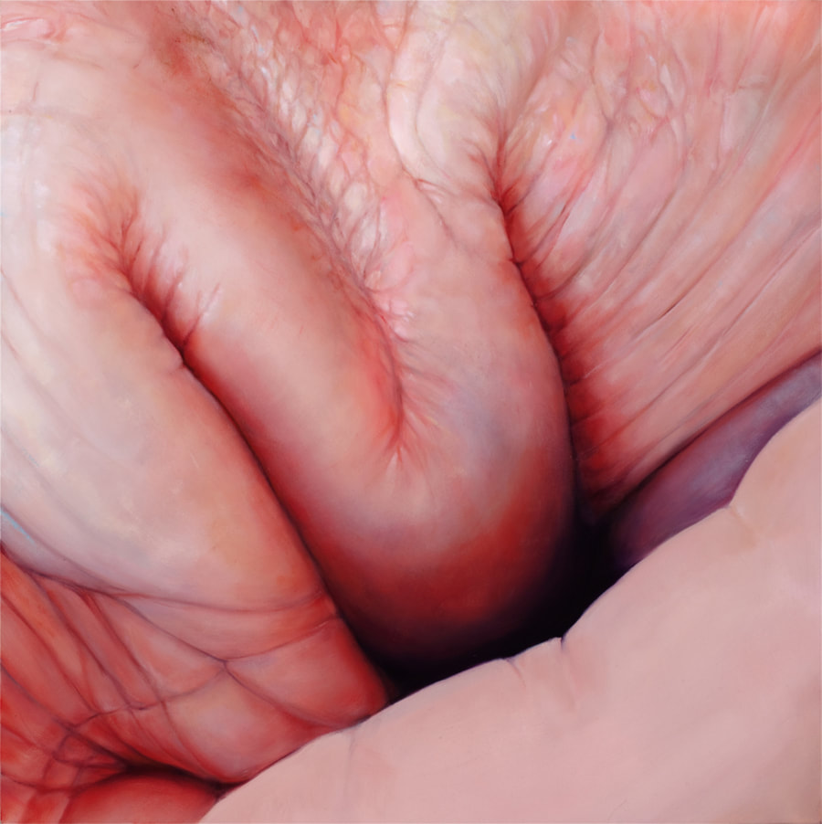
Edie Nadelhaft - Flesh and Bites
To carry on the work of ephemera, I wanted to carry on looking into magnifying into textures like I did with the vegetables. I then thought of ways in which I could link both magnification and ephemera together and I thought that the work of skin and textures would be an interesting approach I could research on.
As I began to research artists which may have made work similar to by interest and that is when I came across Nadelhaft's work where he focuses on taking skin and deforming it to make it look like something other than skin. However the view is able to identify that it is skin through the colours and the folds but the abstract folding and unnatural shapes creates an interesting twist to his work.
I thought this would be a great artists to respond to as it includes the magnification on skin as it could be linked back to ephemera though the wrinkles presented.
In Edie Nadelhaft's series entitled "Flesh" and "Bites", this artist takes an almost microscopic examination of the human body. Folded hands and mid-bite mouths display deeply detailed corporeal lines rendered for our own personal scrutiny. These pieces are meant to come across as decadent and hedonist in nature, viewing the senses in their most straightforward form.
- https://www.juxtapoz.com/news/news/edie-nadelhaft-flesh-and-bites/

|

|
|
My response
For my response I tried to make the same unnatural folds. However I believe that I was not very successful as you can tell in the photograph there are two hand next to each other. I also tried to show wrinkles and see how they could take an interesting form which I believe I was able to create a more successful response compared to the ones of the hands.

|

|
|

|
WWW EBI
development 3
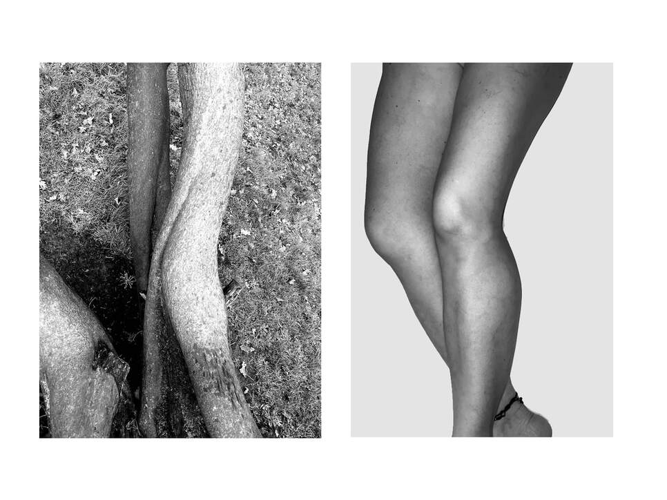
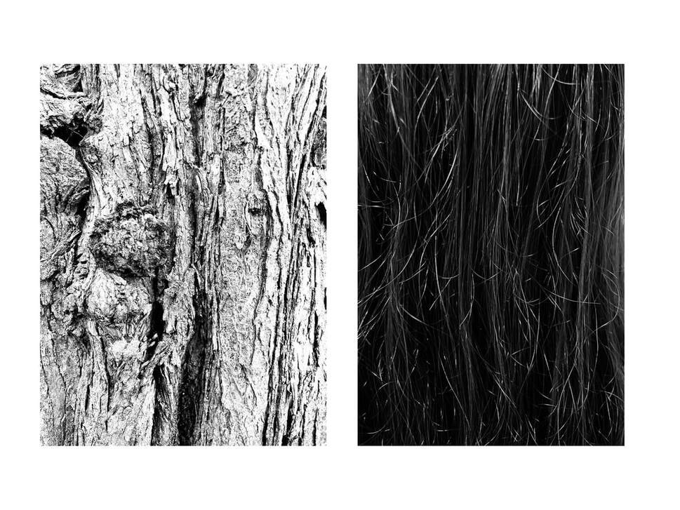
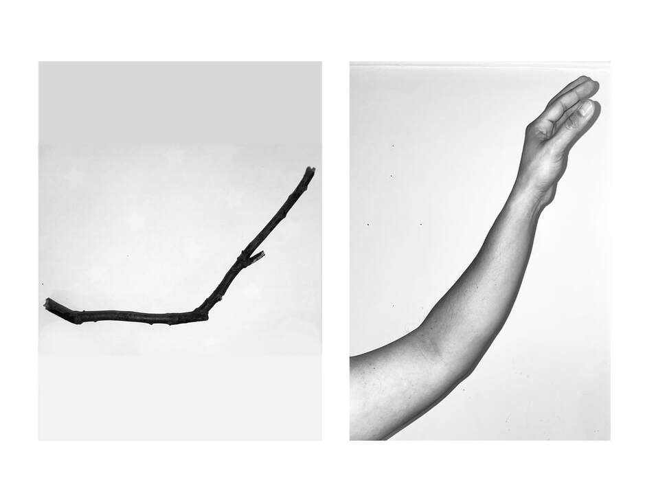
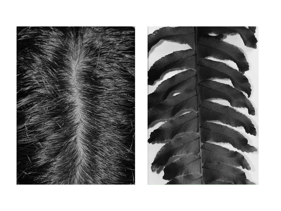
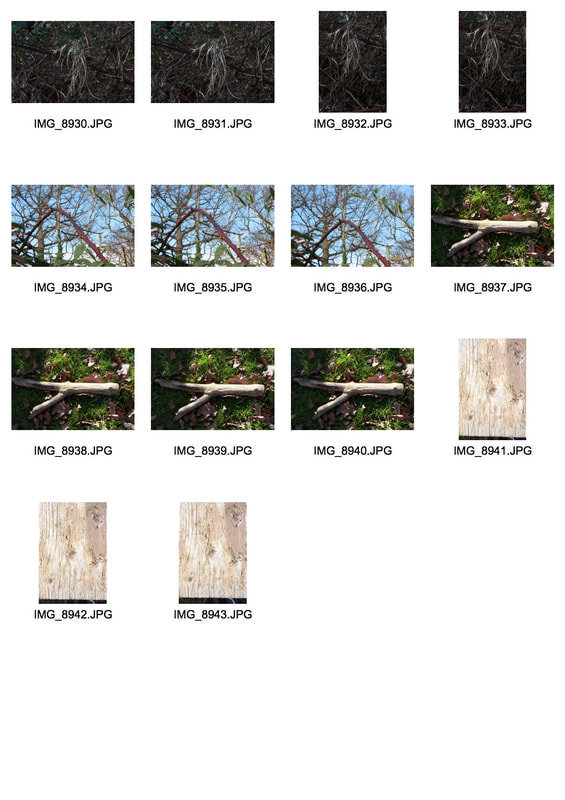
Alicja Brodowicz - ABSTRACT COMPARISON ( BODY VS NATURE)
For this project, we will be focusing on the main comparison of nature and our body. Through Alicja's work, she focuses on the shapes of the human body and the evolution between old and going in nature and humans in comparison of the decaying of the human nature. In most of her artwork you are able to see lots of photographs of features that are usually only seen in the elderly.
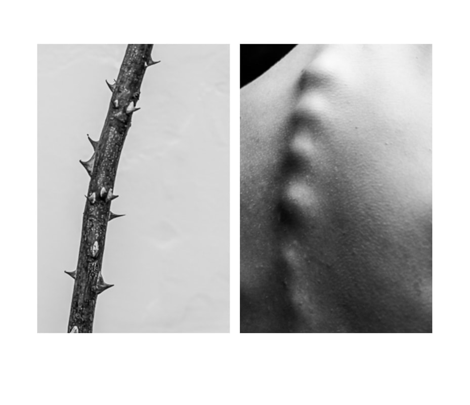
Here you are able to see that Alicja has made the comparison between a stick and the spine as they both include a smooth curve and bumpy features between them. It is also important to notice recurring the compositing in her artwork as it only shows the subject of the photograph.
|
|
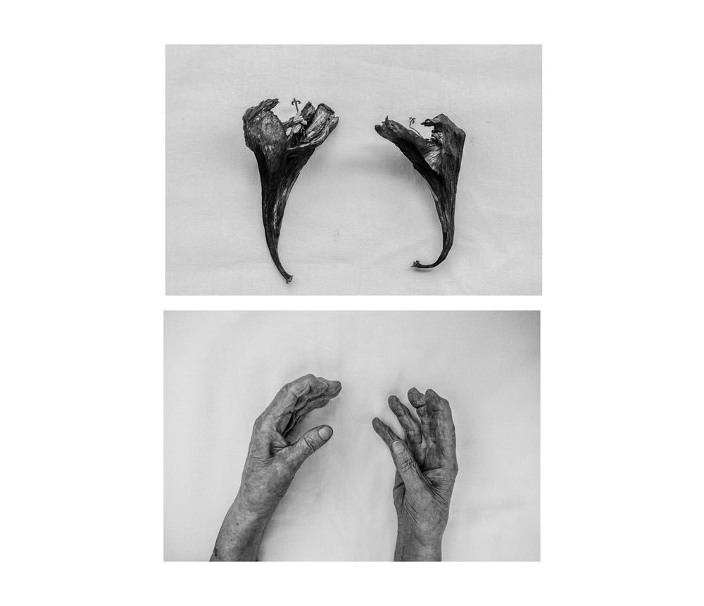
Here she has placed hands and nature in the in the same composition style. In a white sheet to make them the main subject and has placed them in the same place to show the comparison she is trying to portray which is something I will keep in mind when creating my response.
|
Contact sheet
|
|
|
|
My response
|
|
|
|
Evaluation
For this response I was able to adapt nature to the human body as I collected sticks and leafs from a park and visioned what parts of the body I could compared it to which is why I mostly chose sticks and leafs. What went well in this response was the imitations created by the body to nature and the editing too. However I would have tried to keep more white space in the photographs just like the artist does when taking her artwork.
For this response I was able to adapt nature to the human body as I collected sticks and leafs from a park and visioned what parts of the body I could compared it to which is why I mostly chose sticks and leafs. What went well in this response was the imitations created by the body to nature and the editing too. However I would have tried to keep more white space in the photographs just like the artist does when taking her artwork.
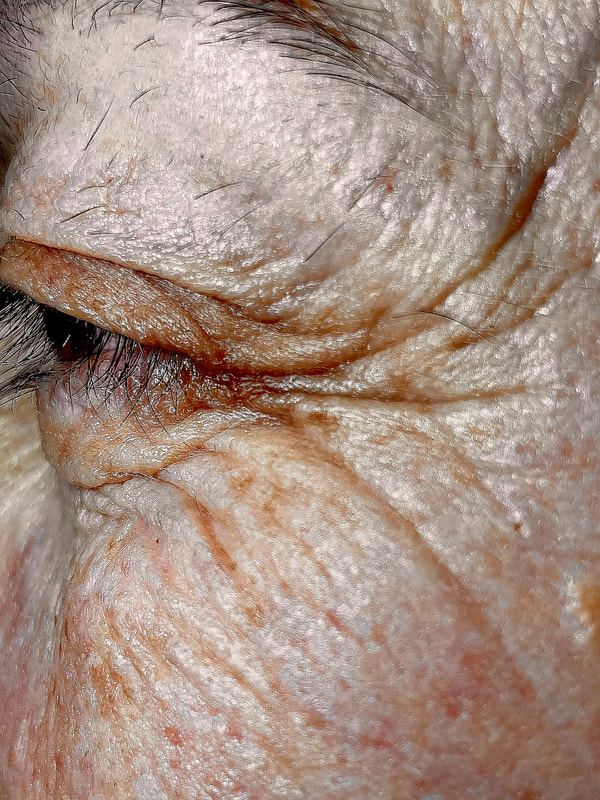
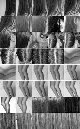
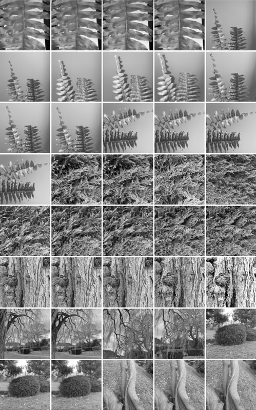
Agnieszka Lepka
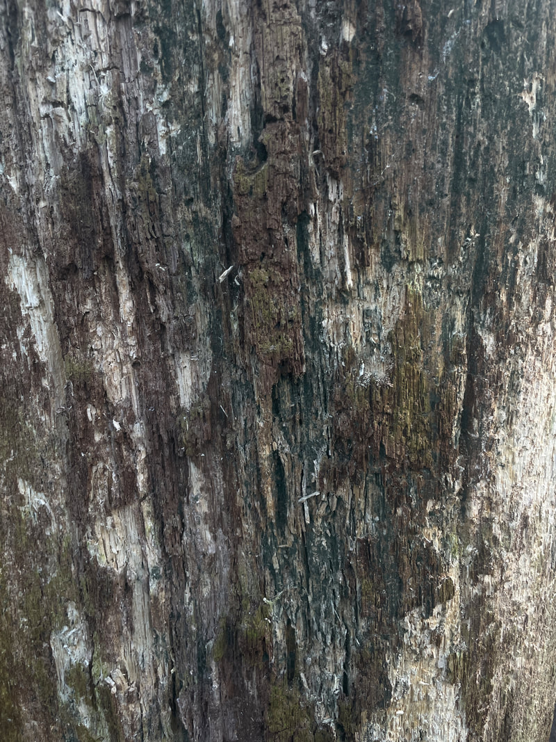
Lepka's artwork focuses on the comparison between the body and nature mainly focusing on wrinkles, veins and scars to bark, affects environment has on things like paint, concrete etc.... Compared to Alicja Brodowicz, their editing style is different because they are coloured photographs with no white borders.
Lepka's artwork focuses on the comparison between the body and nature mainly focusing on wrinkles, veins and scars to bark, affects environment has on things like paint, concrete etc.... Compared to Alicja Brodowicz, their editing style is different because they are coloured photographs with no white borders.
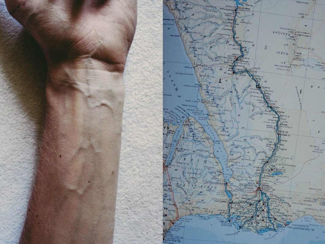
Here there is a comparison between veins and the world's rivers and lakes and streets in a map. The big vein has been compared to a river going through what seems to be a city and the other veins represent the small lakes and streets.
|
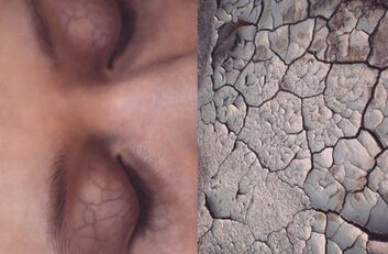
Here Lepka has compared the veins on an eyelid to dried paint as they both contain connecting lines caused by the humidity. The composition in makes the viewer focus on the veins of the eyelid and is able to understand what comparison is being made.
|
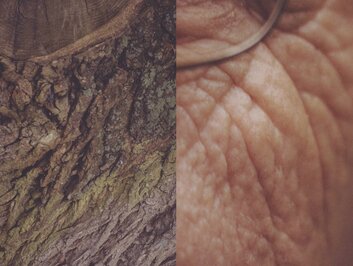
Here they have compared wrinkles to bark textures. What most standout of this photograph is the composition as the glasses of the person seems to be in the same position as the top of the bark which create a successful comparison.
|
Contact sheet
|
|
|
|
|
|
My response
|
|
|

|


|
|

|

|
WWW EBI
development 4
WATER
To further develop this project, I wanted to carry out the nature response so I thought that doing water and freeze flames of water would be a good response to ephemera. I also thought that this would be an interesting shoot to take as I was already exploring how to take detailed photographs and I thought I would link this in with nature.
|
|
|
Contact sheet
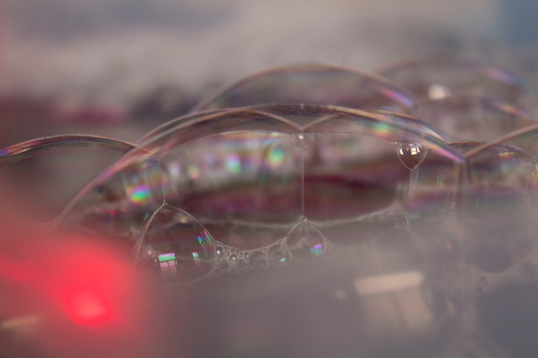
In my response I took photographs of water falling onto a bucket of water and I attempted to freeze frame it. I got a bucket of water and added black dye so there would be less reflection and the contrast between the bubbles and the water would be visible. I attempted the freeze frame the water but it wasn't working how I liked it but I was still intrigued by the bubbles.
My response

|

|

|

|

|

|
WWW EBI
development 5
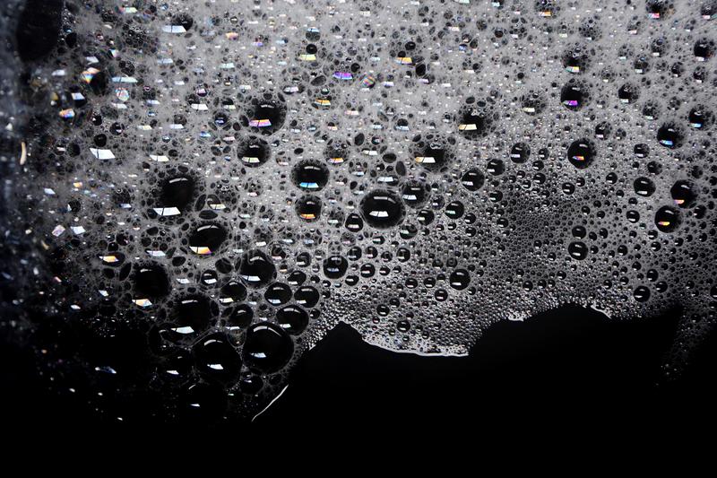
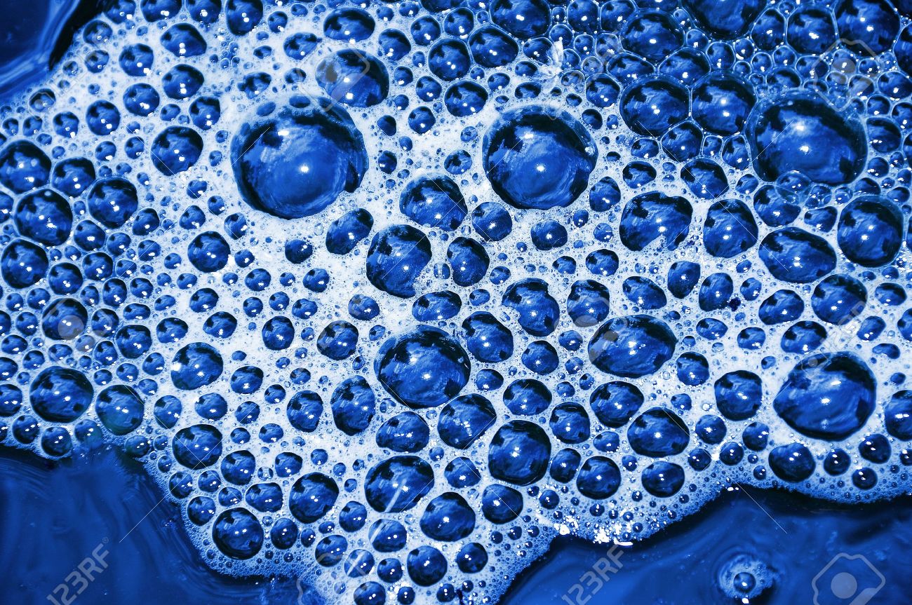
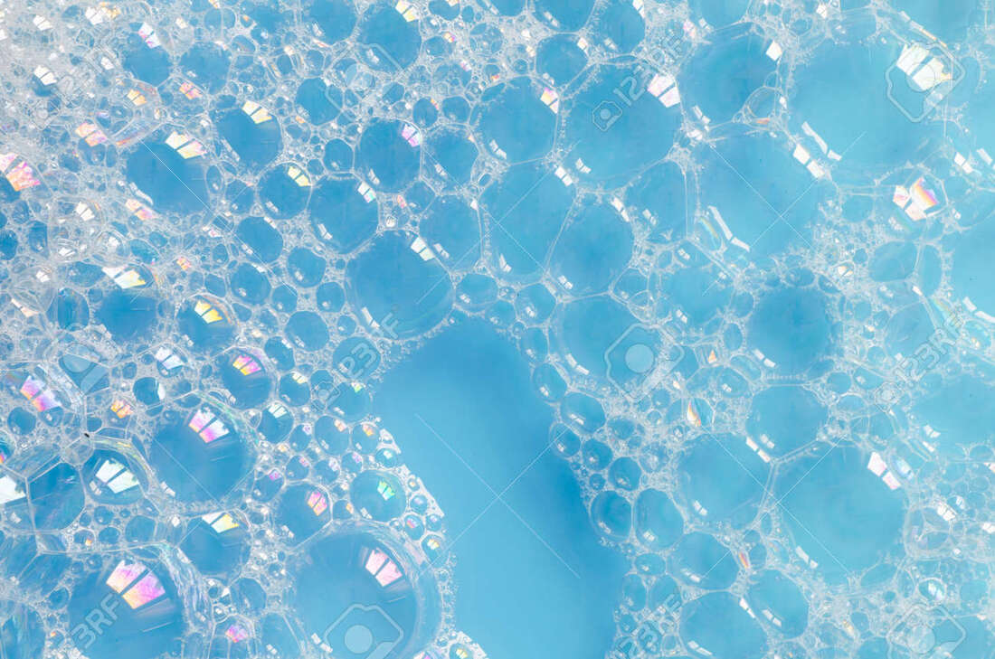
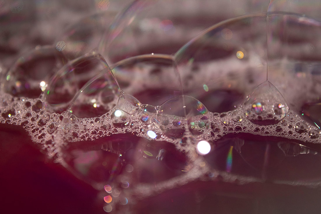
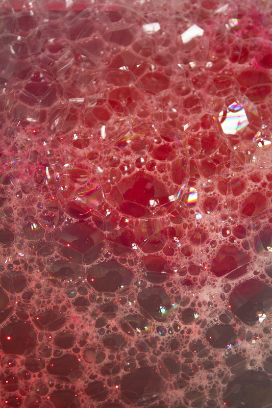
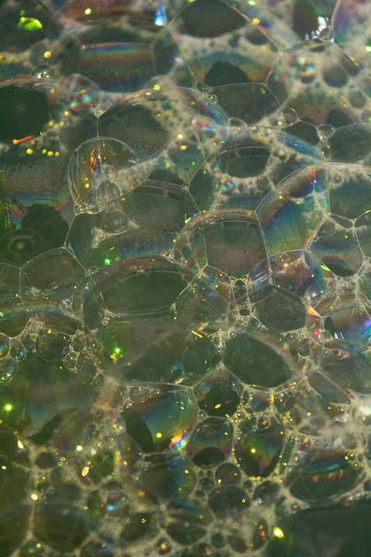
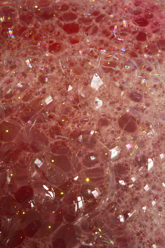
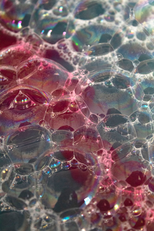
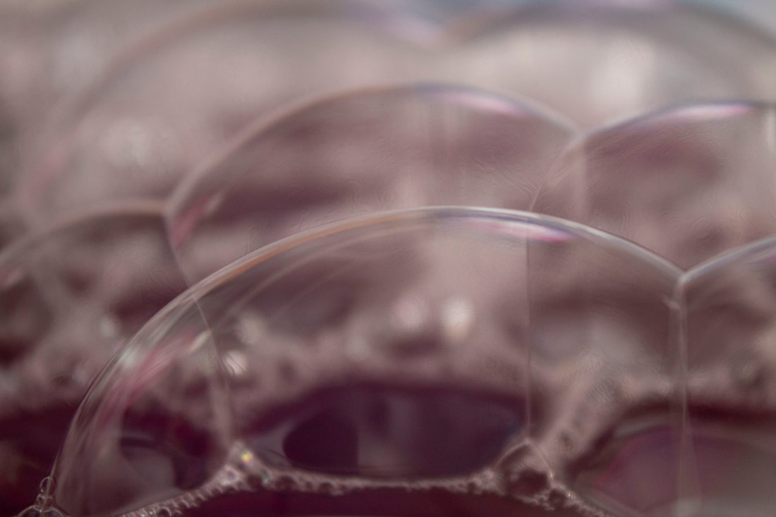
BUBBLES CLOSE UP
|
After taking photographs of stop motion water. I think the thing that stood out the most are the bubbles. This is why I decided to take more photographs of bubbles. My intentions for this shoot was to show the ephemera though bubbles and this was easy to link to due to my last response.
I would like to experiment with the details and colours of the bubbles as I will be able to capture the rain created by the light hitting the bubble. I may try to use a macro lens to capture all the small details. |
Contract sheet
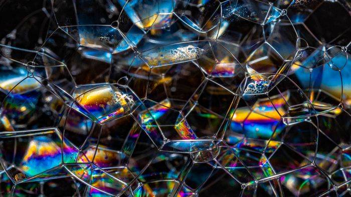
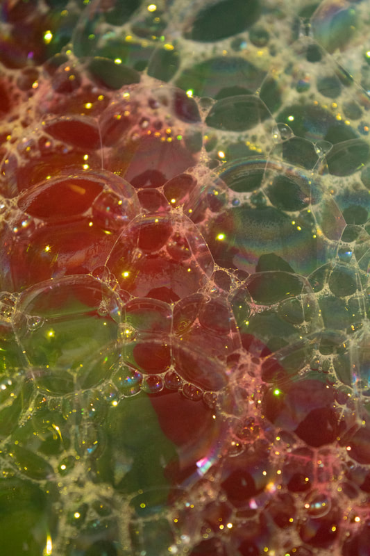
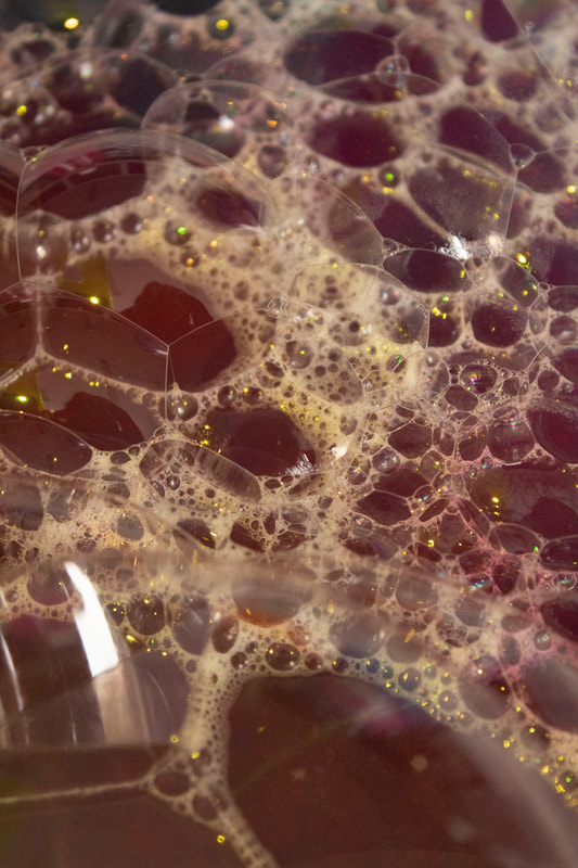
For the shoot, I prepped a bucket of water and with bubbles. Just before taking the photographs, I splashed dye on it and took the photograph quickly so that different colours could be seen and this would then also affect the colour of the bubbles and would change the effect the light has on reflection against the bubble.
I also took photographs of the bubbles close up which I thought were very successful as you are able to see different colours together.
I also took photographs of the bubbles close up which I thought were very successful as you are able to see different colours together.
My response

|
|
|
|
|
|
WWW EBI
development 6
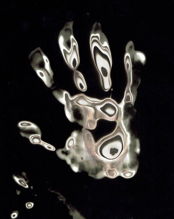
CHEMIGRAMS EXPERIMENTATION
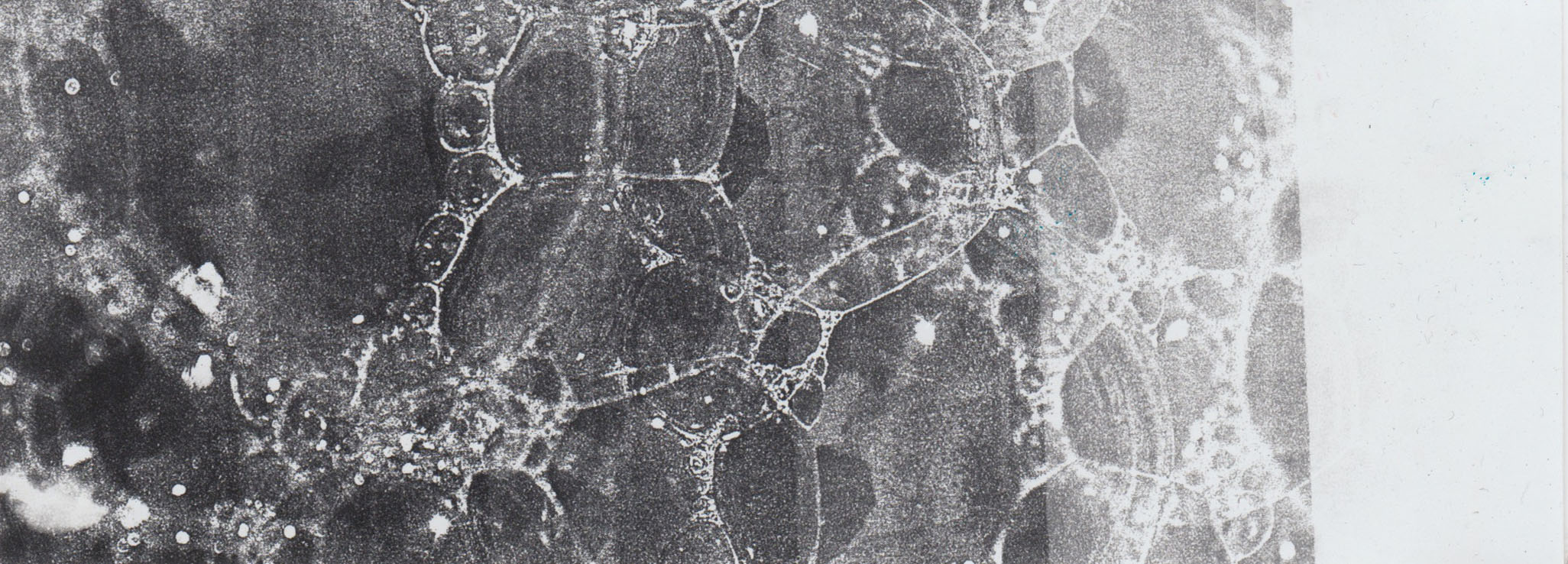
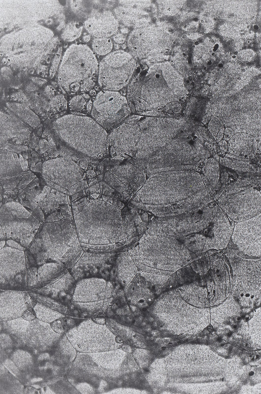
To develop this project, I wanted to experiment with different materials and physical objects. This is why I thought taking photograms and chemigrams where a good development. To begin with, I wanted to see what I could include in these chemigrams. This is why I went on google and searched up chemigrams inspirations and I got three photographs which I thought suited my aim as I was going to use the bubbles photographs.

This chemigram was one of my favourite as is it the one that looks very similar to bubbles with the circles.
|
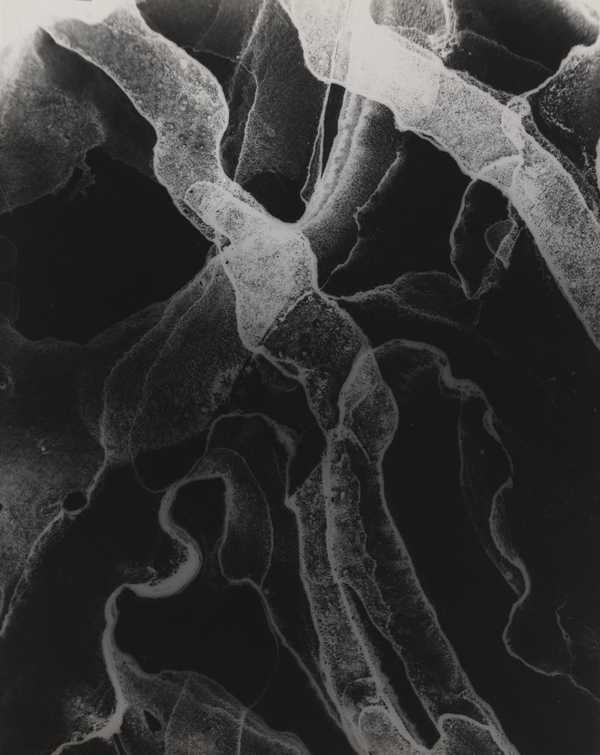
I really like colours in this chemigram a there is fade of white and the dark background really complements these abstract shapes. This is something I would like to try out in mine.
|
This chemigram uses different materials and elements to form shapes. I think this was taken with the use of veg oil which would really compliment the bubbles.
|
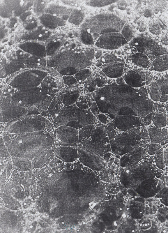
Photograms
To start with I printed out acetate with the photographs of the bubbles. I got multiple photographs and printed them out inverted and original. This allowed me to put photographic paper under neither it and when light is exposed to it, it comes out with the photograph of the bubble. For the inverted acetate, the light enters the section where it is usually white and it turns black.

|

|
I began with making a test strip of the photograms to see how much exposure is needed so the photographs is not too over exposed or under exposed. For each photograph and test, I decided that 4 seconds of exposure was the best suited.

6 seconds 5 seconds 4 seconds 3 seconds 2 seconds 1 second
|
6 seconds 5 seconds 4 seconds 3 seconds 2 seconds 1 second
|
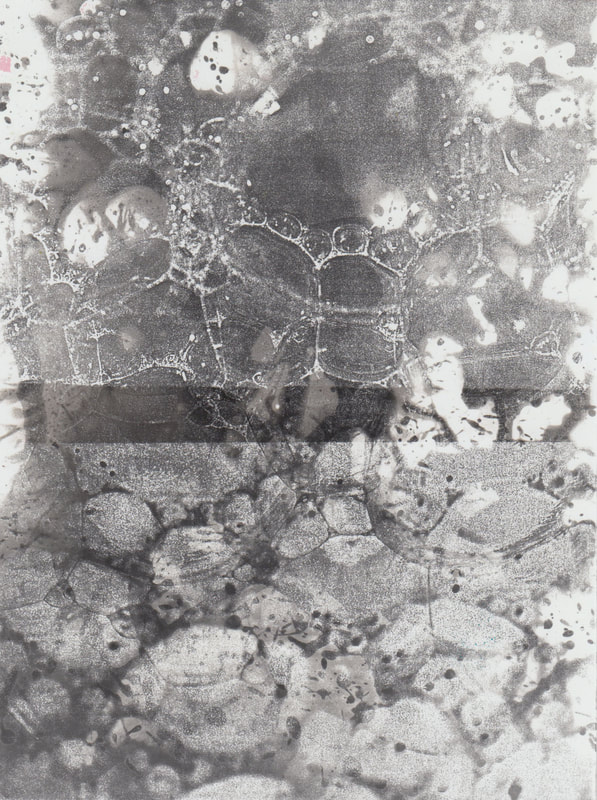
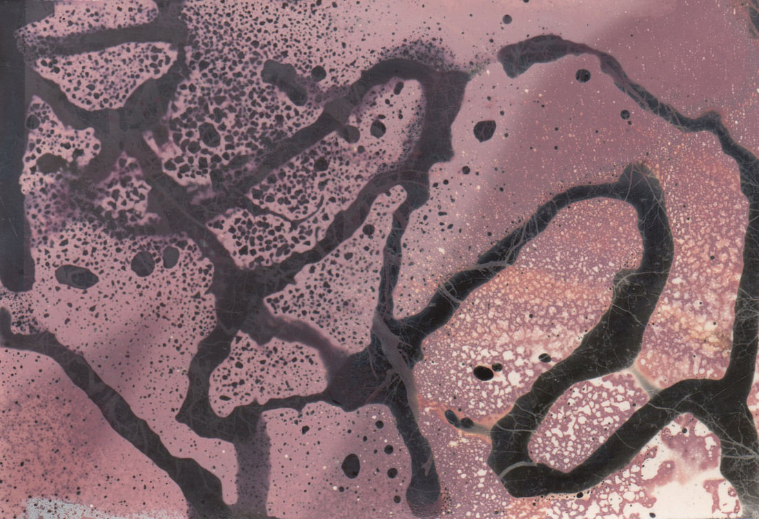
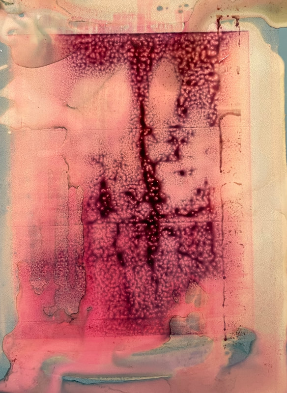
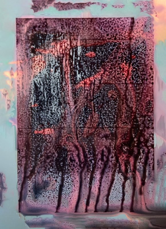
Chemigrams
Once I figured out the right explore for it, I made chemigrams where I experimented different ways to make them look abstract and also make them look interesting. I was able to expose the bubbles onto the paper which were visible in most photographs. However in some, the bubbles can not be seen. However I uploaded the ones I thought were the most successful.

My response
|
|

development 7
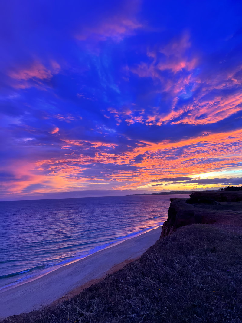
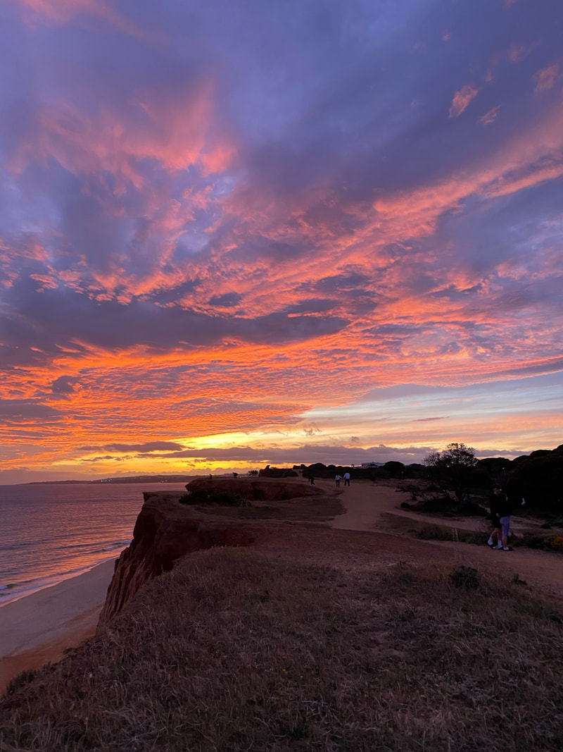
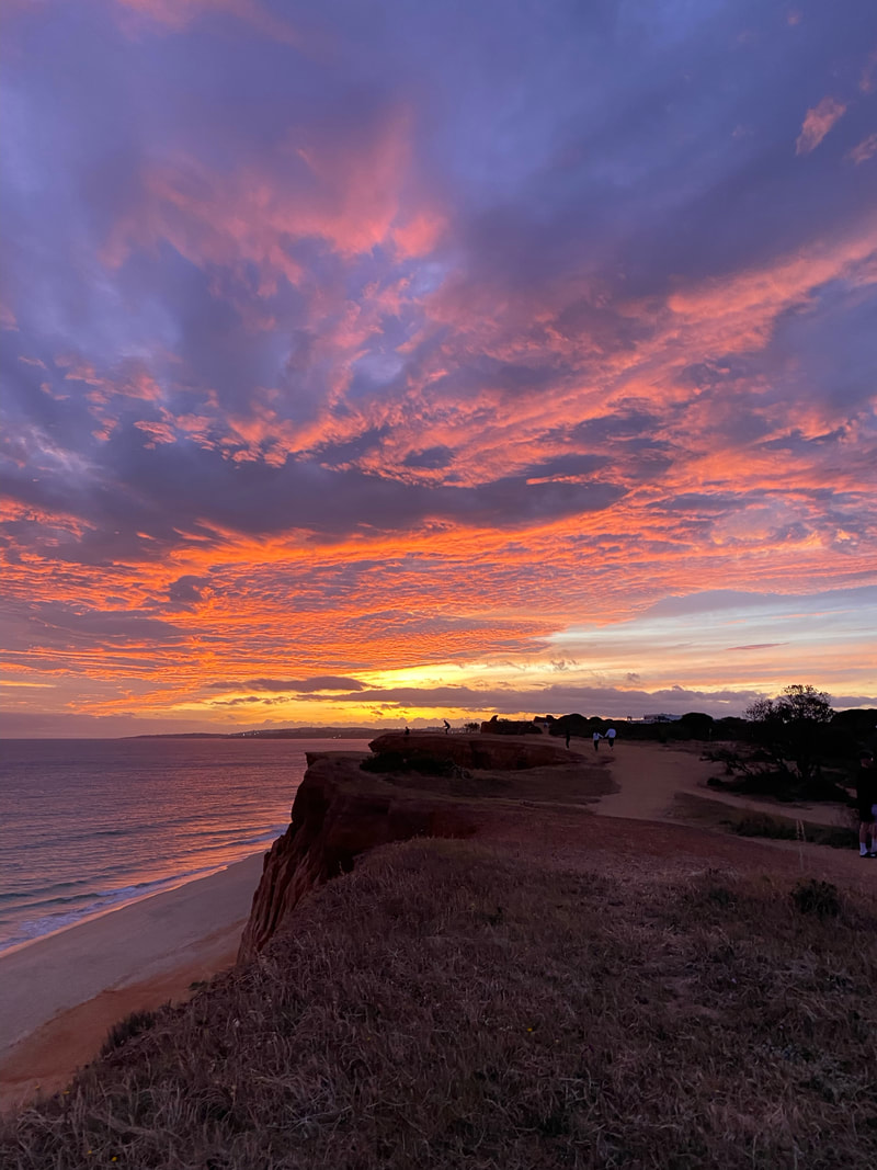
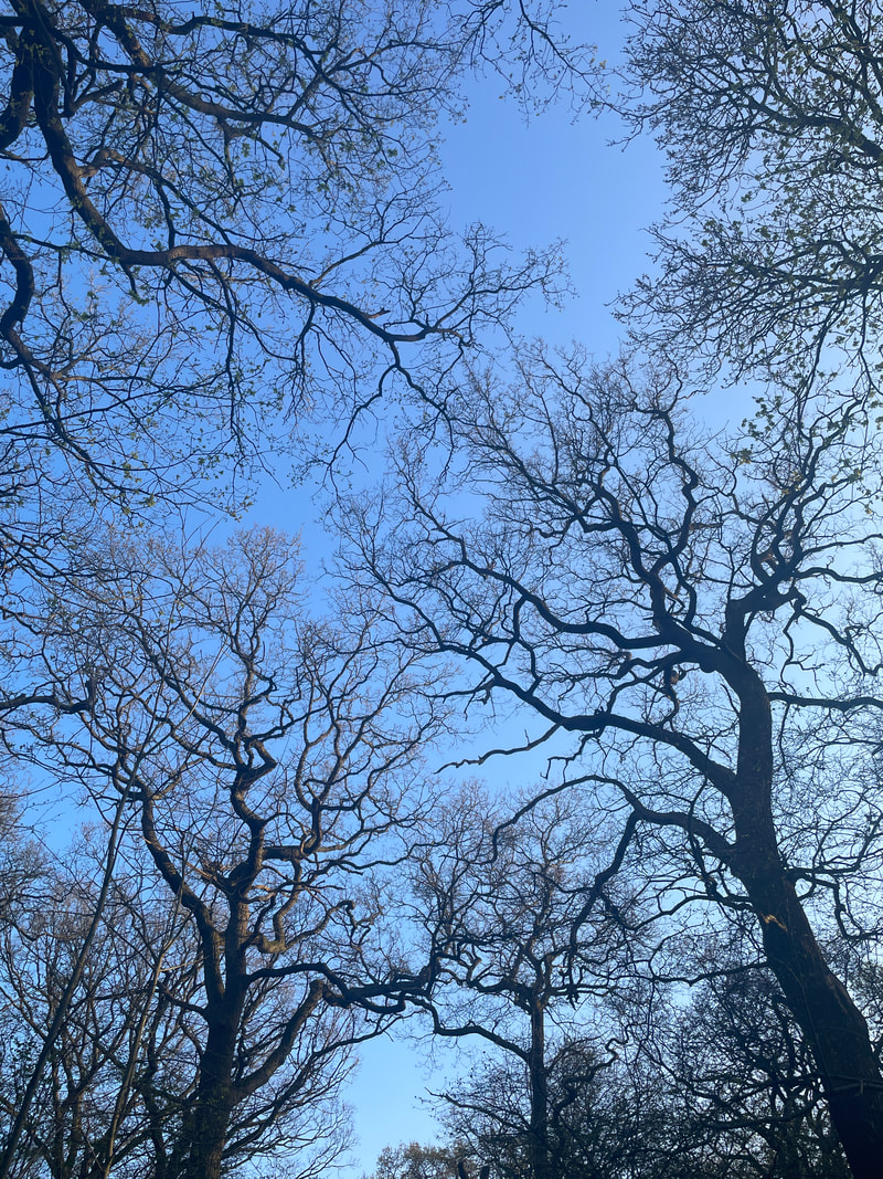
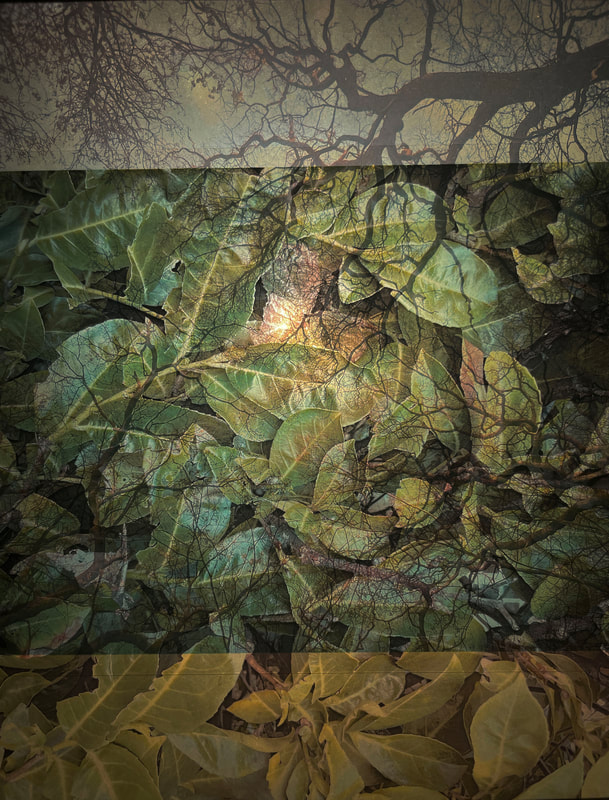
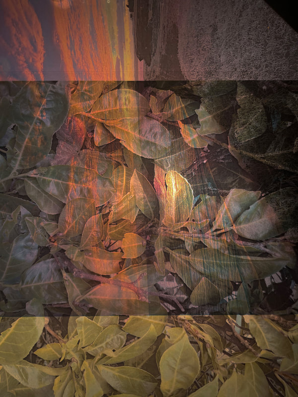
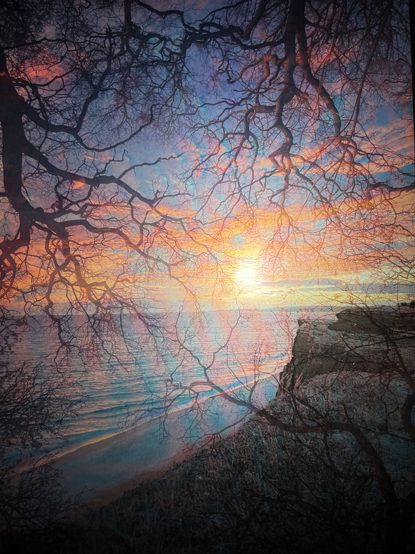
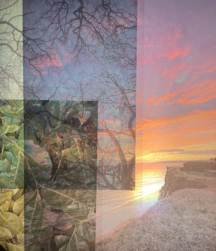
SUNSET
|
|
|
|
|
|

|

|

|

|
|
|
|
|
|

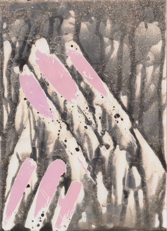
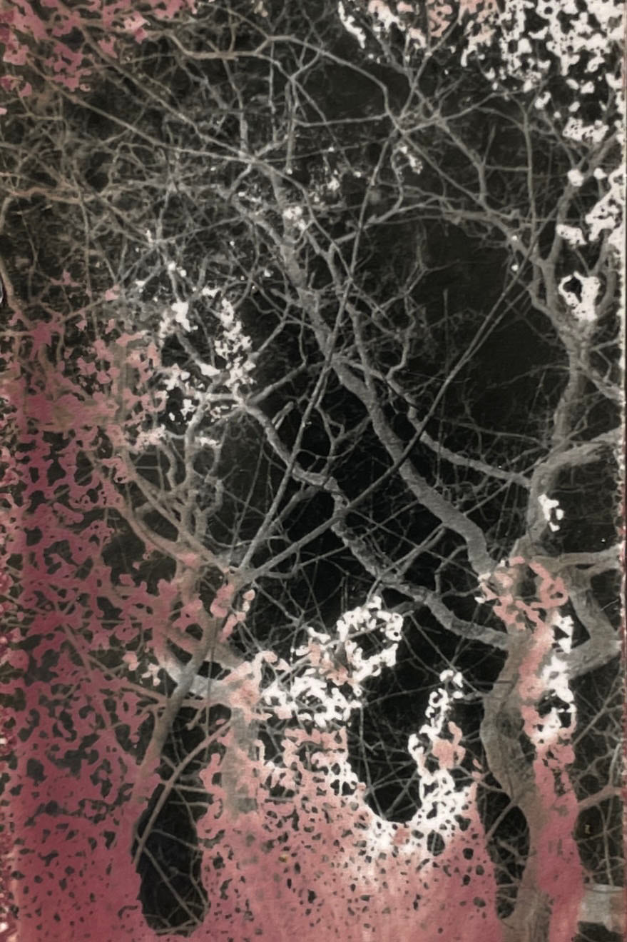
development 8
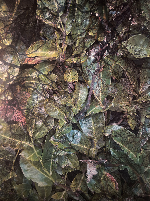
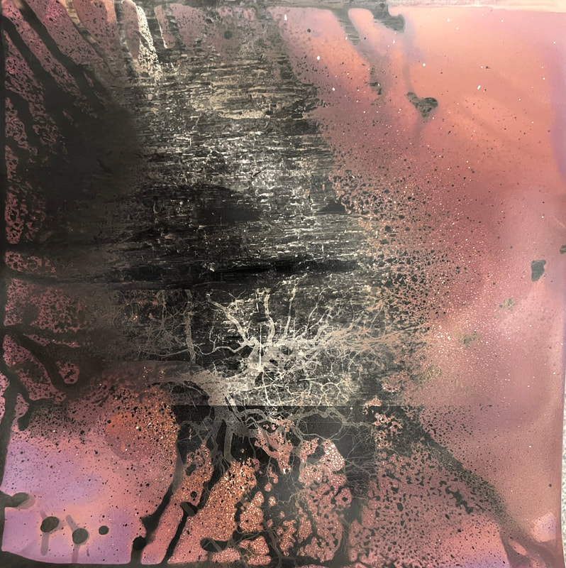
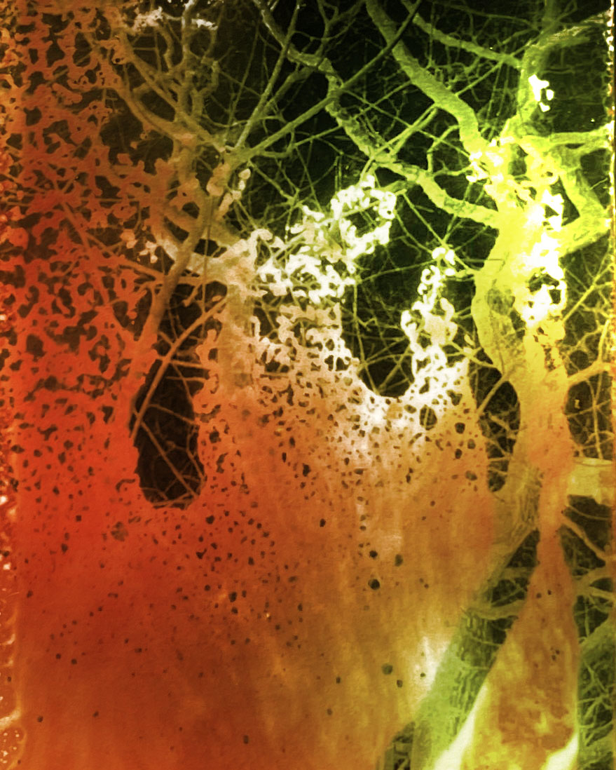
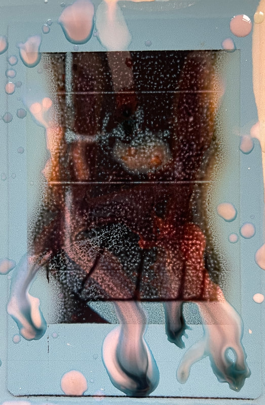
Going back to my original intentions, I went onto the dark room where I made test sheet sand experimented with how I could use there photographs at an advantage where I am able to make abstract images while experimenting. I did this by doing things like: adding Vaseline so they chemicals don't impact the section making it turn into a pick colour in the future, eventually turning black. This is why when scanning in the photograph, I had to be very quick and time how I wanted the photograph to turn out.


After this, I started to make large chemigrams where I was able to experiment a lot more due to the large surface area I was able to use the techniques from the websites and research I did.

|

|
|
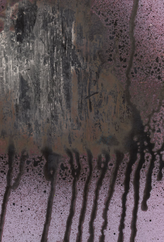
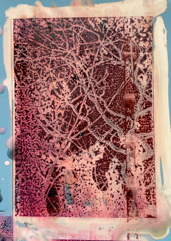
Close ups
I then decided to make close ups of the chemigrams so I could point out the more significant bits and the sections I thought were most successful.

|
|

|
|
WWW EBI
development 9
In chemigrams, there are a limit of colour in which it depend on how the paper was exposed and the amount of time is was exposed for. The colours usually go from white, then pink then purple then blue and then too black. This means that if you would like to achieve other colours, you would have to rely on coloured dyes or other chemicals.
For my next development, I wanted to experiment with more colours and one way in which I decided to begin with is using photoshop so I could see what they chemigrams would look like.
This is why I got some photographs from google which showed a clear gradient between colours so it looked like the dye was smudged in as it would be if we were to be mixing different colours together.
|
Colours I used to edit with ( acquired from google ) :
|
Steps for editing on photoshop:
|
Results:

|

|
|
|
development 10

|
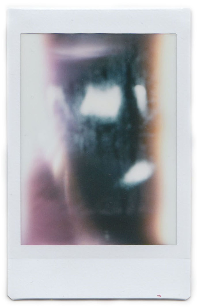
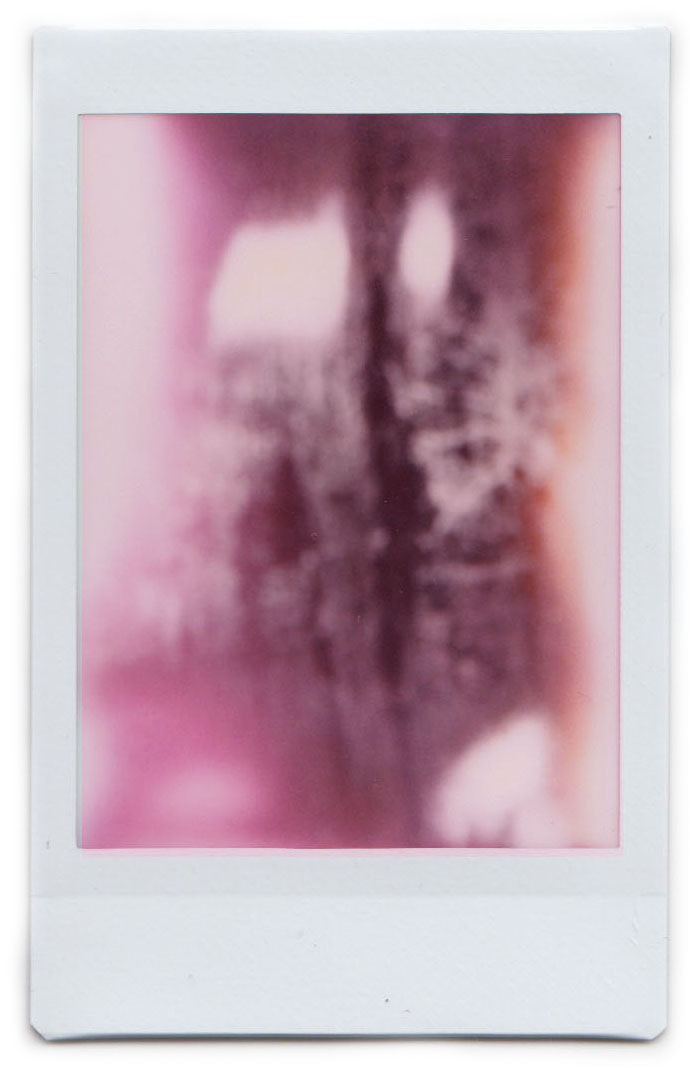
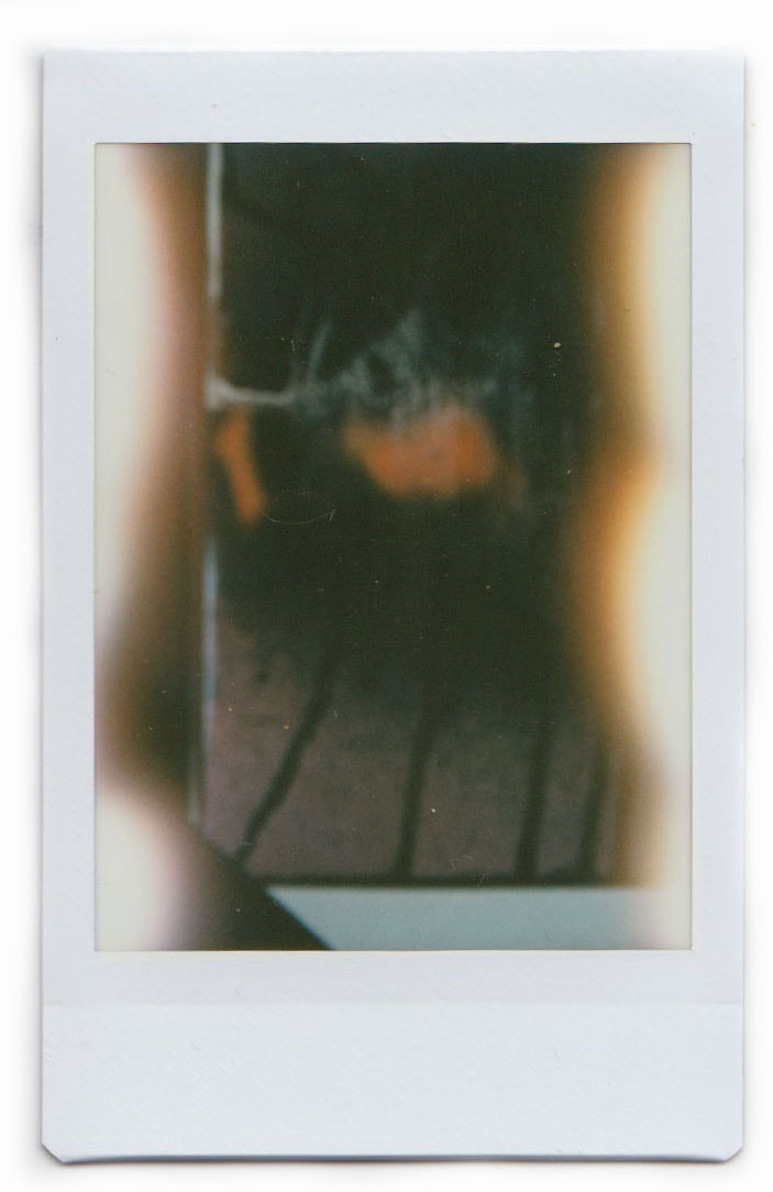
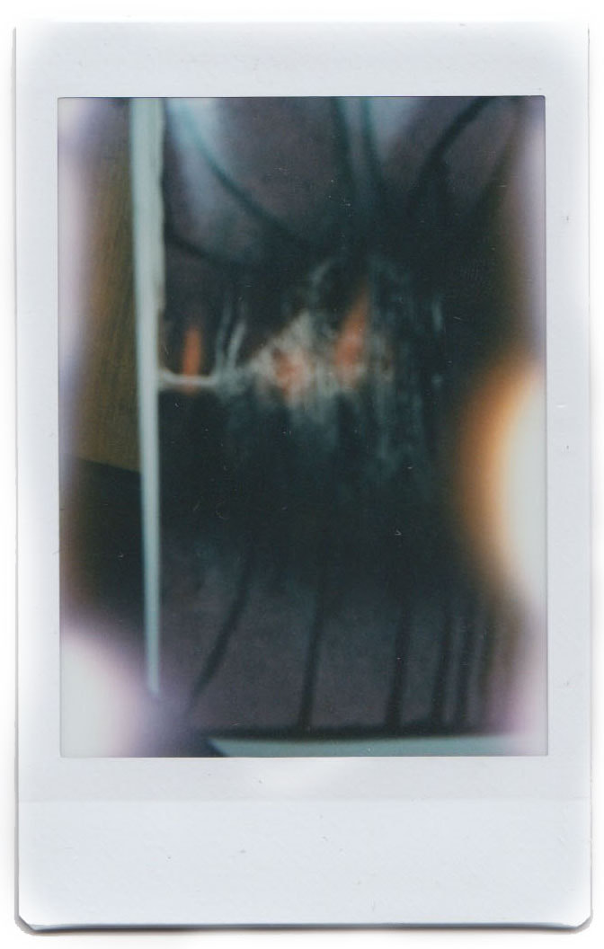
Next I wanted to carry out more physical experiments and I thought about taking photographs of the chemigrams on a Polaroid camera as it would have different colours on them created from simply placing a finger on the lens or from the flash.
I did this by placing a chemigram on a white piece of card so it would be flat on the image and I got a Polaroid camera and took a the photograph with the aid of a studio lights. |
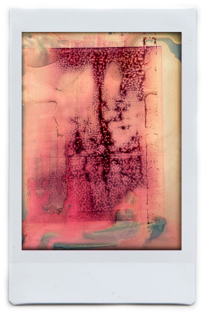
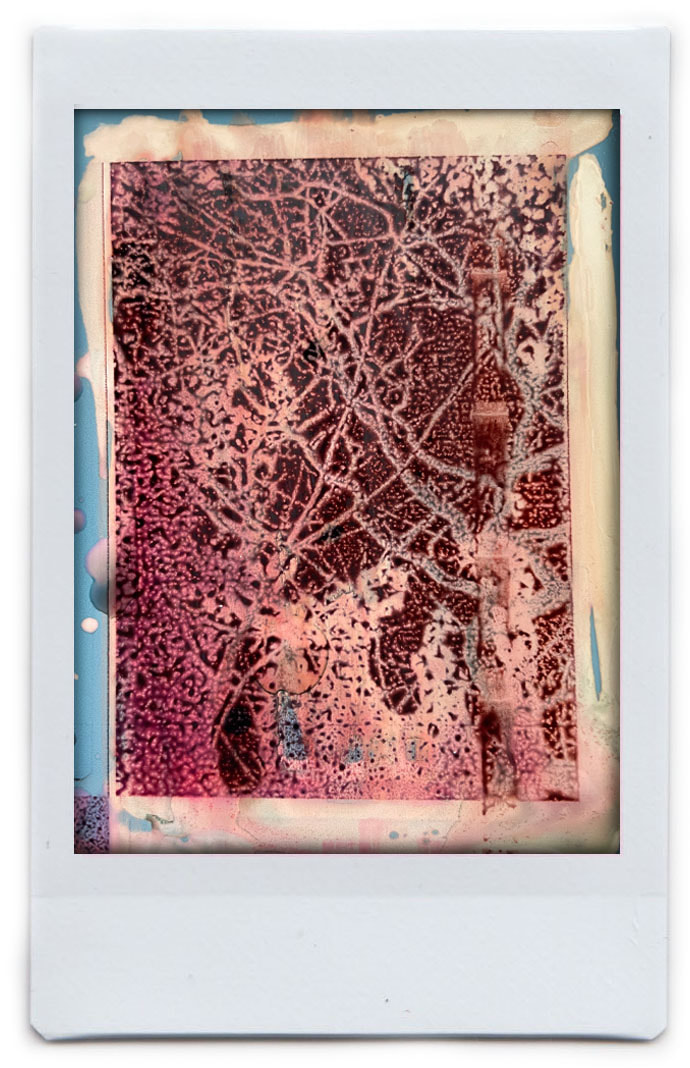
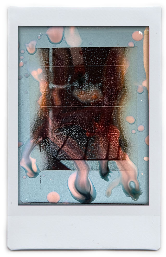
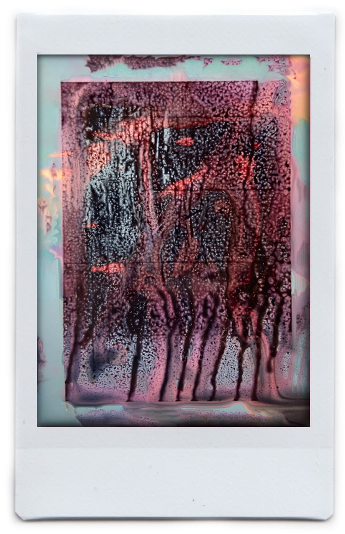
Results
|
|
|
|
development 11
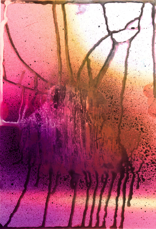
For my next response, I printed out the scans onto coloured paper which is originally blue and when bleach is applied to it, it turns pink, then yellow, then white. I used different techniques so that different colours would appear in different places. These are the techniques and the final results.
|
Teachniques:
- Vaseline. - Slashing bleach. - Dripping the bleach. - Paint brush. - Letting a puddle of bleach sit in place. - Putting bleach all over it - |
|
Results:
|
|
|
|
development 12
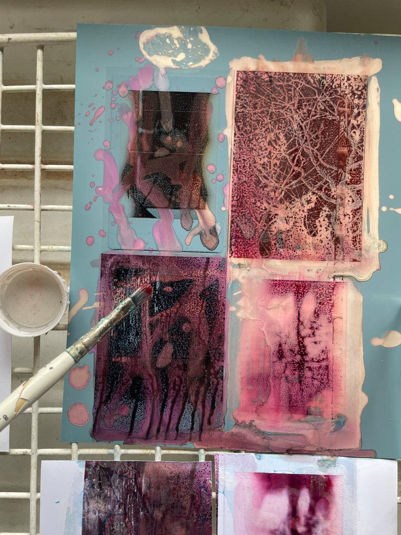
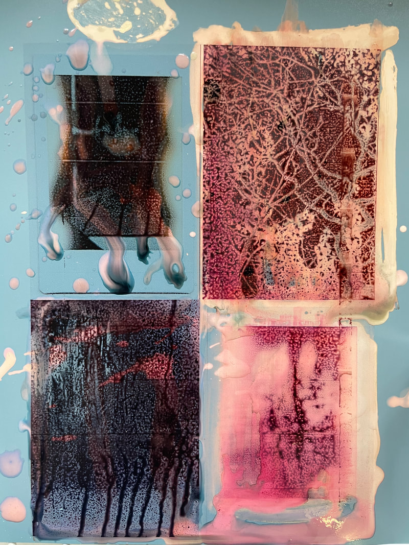
Next I went onto photoshop and photoshopped the chemigrams onto the polaroids as that was what I was attempting to do the first time when I was photographing the chemigrams with the polaroid.
Final piece
|
|
