Abstract form

Project 1 - The white paper test
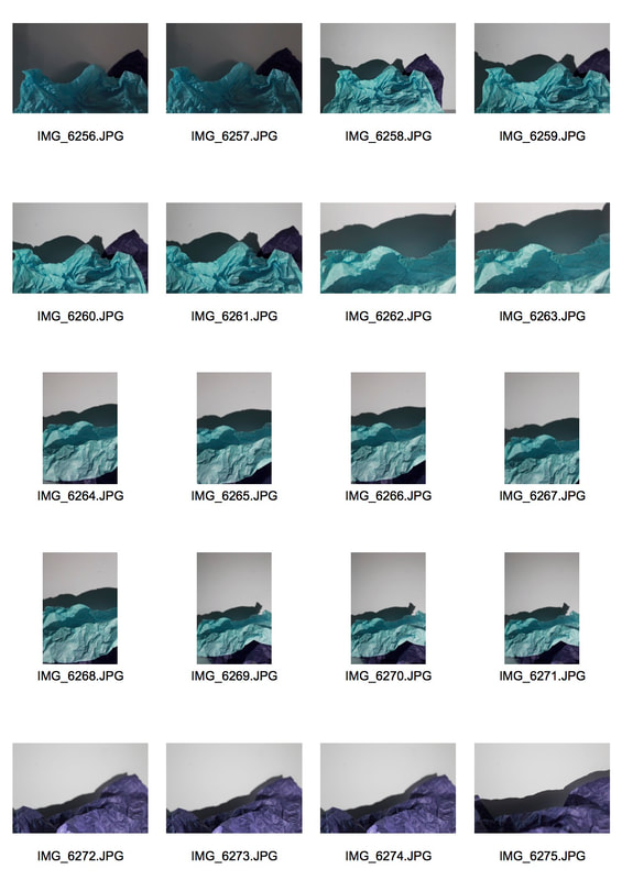
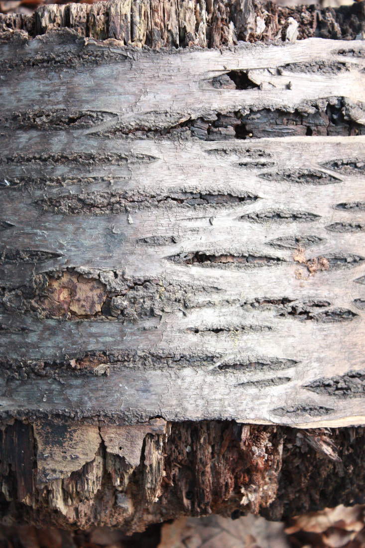
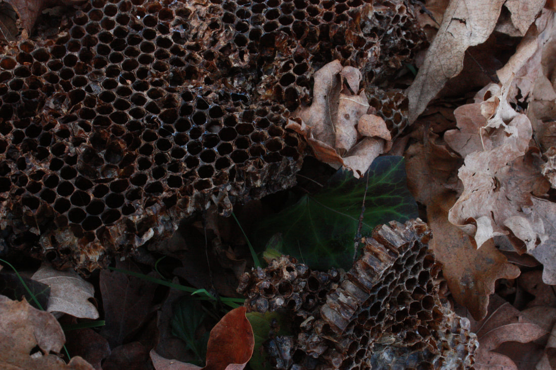
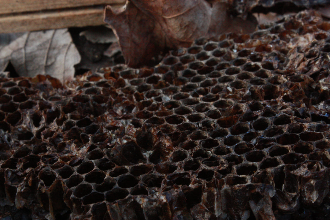
We initiated this topic by taking photographs of crumpled and moulded papers.
My shoot

|

|
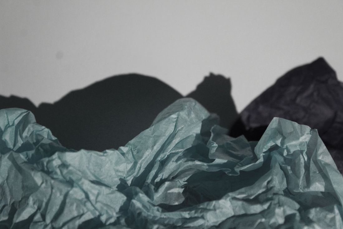
Finals
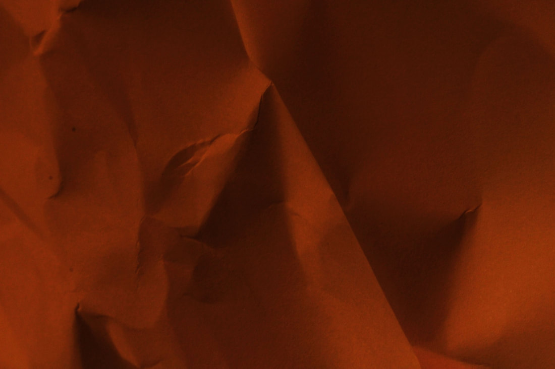
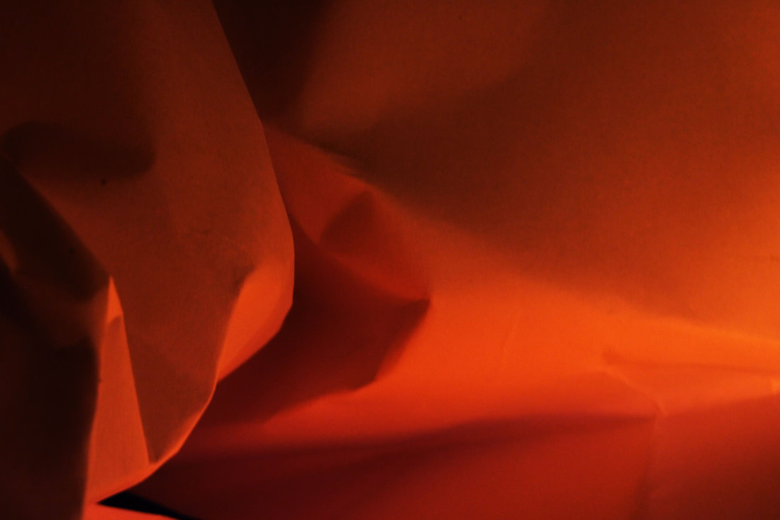
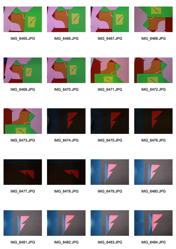
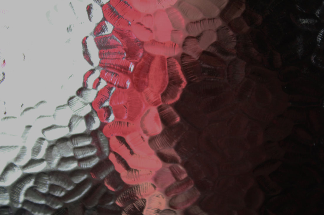
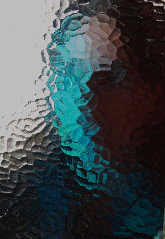
In my coloured response I was inspired by a model shoot and a person posing to which is why the paper is seen to be standing up. The colour then created a lively vibe. In the warm orange response I was inspired by the desert and its shapes and curves created by the wind so I represented that for some of the mine photographs. I wanted to demonstrate the indentations and folds created in the paper so that the light was captured by some bits of paper but some others not as much. I especially represented this idea with the colour shoot as I used a red and blue colour light which turned to be successful as some fold of the paper captured one colour and not the other and even some folds captured both which blended in the colours.


|


|
|
|


|


|
Evaluation
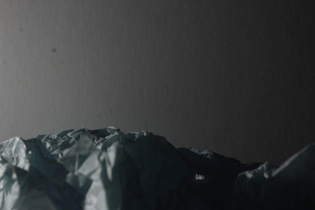
The final photographs of this shoot was chosen by the contest and the shadows created by the paper. Where there were larger folds, there was more shadow created. Before starting my shoot I wanted to achieve a warm tone and smooth curves in the paper. This was then found to by successful in some of the final photographs however some other photographs created a smaller shadow created by small folds.
The final photographs of this shoot was chosen by the contest and the shadows created by the paper. Where there were larger folds, there was more shadow created. Before starting my shoot I wanted to achieve a warm tone and smooth curves in the paper. This was then found to by successful in some of the final photographs however some other photographs created a smaller shadow created by small folds.
First artist response
Brendan Austin
Austin's work is a sculpture created with paper that made it seem like natural environments like mountains. This art work is called 'Paper Mountain'. The final sculpture made by modelled white paper made created a recognisable structure and has an important message which he states:
Austin's work is a sculpture created with paper that made it seem like natural environments like mountains. This art work is called 'Paper Mountain'. The final sculpture made by modelled white paper made created a recognisable structure and has an important message which he states:
"The isolated desert city running on oil generators, the mars like landscapes of a volcanic environment and the mountains made from paper all attempt to start a conversation concerning the loss of meaning and reality."
|

|
|
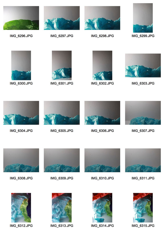
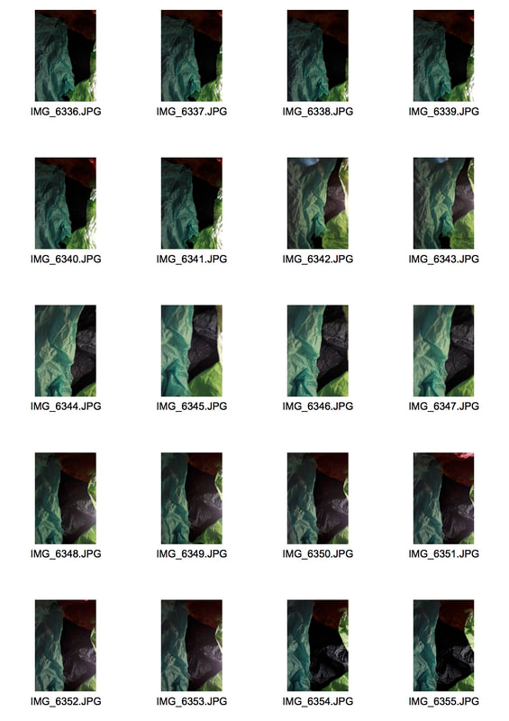
MY SHOOT
|
|
|
|
Finals
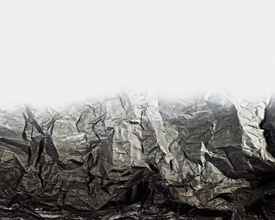
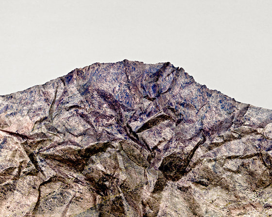
Thought the shoot, I kept the environment idea and tried to make the paper look like nature e.g. mountains like Austin's work and I also wanted to do a cave response. I made sure to keep a depth of field on the images as Austin does to which I find to be significant in his work and representative when identifying the mountain.


|

|
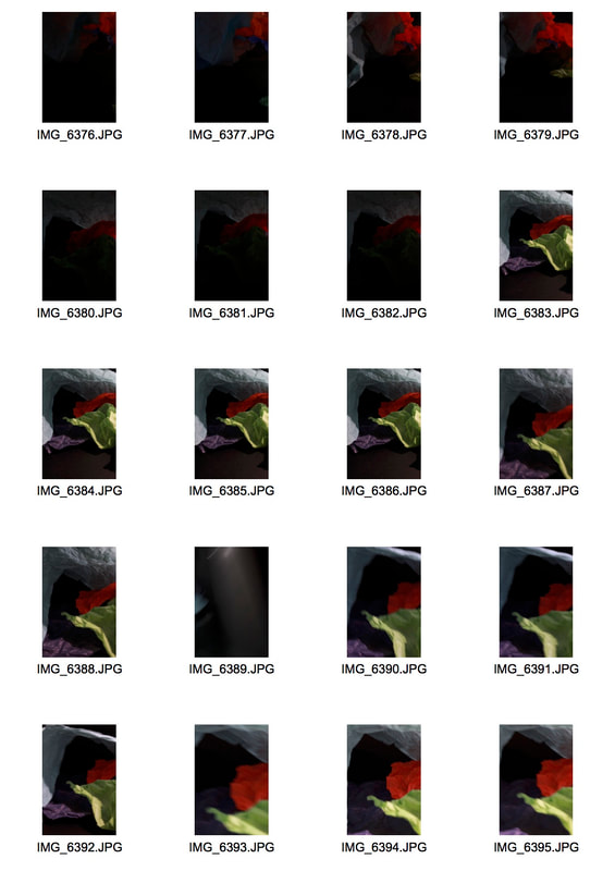
My independent cave response-

|

|
Evaluation
In this response I used the modded and creased paper into advantage which using the flash light. This then exposed some of the areas of the paper as the light shone upon the paper but then the light did not reach other areas as it was facing away from the light which I found to be a successful response and reached my goal. However I would have liked to used brown or warm coloured paper for the cave response as it would make it seem more believable and for the mountain response, I would have liked to shown more creases towards lower bit of the paper.
In this response I used the modded and creased paper into advantage which using the flash light. This then exposed some of the areas of the paper as the light shone upon the paper but then the light did not reach other areas as it was facing away from the light which I found to be a successful response and reached my goal. However I would have liked to used brown or warm coloured paper for the cave response as it would make it seem more believable and for the mountain response, I would have liked to shown more creases towards lower bit of the paper.
Second artist response
Tamara Lorenz
Creates various constructions which she then photographs to exploit their abstract properties. The addition of strong planes of colour provide another source of contrast in addition to those of line, shape, tone and texture.
Rather than photographs of things, each image seems to create its own reality. Consequently, the viewer is unable to recognise a conventional subject and is occupied with the business of looking.

|

|

|
MY SHOOT
|
|
|
|
editing
|
|
FINALS
Taking these photographs, I had to bear in mind that the colours are vibrant and it has interesting shapes and the contrast between each shape and colours. What I found while taking these photographs was that the colour wasn't as vibrant as I wanted it to be. But concluded in saturation tare when imported on photoshop. I also wanted the keep the straight lines to connect hence to why some different cut outs line up. This is what I saw Tamara Lorenze do so I applied that into my work. I also attempted for my photographs to be symmetrical.

|

|
Evaluation
By the end of this response I found that the original photographs without the editing were very dull and with the help of the photoshop editing, it made them brighter and more like Tamara Lorenz's work. I found that this response was successful as there are different shapes and colours and the contrast between them are impactful to Lorenz's work. However I had the iso at a setting where the photograph came out grainy hence to why one of the photographs black was not fully black due to the graininess.
If I were to retake these photographs, I would retake the one that is black red and blue and change the setting of the iso setting to make it less grainy.
Project 2 - Ordinary to Extraordinary
Edward Weston
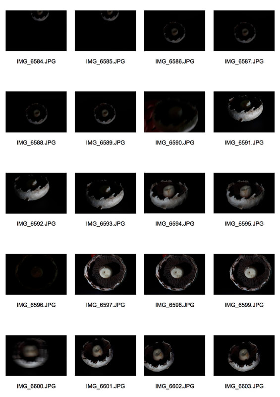
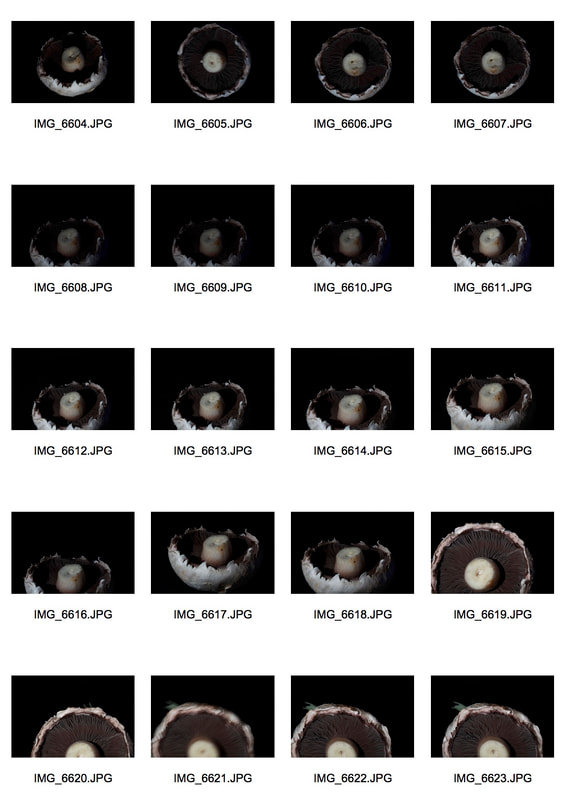
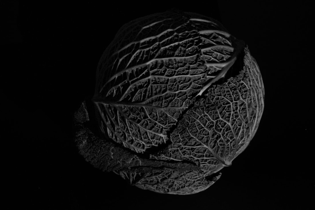
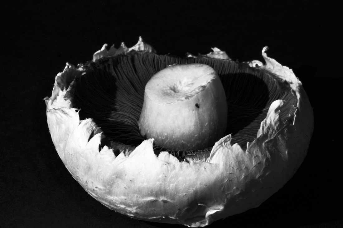
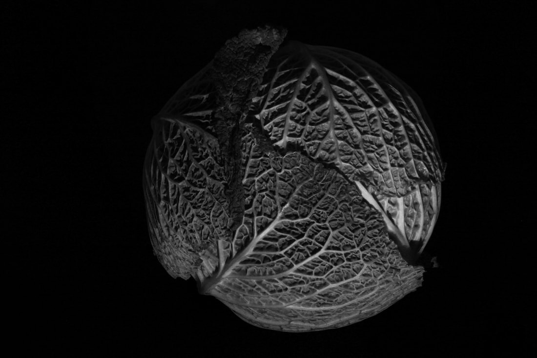
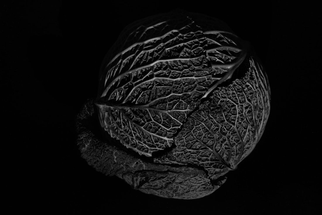
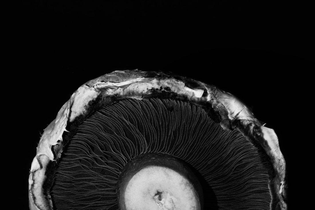
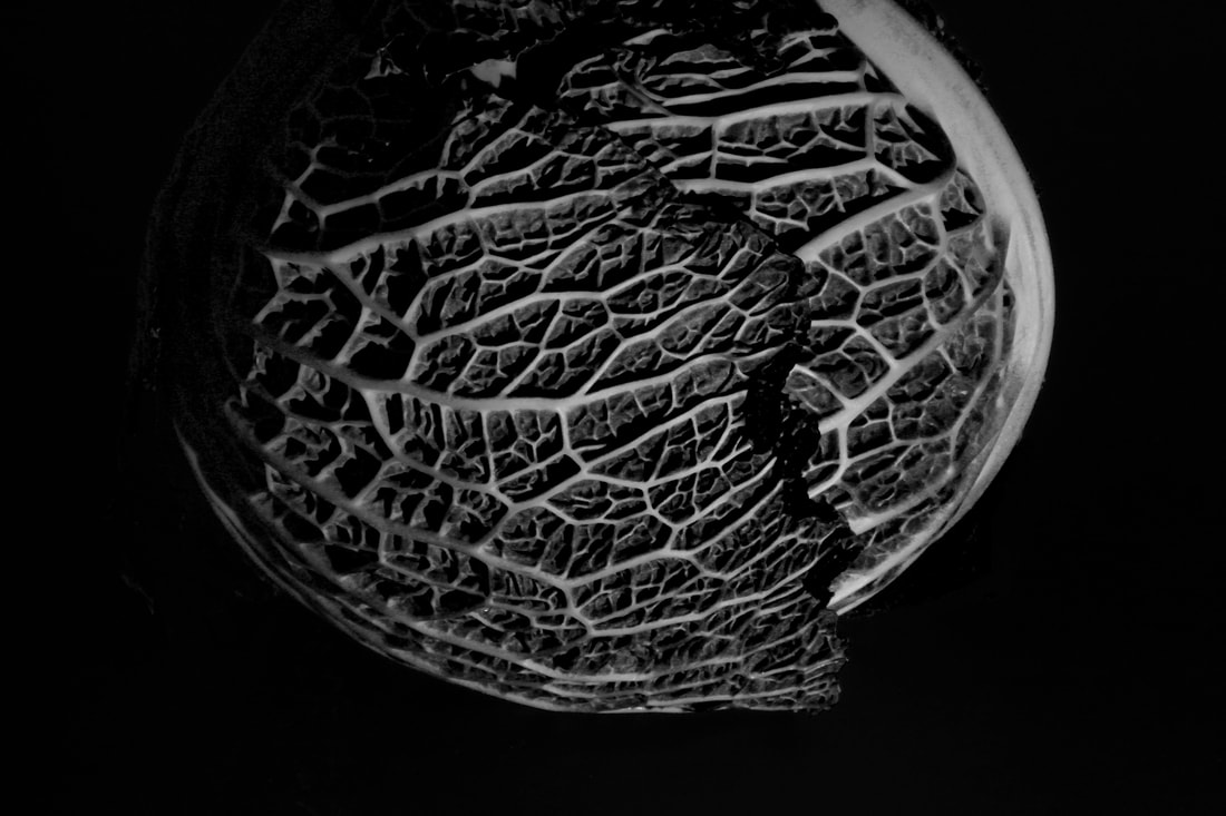
Weston has been to be one of the most influential photographers in the 20th century with his artwork. He created photograph with everyday objects that you are able to see around your home or anywhere. He got those objects and showed their textures and shapes that are not always seen. He mainly focused on taking photographs of vegetables and fruits and showed their natural textures.
Weston has been to be one of the most influential photographers in the 20th century with his artwork. He created photograph with everyday objects that you are able to see around your home or anywhere. He got those objects and showed their textures and shapes that are not always seen. He mainly focused on taking photographs of vegetables and fruits and showed their natural textures.
|
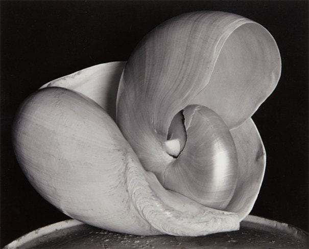
'Nautilus', 1927
In this photograph you are able to see shell. What Edward Weston has created through this photograph is that he has been able to show a perspective of the shell where it is not usually identified by. He did this to dhow the curves and shows creating in a shell making this photograph unique from other photographs of shells. "To see the Thing Itself is essential: the quintessence revealed direct without the fog of impressionism... This then: to photograph a rock, have it look like a rock. Significant presentation- not interpretation." |

|
Edward's inspiration to the creation of this photograph is this painting by Henrietta Shore.

|

|
Secrets of Edward Weston's photography
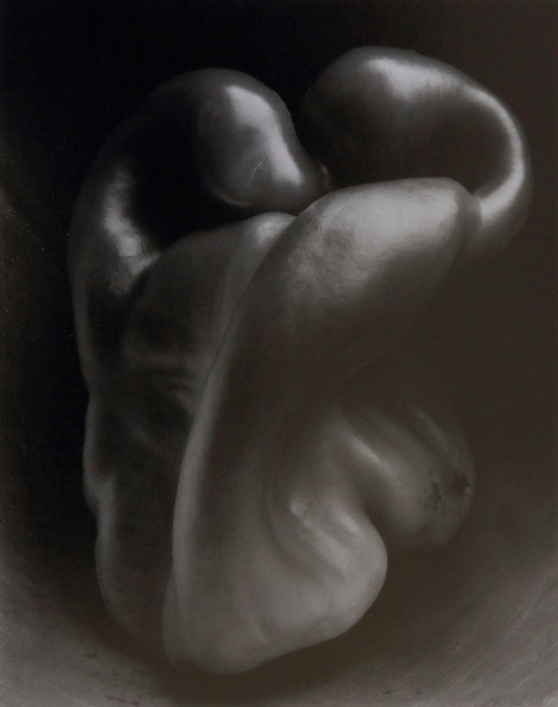
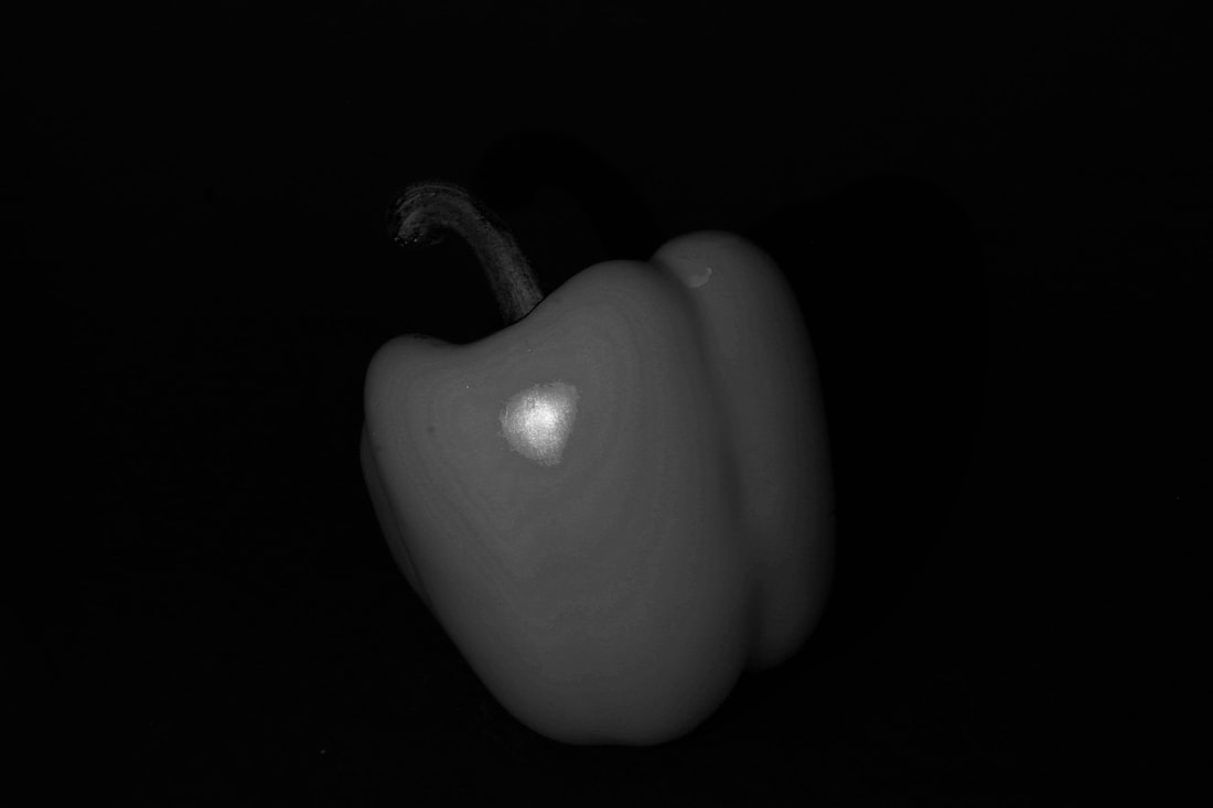
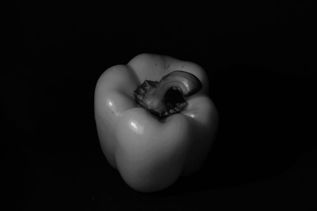
Question) What type of camera did Weston use? 2.5 by 3.5 negative Graflex camera. Question) What was the benefit of using this type of camera? It allows him the view of his subject when photographing, portable and handheld. Question) What was Weston’s philosophy about Photography? His philosophy had creating his own visual language. The photos had a meaning behind it and was less about what was seen in the photograph. Question) What issues did Weston encounter when photographing the pepper? The aperture was too big to create focused and to achieve his work so there for he created f240. Question) How long was the exposure for the pepper photos and did he use natural or artificial light? 4 hours and used natural lighting. Question) How did the long exposure affect the image? Gave the pepper a luminous effect. |
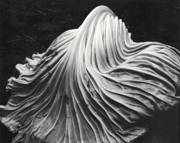
In this photograph he represented the strands of a lettuce leaf as a flowing texture. This creates a different view to a lettuce.
|
|
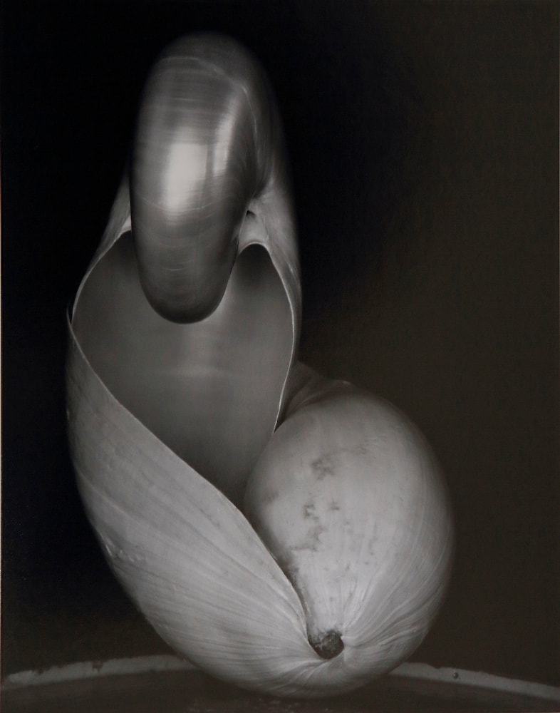
Here you are able to see what seems to be a shell inside of a shell which creates a more shadows and curves than which a single one.
|
|
MY SHOOT
|
|
|
|
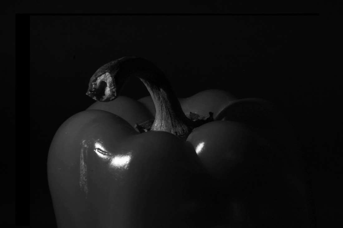
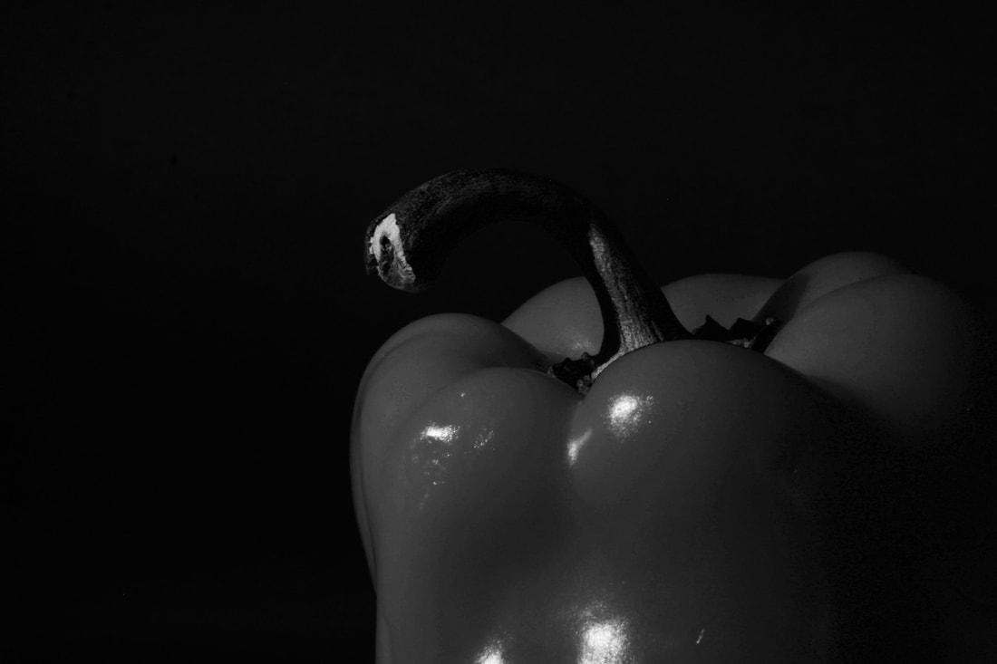
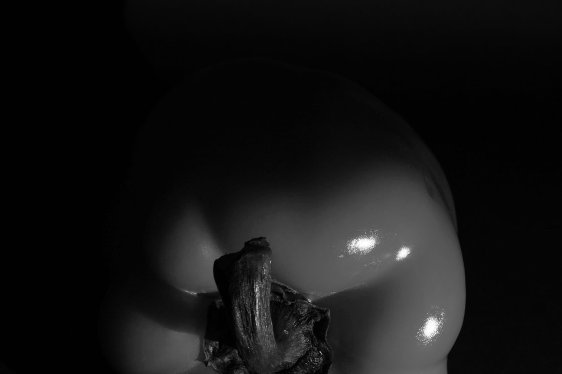
finals
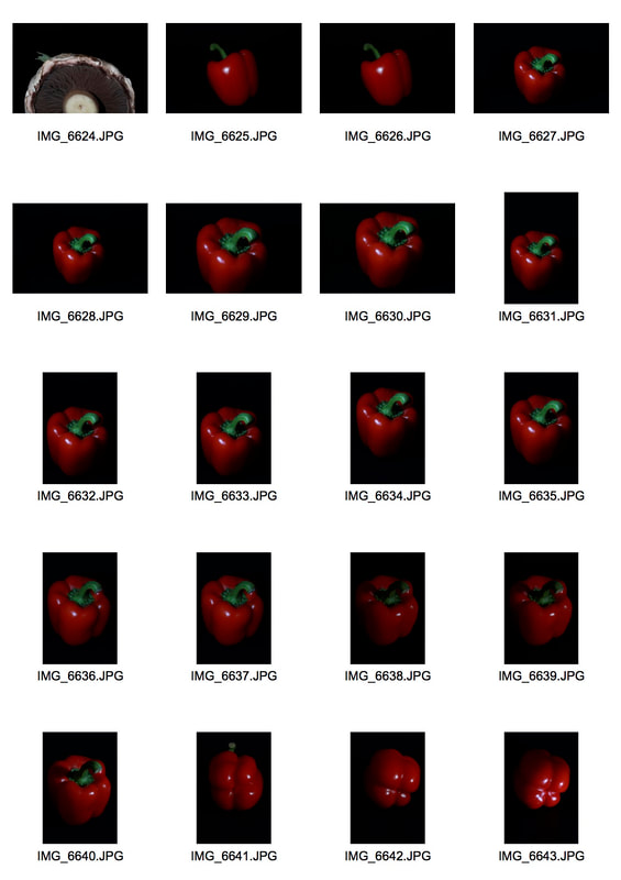
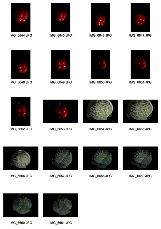
As I was creating this response, I was able to show the natural textures of each vegetable just like Edward Weston's work. I made sure to include entered photographs of each vegetable and also managed to include close up photographs.

|

|
Second response

|


Evaluation
I decided to retake the photographs of the peppers because I found that the pepper had neatly any texture to it apart from the stem and the curves. With this information, for my second response I incorporated the most significant curves and mainly the stem. I believe that these photographs came out more successful that the first response with he peppers because you are able to see the texture as Edward Weston mainly focused on in his photograph and that is what I wanted to achieve when responding to his work. You are able to see the natural textures of the stem and the silk texture to the pepper which came out to be a nice contrast between the two. Overall, you are able to see the textures of all of the vegetables I took photographs of and turned out to be a successful response to Edward Weston's work. |
Project 3 - abstract COMPARISON ( body vs nature)
Alicja Brodowicz
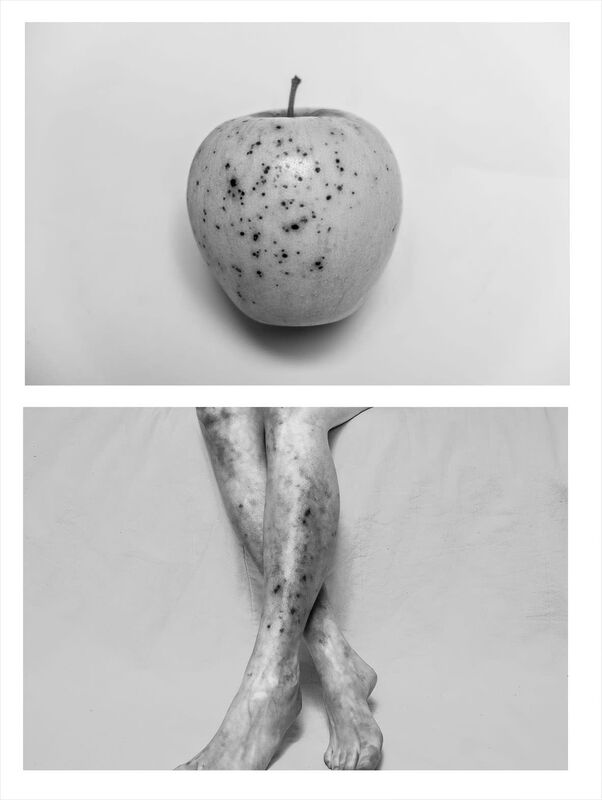
For this project, we will be focusing on the main comparison of nature and our body. Through Alicja's work, she focuses on the shapes of the human body and the evolution between old and going in nature and humans in comparison of the decaying of the human nature. In most of her artwork you are able to see lots of photographs of features that are usually only seen in the elderly.
For this project, we will be focusing on the main comparison of nature and our body. Through Alicja's work, she focuses on the shapes of the human body and the evolution between old and going in nature and humans in comparison of the decaying of the human nature. In most of her artwork you are able to see lots of photographs of features that are usually only seen in the elderly.
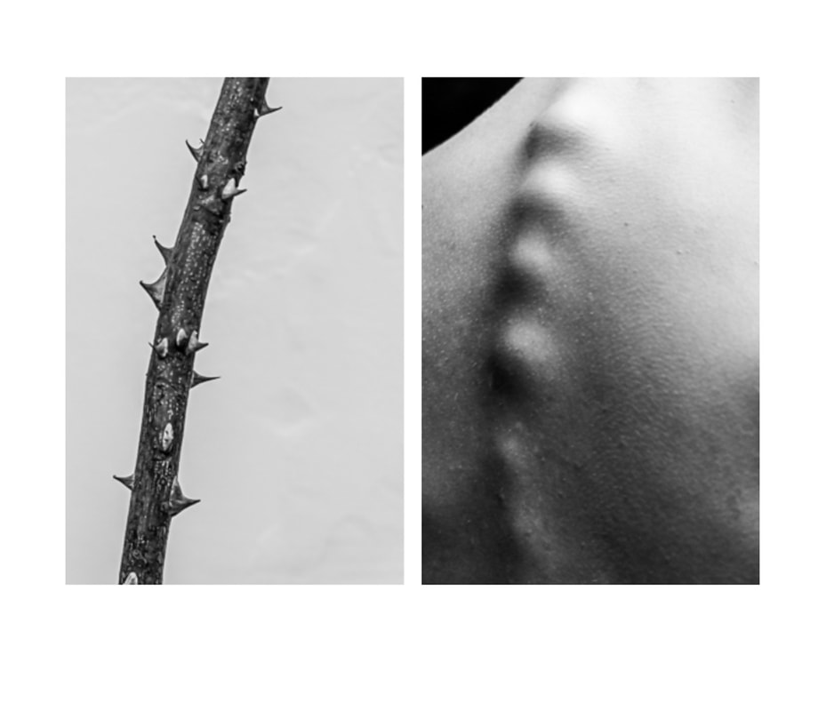
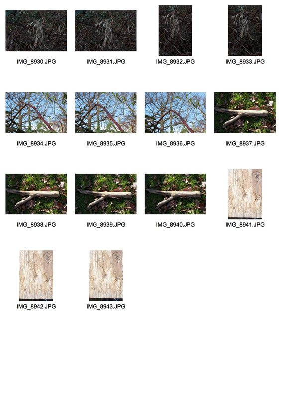
Here you are able to see that Alicja has made the comparison between a stick and the spine as they both include a smooth curve and bumpy features between them. It is also important to notice recurring the compositing in her artwork as it only shows the subject of the photograph.
|
|
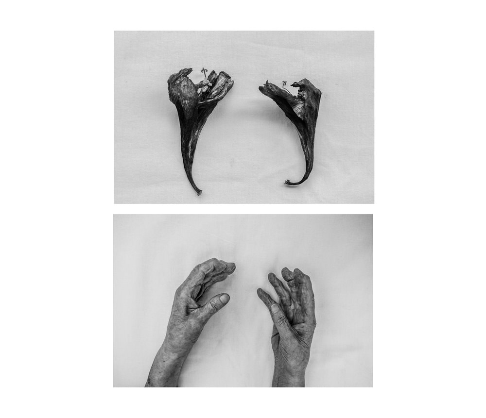
Here she has placed hands and nature in the in the same composition style. In a white sheet to make them the main subject and has placed them in the same place to show the comparison she is trying to portray which is something I will keep in mind when creating my response.
|
MY SHOOT

|

|

|

|
FINALS

|

|

|

|
Evaluation
For this response I was able to adapt nature to the human body as I collected sticks and leafs from a park and visioned what parts of the body I could compared it to which is why I mostly chose sticks and leafs. What went well in this response was the imitations created by the body to nature and the editing too. However I would have tried to keep more white space in the photographs just like the artist does when taking her artwork.
For this response I was able to adapt nature to the human body as I collected sticks and leafs from a park and visioned what parts of the body I could compared it to which is why I mostly chose sticks and leafs. What went well in this response was the imitations created by the body to nature and the editing too. However I would have tried to keep more white space in the photographs just like the artist does when taking her artwork.
Agnieszka Lepka
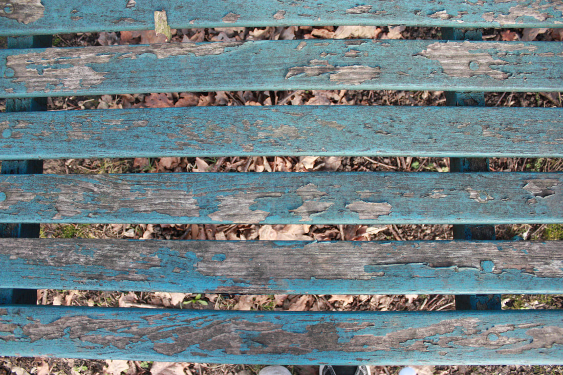
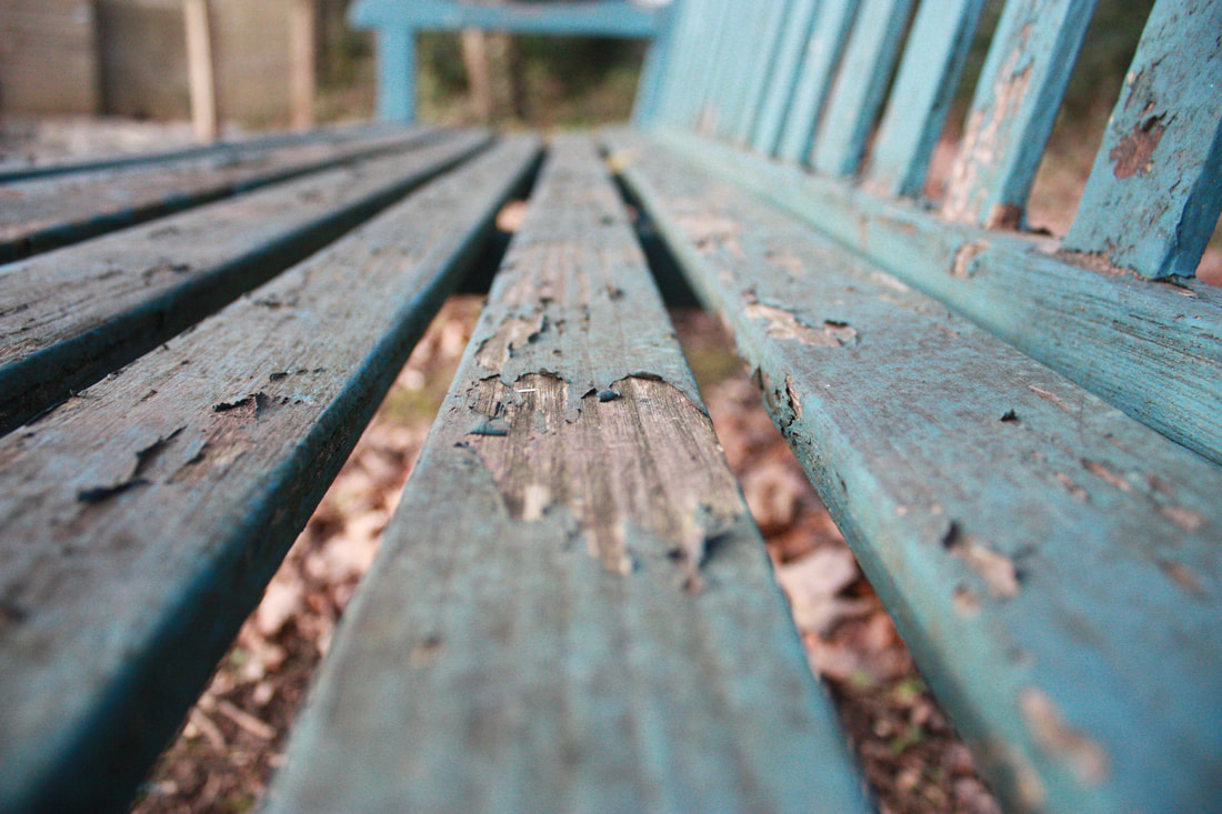
Lepka's artwork focuses on the comparison between the body and nature mainly focusing on wrinkles, veins and scars to bark, affects environment has on things like paint, concrete etc.... Compared to Alicja Brodowicz, their editing style is different because they are coloured photographs with no white borders.
Lepka's artwork focuses on the comparison between the body and nature mainly focusing on wrinkles, veins and scars to bark, affects environment has on things like paint, concrete etc.... Compared to Alicja Brodowicz, their editing style is different because they are coloured photographs with no white borders.
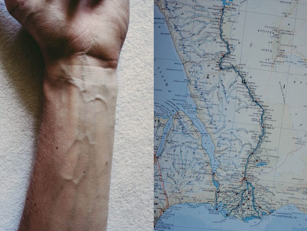
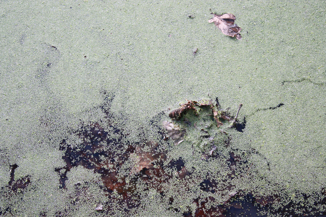
Here there is a comparison between veins and the world's rivers and lakes and streets in a map. The big vein has been compared to a river going through what seems to be a city and the other veins represent the small lakes and streets.
|

Here Lepka has compared the veins on an eyelid to dried paint as they both contain connecting lines caused by the humidity. The composition in makes the viewer focus on the veins of the eyelid and is able to understand what comparison is being made.
|

Here they have compared wrinkles to bark textures. What most standout of this photograph is the composition as the glasses of the person seems to be in the same position as the top of the bark which create a successful comparison.
|
my shoot
|
|
|
|
|
|
Finals
|
|
|
|
|
|
|
|
|
Project 4 - Abstract portraits
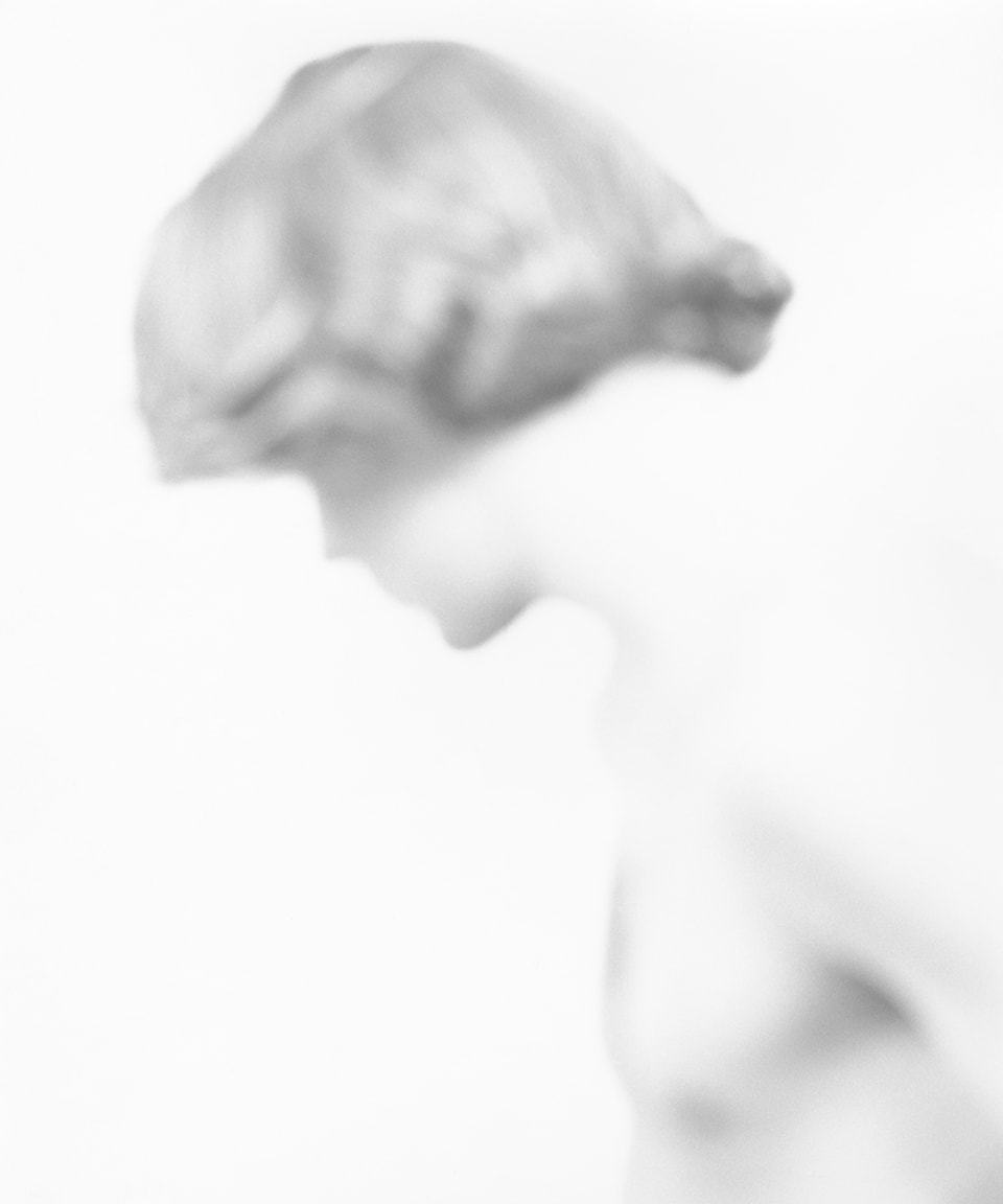
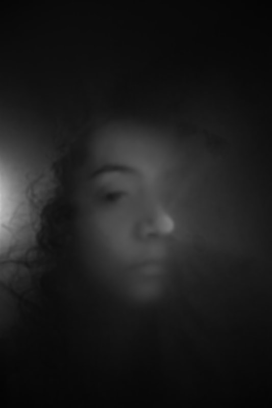
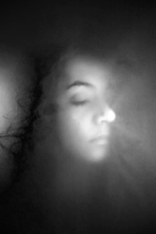
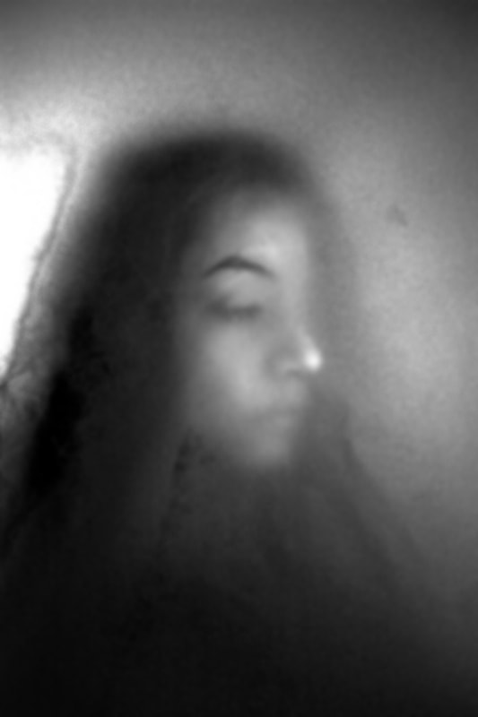
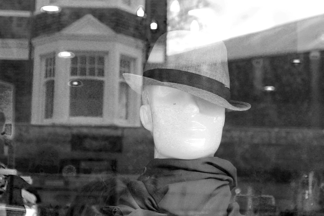
Bill Jacobson
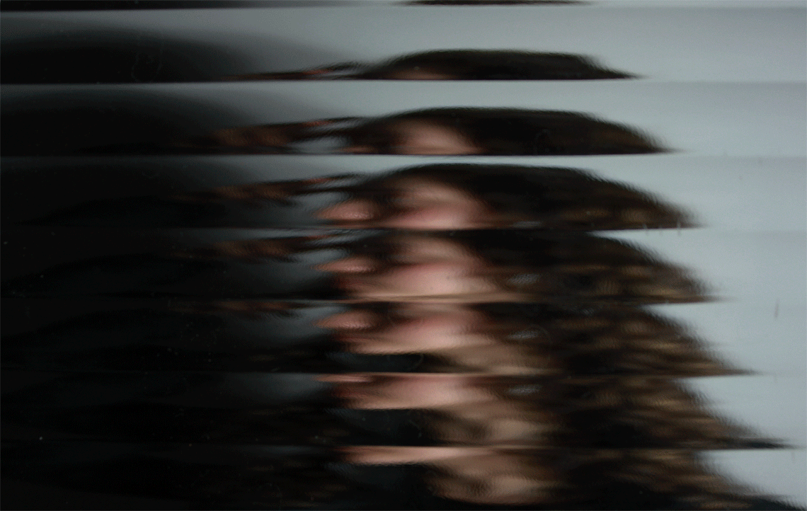
Jacobson is a photographer based in America that mainly focused on portraitures in 1989. Jacobson's work 'Interim Portraits', feature shadowy, pale figures that evoke the loss experienced by many during the height of the AIDS epidemic. The blurred subjects underline the futility of capturing a true human likeness in both portraiture and memory. His portraits are distinguishable although blurry, you are still able to see the model's facial features which is what makes his artwork significant.
Jacobson is a photographer based in America that mainly focused on portraitures in 1989. Jacobson's work 'Interim Portraits', feature shadowy, pale figures that evoke the loss experienced by many during the height of the AIDS epidemic. The blurred subjects underline the futility of capturing a true human likeness in both portraiture and memory. His portraits are distinguishable although blurry, you are still able to see the model's facial features which is what makes his artwork significant.
Bill Jacobson: First I should talk about what it meant for me to shoot out of focus, which I did from 1989 until 2002. During that time, I completed a number of series, which can also be called blurry, defocused, or perhaps diffused. I have never known what to call it, as it’s just how I’ve viewed the world. They’re intended as a metaphor for an inner state or an interior way of being. The pictures denied representations of physicality in part because there was no detail. Whether I was working in black and white or colour, it reduced the images down to areas of tone, colour, or forms adjacent to each other within the frame.
In this you are able to distinguish a male looking at the floor. You are able to recognise his side profile and his light hair. The composition in this photograph lets the viewer know that this is a male by his posture.
|
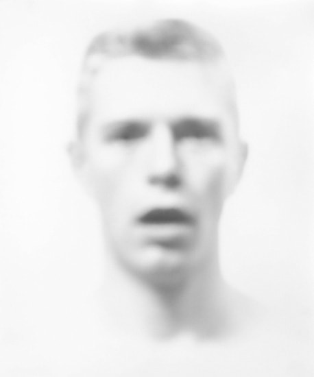
In this photograph the eyes and the mouth are the darkest part of this portraiture and it leaves the viewer wondering hat is the state of his facial expression as he sees shocked which could be related to the concept of AIDs in his artwork.
|
This photograph seems different to the other portraits as it is more blurry as the model seems to be further away. he is also seen to be looking down which is significant that the viewer is able to recognise this with such a blurry photograph.
|
Interviewer: What influenced this way of thinking?
BJ: I spent a lot of the 1980s collecting early twentieth-century anonymous snapshots from flea markets. They would immediately bring to mind that the subjects were no longer alive, or were decades older than when the images were made. The figures in them were often blurred or obscured, and this became a parallel for the passage of time, illness, or death. I often think of Roland Barthes writing in Camera Lucida that every photograph is of a dead moment.
my shoot

|

|
Finals
|
|
|

|
After editing
|
|
|
Evaluation
My main target when recreating this artwork was to portray a blurred face which can barley be distinguished. This is why some aspects of the final photographs seem somewhat recognisable. Although Jacobson is seen to be a lighter background with one the darkness around the model's face, my final photographs came out to be dark and mysterious which I believe are good photographs but not as a response of Bill Jacobson's work. In my photographs, it seems to have a darker mood as there wasn't enough light hitting the background in order to make the photograph look brighter. Another criticism that I noticed was that the model's face wasn't blurred enough like Jacobsons work.
However if i could create a second response, I would encooparate more light and make the model stand further away from the translucent sheet.
Second artist response
Erwin Blumenfeld
|
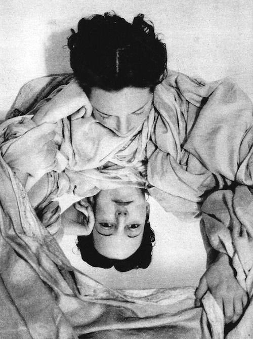
Blumenfeld is was a fashion photographer from the united states that explored different aspects of reflection. He would get the model to face the camera with a glass between the camera and them or got mirrors that created various reflections creating .
This artwork was mainly focused on the abstract representation of a face |

|

|
|
|
Finals
|
|
|


|
|


Second response


|

|
Project 5 - Ambiguity
Johnny Kerr
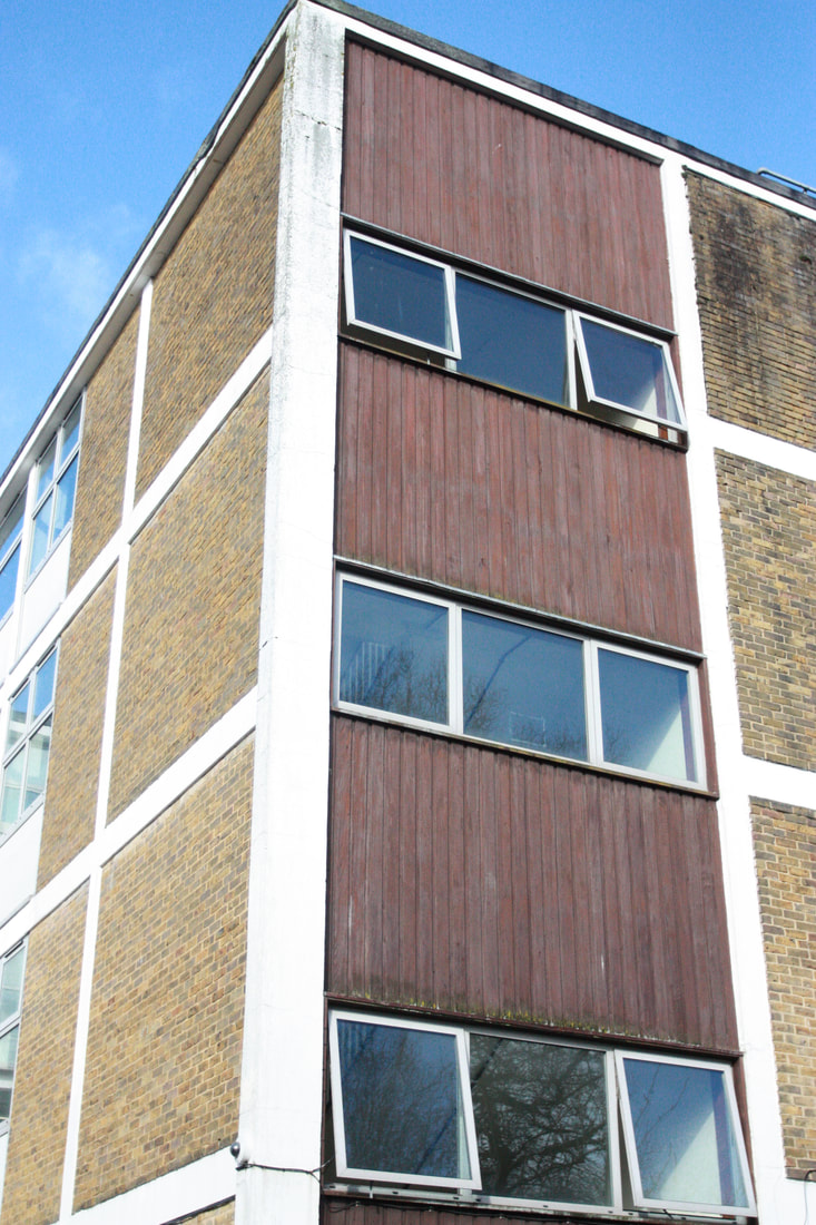
Kerr's work was inspired by Antonie Predock's investigation, Ambiguity. Kerr's work is based on photographing shapes, lines and shadows created by the sun creating more lines resulting in a new view on architecture. Kerr would then link straight lines of building and connect them caused by the angle set in his camera. His work would then leave the viewer baffled on what shapes are where and how the photograph was planned out creating an abstract perception of architecture.
Kerr's work was inspired by Antonie Predock's investigation, Ambiguity. Kerr's work is based on photographing shapes, lines and shadows created by the sun creating more lines resulting in a new view on architecture. Kerr would then link straight lines of building and connect them caused by the angle set in his camera. His work would then leave the viewer baffled on what shapes are where and how the photograph was planned out creating an abstract perception of architecture.

|

|
|

|

|
my shoot
For this project I will like to present lines and shapes like Kerr but I want to focus on the abstract side of his work as is what is most interesting in his work. In his work I also see that he works on symmetrical lines, horizontally and vertically which makes his work even more satisfying and significant. For the first shoot we got to go around our school building and tried to find shapes and lines that could recreate Kerr's work.
|
|
|
|
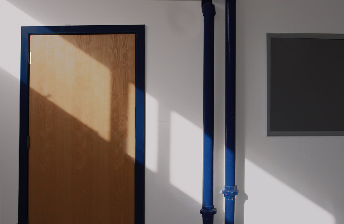
finals - school
|
Unedited

|
Edited
|
|

|

|

|
WORK DONE AT HOME

|
|

|

|
Project 6 - Abstracting the Environment
First artist response
Stephen Calcutt
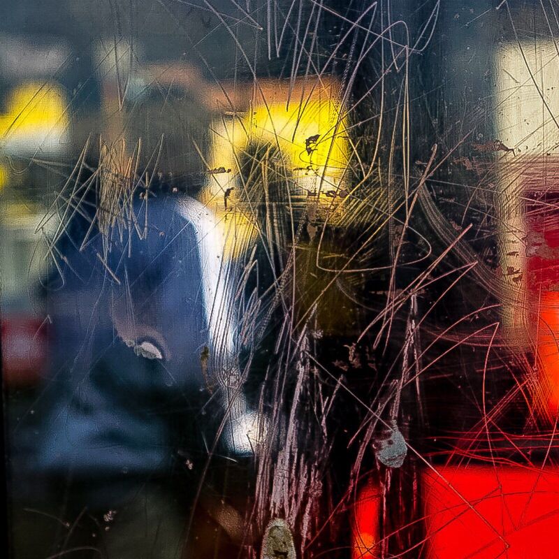
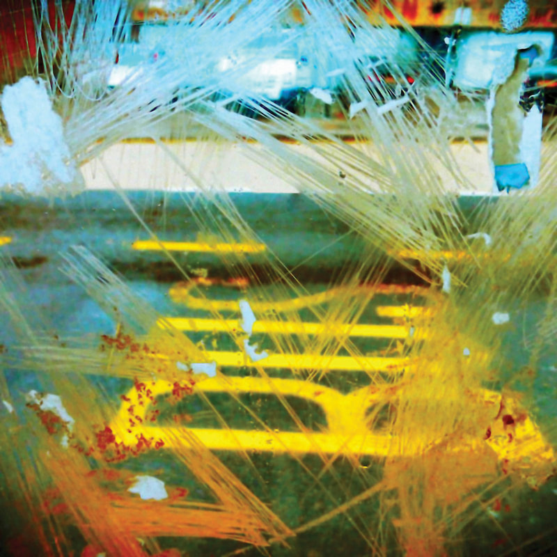
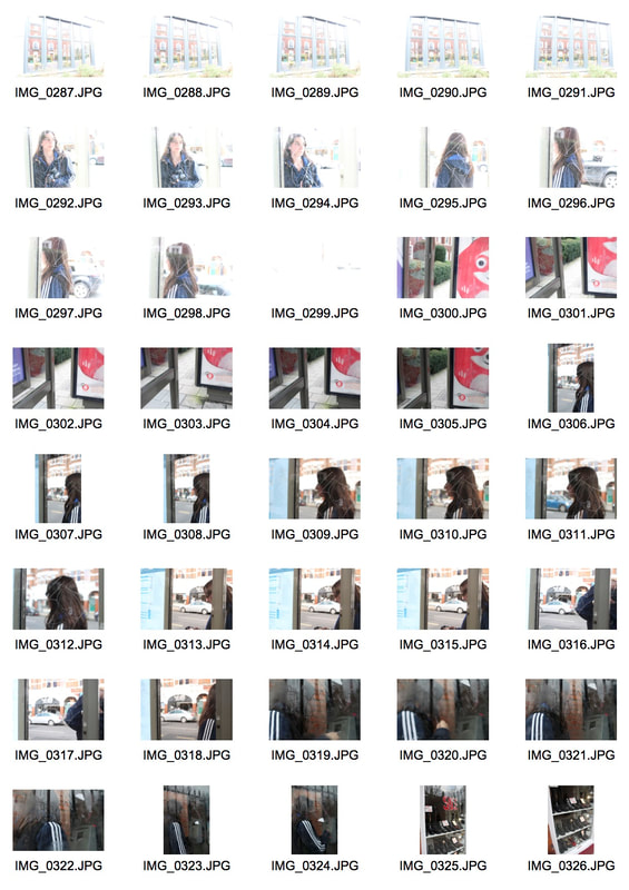
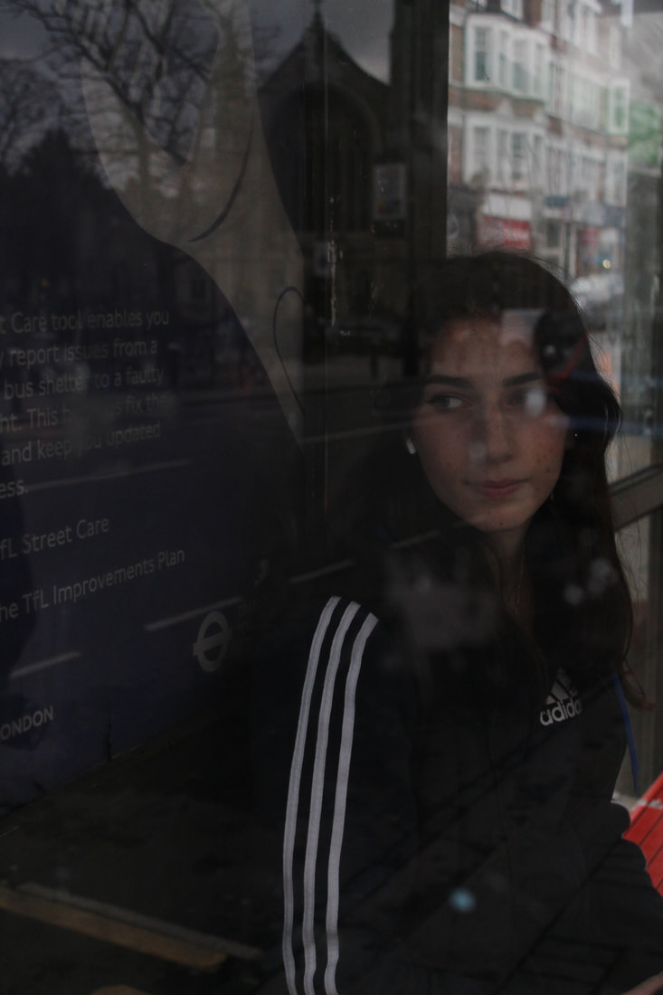
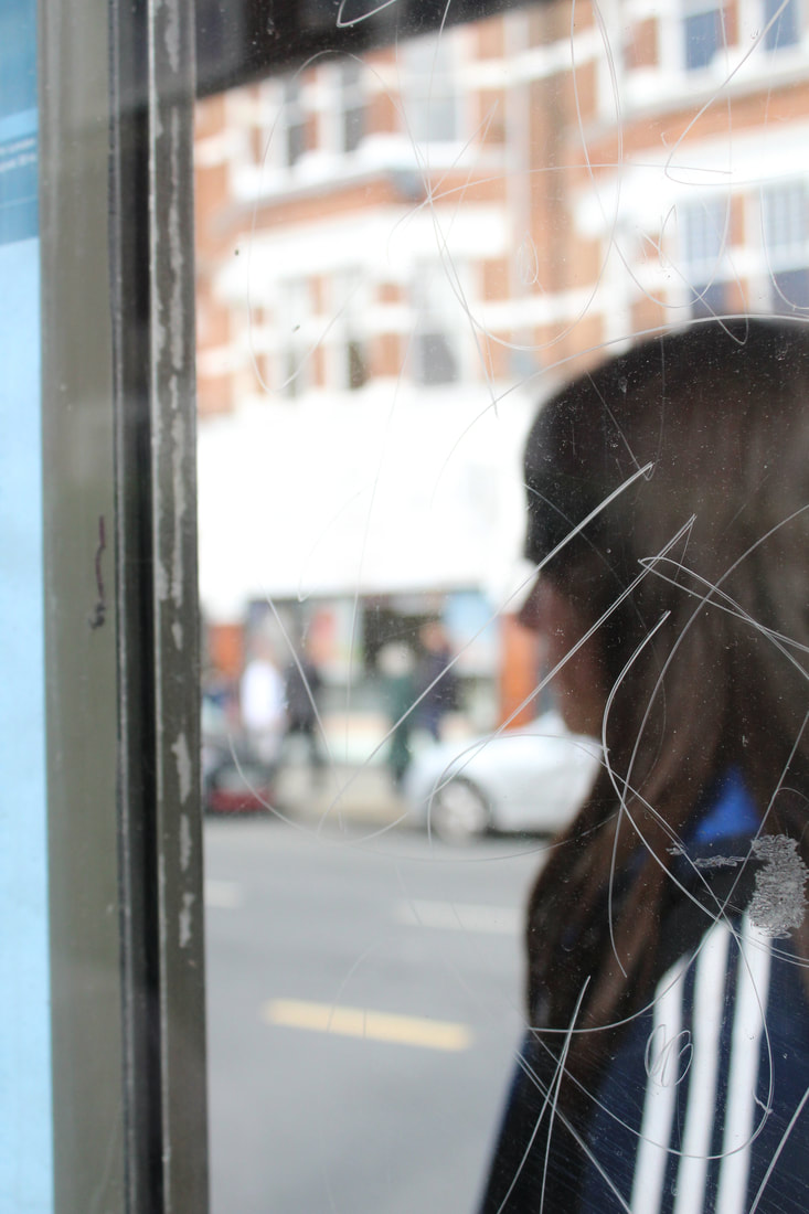
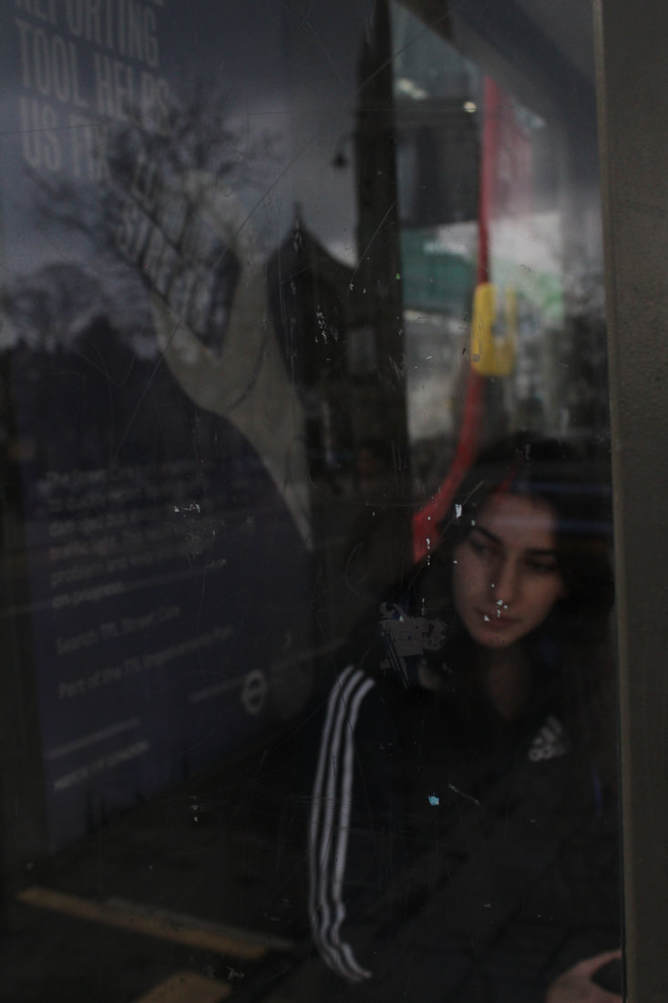
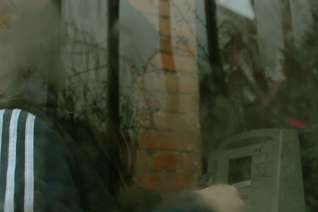
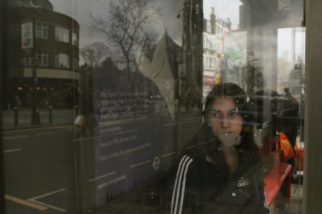
Calcutt's work focus on the streets of Birmingham and the people. One main thing that is significant about the streets, is the bus stops and shelters. Stephen's artwork is taken through the grafitty and scratches
Calcutt's work focus on the streets of Birmingham and the people. One main thing that is significant about the streets, is the bus stops and shelters. Stephen's artwork is taken through the grafitty and scratches
|
|
|
my shoot
|
|
|
In my response, I was interested in taking photographs of the model in a bus stop as there is usually scratchings and graffiti on the creating an urban style photographs. When taking the photographs I wanted to angle the camera so the graffiti would cover the models face so it looks deliberate.
finals
|
Originals
|
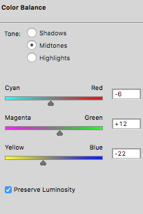
Settings
|
Edited

|
|

|

|
|

|
Evaluation
In my final response, I wanted to focus on the bus stop theme and scratching in the bus stop. I think my response came out successful as hey were what I inteded to crea
In my final response, I wanted to focus on the bus stop theme and scratching in the bus stop. I think my response came out successful as hey were what I inteded to crea
second artist response
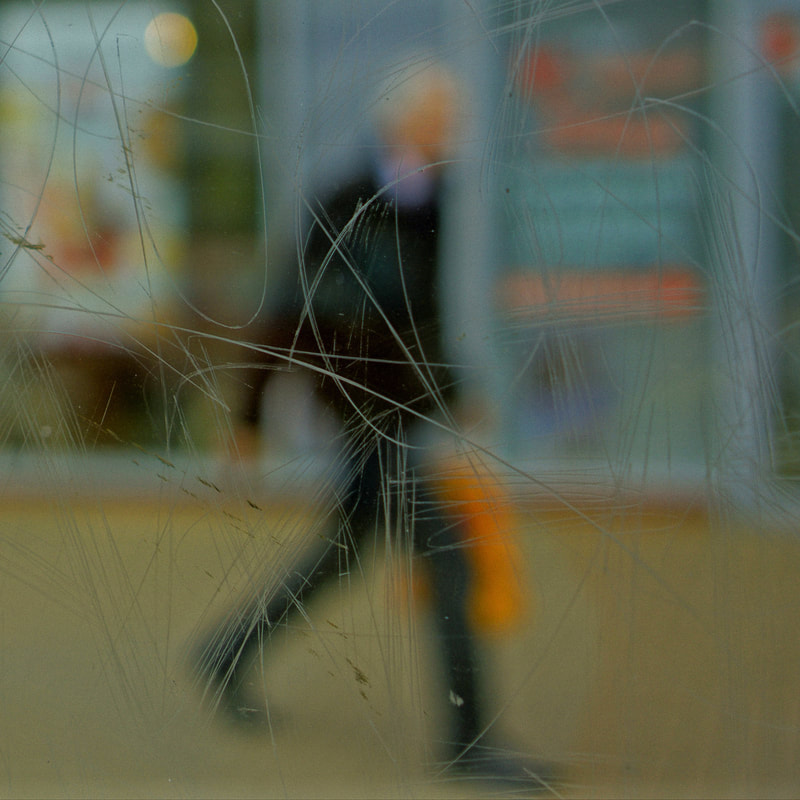
Saul Leiter
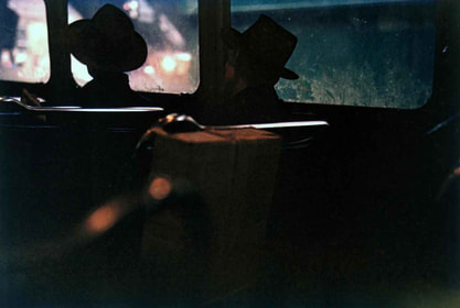
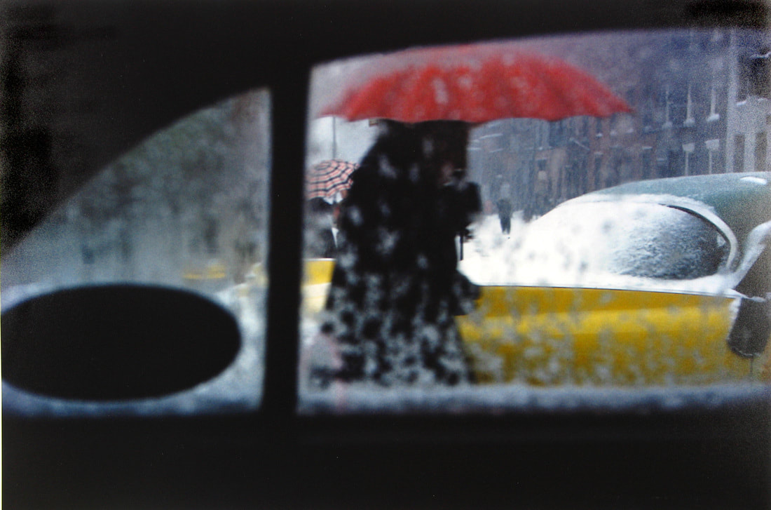
Leiter's photography mainly focuses on taking urban photographs of people in the street and would focus on documenting the streets of New York. In his photograph there is a clear pattern of the subject being a silhouette, photographs through small spaces and has a significant mood related to them. He also focuses on the colour of he photographs due to the low exposure of them, he makes sure to include bright colours to make the photograph stand out.
Leiter's photography mainly focuses on taking urban photographs of people in the street and would focus on documenting the streets of New York. In his photograph there is a clear pattern of the subject being a silhouette, photographs through small spaces and has a significant mood related to them. He also focuses on the colour of he photographs due to the low exposure of them, he makes sure to include bright colours to make the photograph stand out.

|
|
|
my shoot

|

|
finals
Sequence 1
|
|
|
Sequence 2

|

|

Third artist response
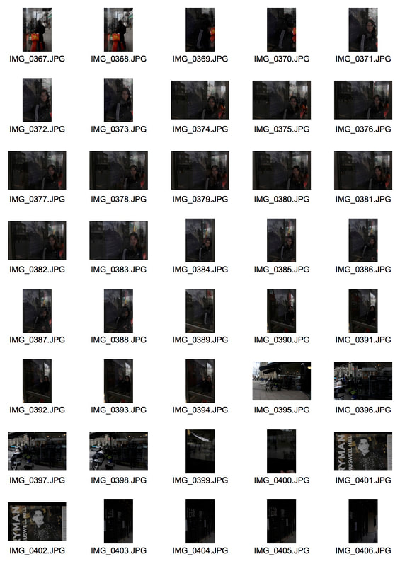
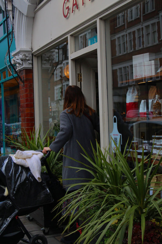
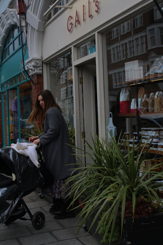
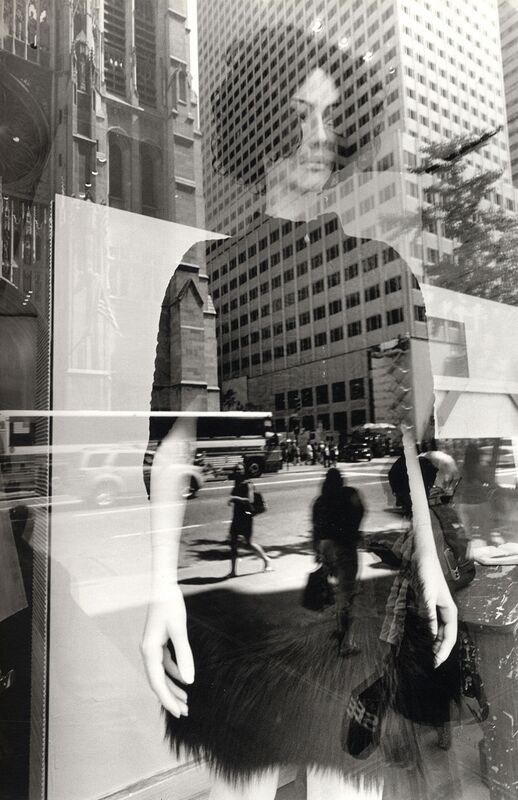
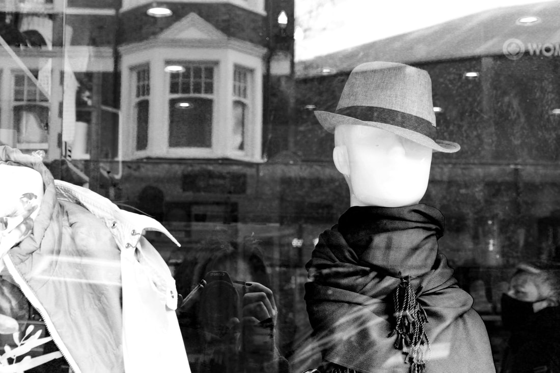
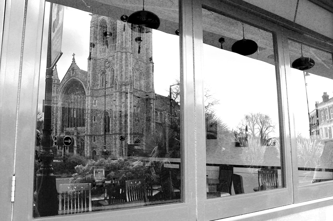
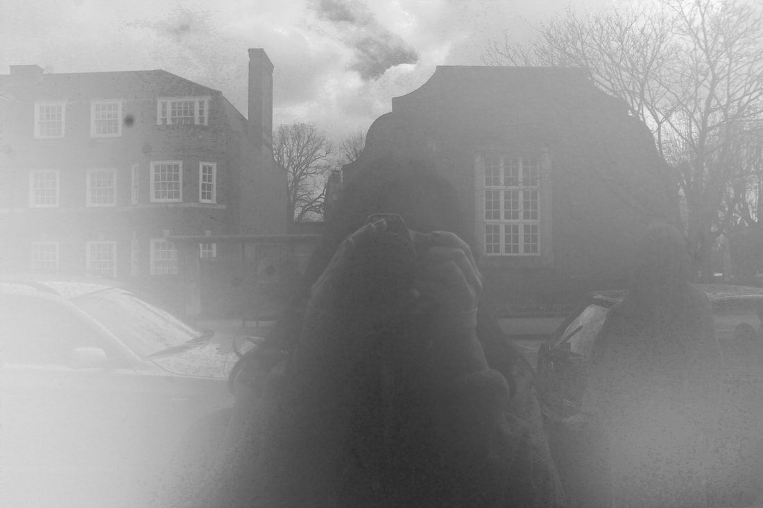
Lee Friedlander
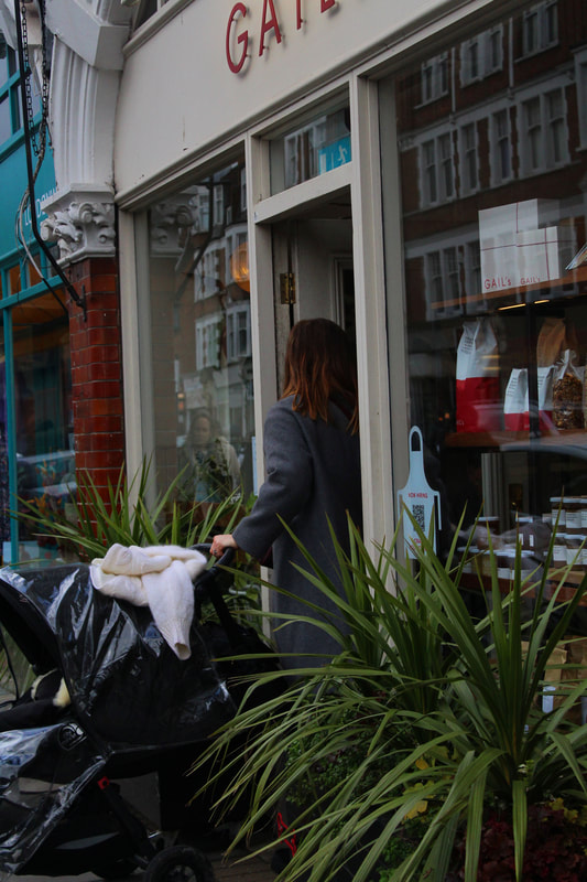
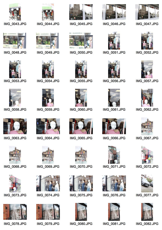
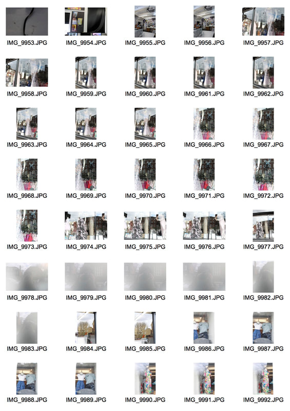
Friedlander is a photographer that took photographs through shop windows where there was either a reflection of the opposite road or buildings. What is most noticeable in his work is that you are able to see the indie of the shop and he reflection. Friedlander used this into advantage and would angle the camera in order for the building to be on a mannequin's body representing a dress or clothing.
Friedlander is a photographer that took photographs through shop windows where there was either a reflection of the opposite road or buildings. What is most noticeable in his work is that you are able to see the indie of the shop and he reflection. Friedlander used this into advantage and would angle the camera in order for the building to be on a mannequin's body representing a dress or clothing.
|

|


|
my shoot
|
|
|
|
finals

|

|

|

|
project 7 - chemigrams
Pierre Cordier
November 10, 1956 - Cordier wrote a dedication with nail polish on photographic paper, he discovered his creation, Chemigrams. His technique included substances such as oil, wax, vanish and the chemistry of the photography (photosensitive emulsion, developer and fixer) without the use of a projected photograph, camera or light.
November 10, 1956 - Cordier wrote a dedication with nail polish on photographic paper, he discovered his creation, Chemigrams. His technique included substances such as oil, wax, vanish and the chemistry of the photography (photosensitive emulsion, developer and fixer) without the use of a projected photograph, camera or light.
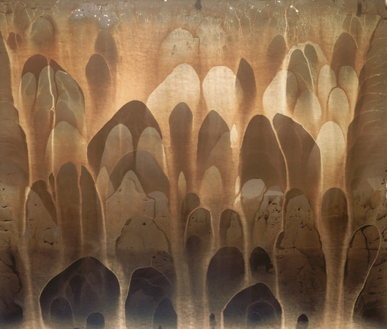
These substances then prevents the chemicals to develop the photosensitive paper which limits the access of light absorbed creating patterns and shapes that were represented by the colours cause by the exposure of light.
|

|

|
Nowadays, you have to explain that before we had digital, photos were based on silver. The surfaces were light sensitive thanks to the silver salts they contained. You developed the image with developer and you fixed it with fixer. Chemigrams use these same products but without a camera. To get shapes you turn to things you can find in the kitchen, the bathroom, or the hardware store, and these are what we call resists. They can be soft (honey, syrup, oil) or hard (varnish, wax, adhesive). You set them onto the light sensitive surface with brushes, rollers or sprayers. By soaking the paper alternately in developer (to get the blacks) and fixer (to get the whites), there gradually appear images impossible to obtain with painting, photography, or the computer.
finals

|

|

|

|

|

|

|

|
3 stands development
First strand
Radu Zaciu
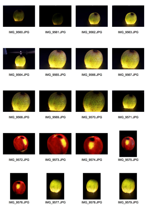
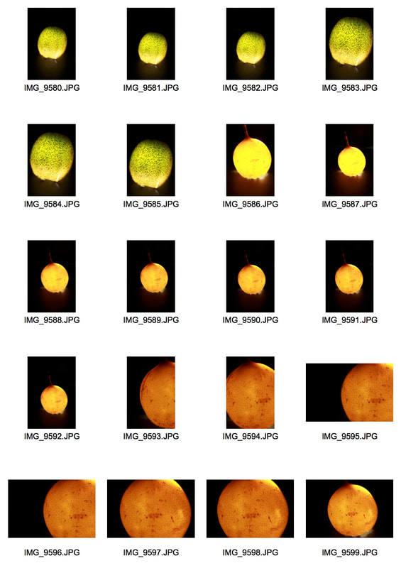
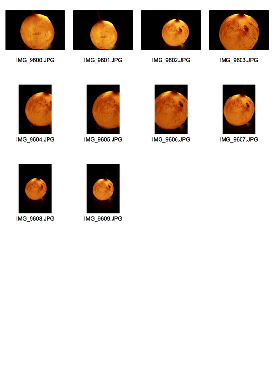
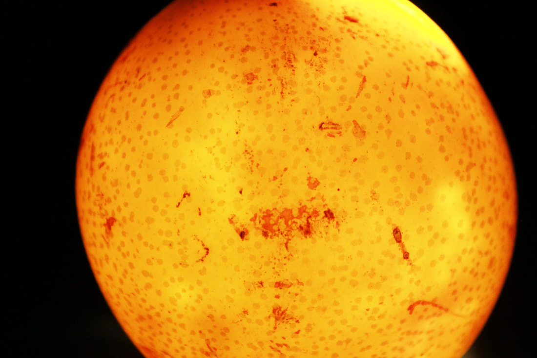
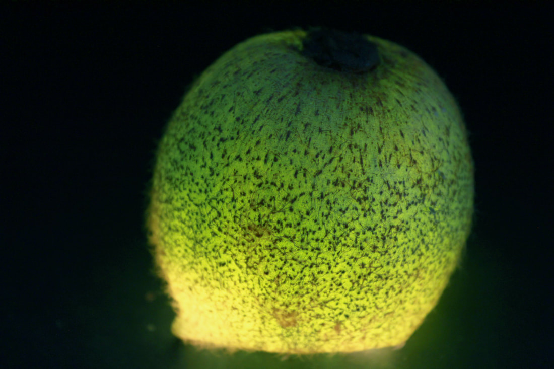
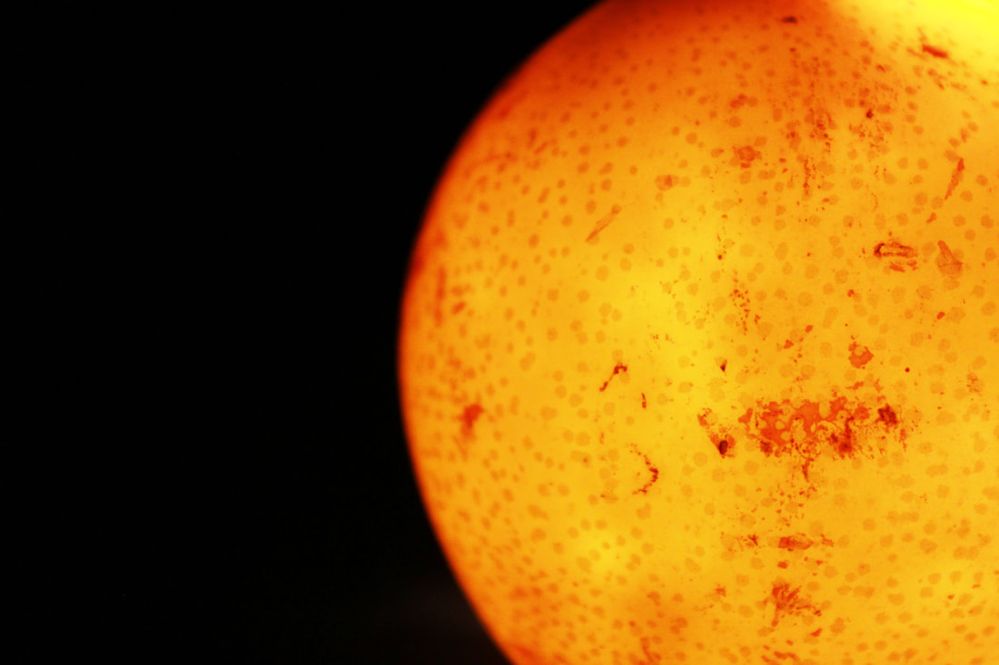
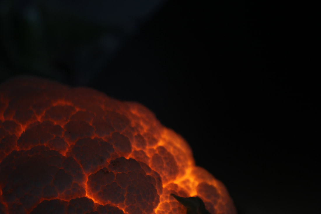
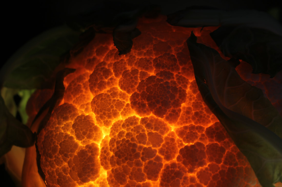
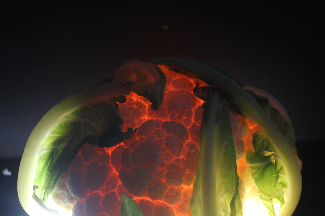
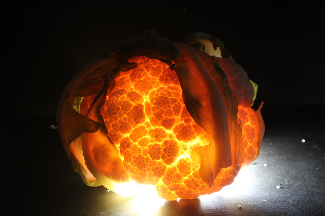
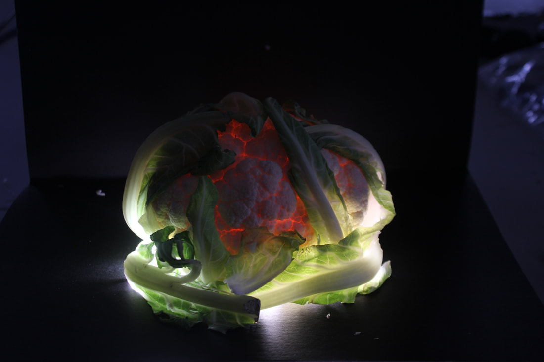
Zaciu's work is focused on the illumination of fruits and vegetables creating them into laps. He would hollow out the fruit and place a light inside exposing pattens and definition in them. He exposed different fruit like strawberries which emit a vibrant glow and the seeds creating a tiny enigmatic polka dots. The illumination of a cauliflower will expose little pathways between each segment of cauliflower creating a lit path effect.

My shoot
|
Kiwi

|
Passion Fruit

|
Maracuya

|
For the creations of these photographs, I got fruits like a passion fruit and kiwi (which is what I used of this shoots, and hollowed it out since they were easy to hollow out. I then got a light box and covered section of the light so it would only project a small square of the light with black card paper. I then placed the hollowed out fruit on top of light which then illuminated the fruit revealing shapes and definition.
I then placed the camera on a tripod since the setting o the camera used a long exposure in order for the patterns and hidden textures of the fruit would be exposed.
I then placed the camera on a tripod since the setting o the camera used a long exposure in order for the patterns and hidden textures of the fruit would be exposed.
|
|
|
Finals


|


|
Evaluation
What I wanted to achieve when creating this response, I wanted the fruits to look like lamps and also wanted to expose different pattens hidden in them. For example, the passion fruit exposed different depth in it as without the light, it was a dark purple colour and when the light entered, it turned a red colour which made the fruit look like a plum. For the kiwi, the fur around the skin was exposed and limited the light creating a poke a dot effect like a strawberry and of the maracuya, it was enlightened which gave a lightbulb effect.
What I wanted to achieve when creating this response, I wanted the fruits to look like lamps and also wanted to expose different pattens hidden in them. For example, the passion fruit exposed different depth in it as without the light, it was a dark purple colour and when the light entered, it turned a red colour which made the fruit look like a plum. For the kiwi, the fur around the skin was exposed and limited the light creating a poke a dot effect like a strawberry and of the maracuya, it was enlightened which gave a lightbulb effect.
second response
|
|

|
|
|
|
Second strand
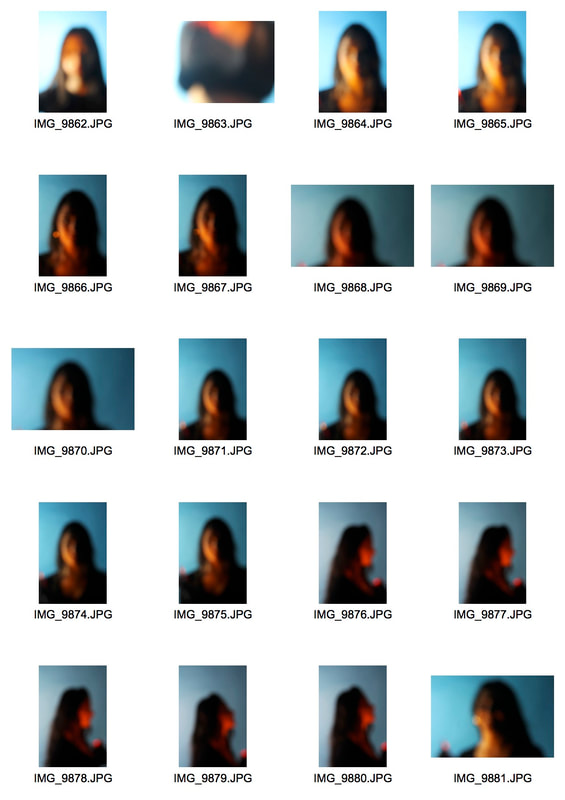
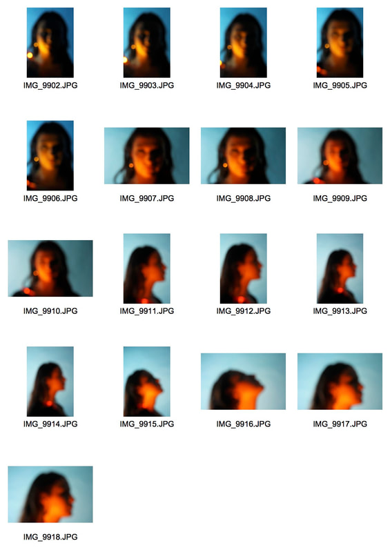
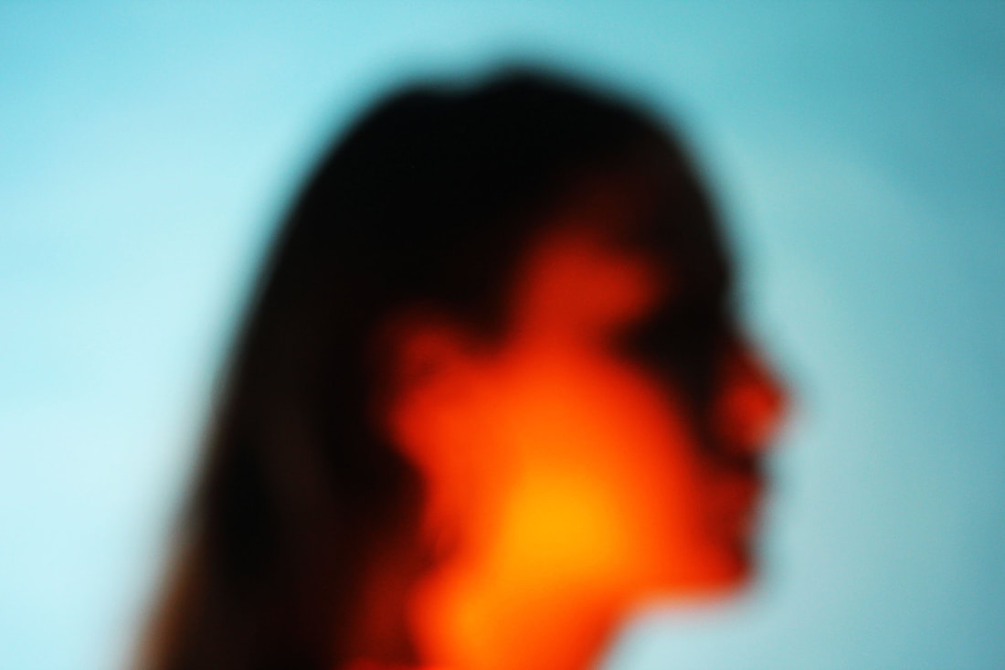
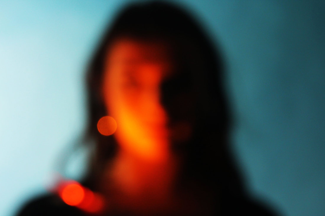
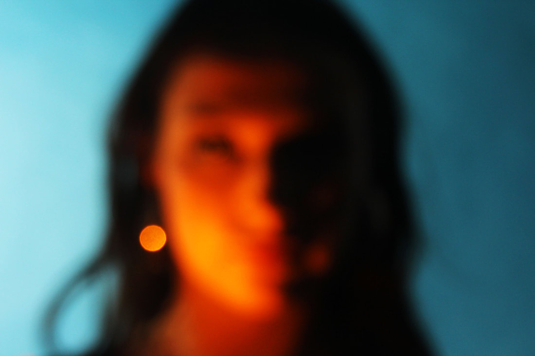
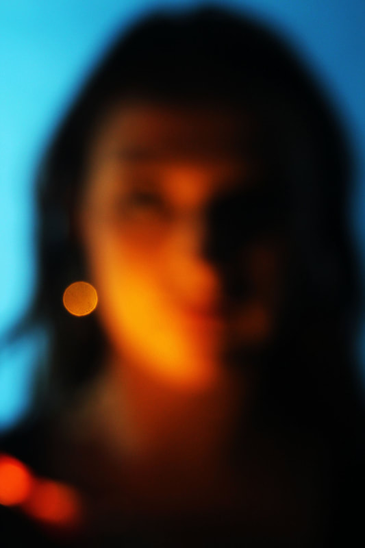
Bill Armstrong
Bill Armstrong's photography is best known by its colourful and blurry themes. In his photographs you are able to see a colour where it would be abnormal to be. For example you may see a whole person in pink which creates a nice mix with the background colour. Another patten is the silhouette against the bright colours which creates a mysterious feel to the image but the colours act as a reassurance.

Contact sheet

|

|
Finals
|

|
|
Third strand
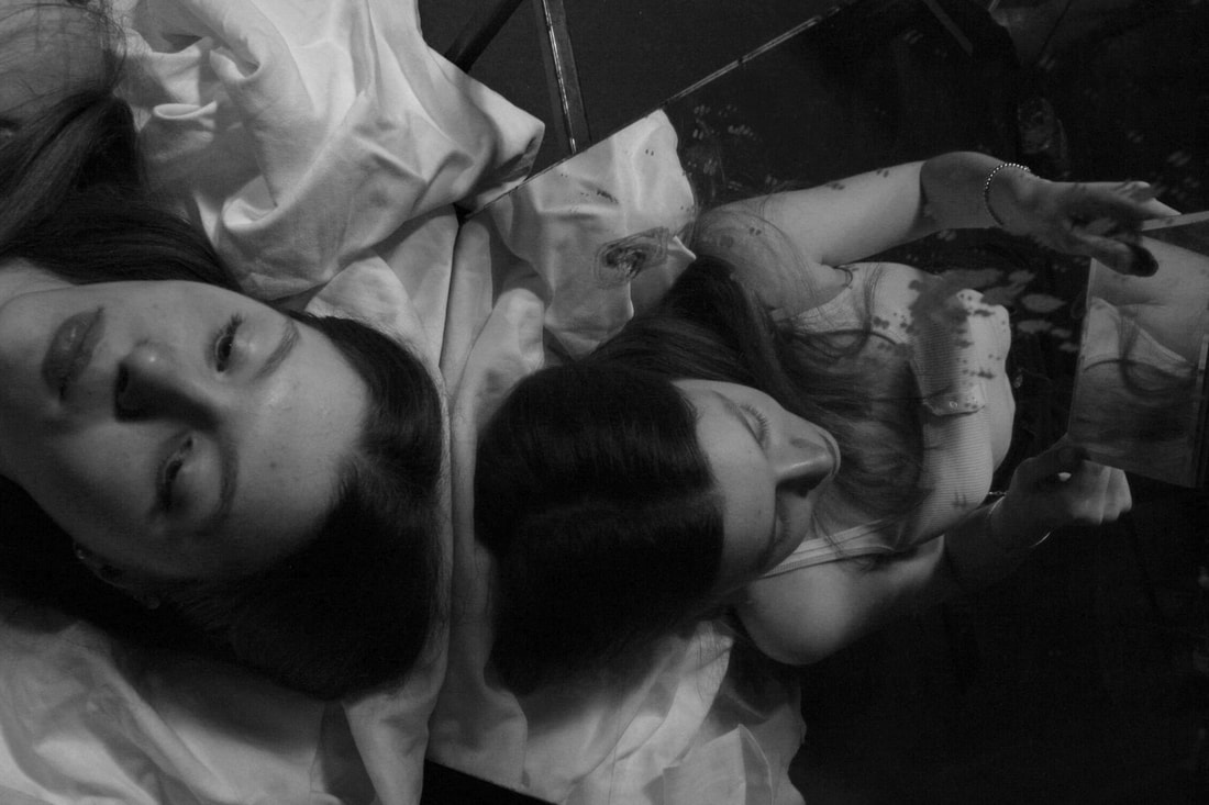
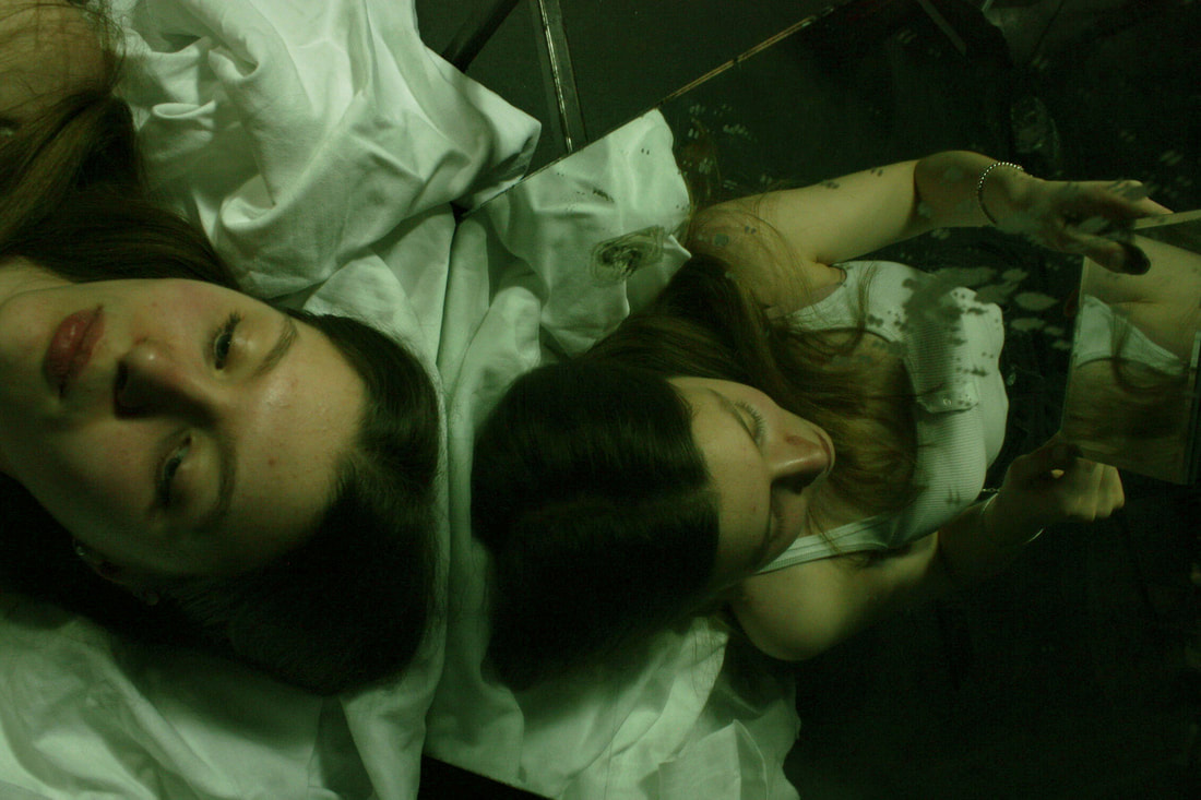
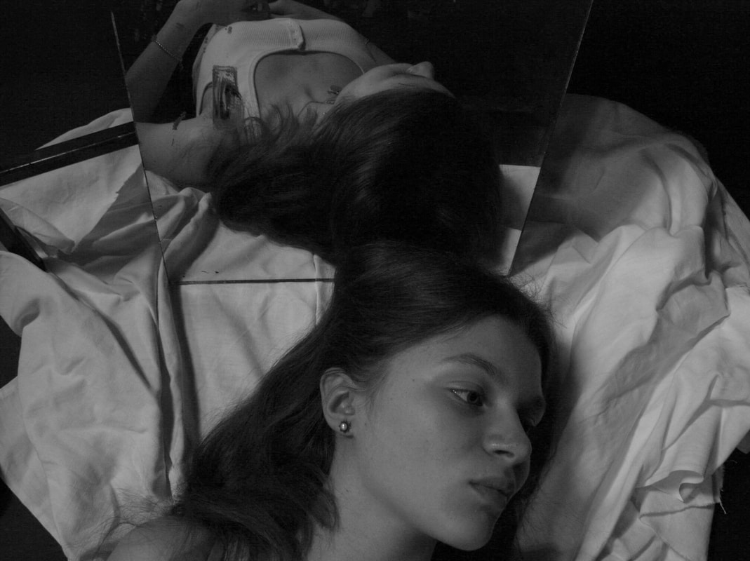
Erwin Blumenfeld
Blumenfeld was a fashion photographer from the united states that explored different aspects of reflection. He would get the model to face the camera with a glass between the camera and them or got mirrors that created various reflections creating . Blumenfeld's work is based on the reflection of the female models mainly creating a feminine aspect into his work. He would portray body parts like legs, eyes, face, back ect and present them through mirror creating his fashion photography pattern.

In response to his work, I would like to take photographs of a model and reflect their features in different ways.
my shoot
|
|
|
|
Finals


|


|
|
|

|


|
Evaluation
The subject I chose to photograph suited the theme as it fitted the feminine theme just like in Blumenfeld's work. My composition helped to support my response to the theme by the model laid on top of a white sheet which created a comfort feel to the photograph and the mirror placed above her head exposing her from the opposite angle creating a subtle position of the mirror. I managed the exposure very well. My ISO was 1600, shutter speed was 1/125 and aperture settings were f16. I prioritised my shutter speed to capture frozen moment. I prioritised aperture to manipulate depth of field and used a studio light which helped with the lighting and the shadows.
The mirror I positioned to photograph did not necessarily fit the brief as it was not reflecting onto womanly features. Next time I should go to place the mirror somewhere else or make the model pose differently and think more about my composition so it fits with Blumenfeld's work better. The image is under exposed which focused on dark colours rather than light colours. Next time I should experiment with film.
Next time I will consider the work of Blumenfeld to inspire a more accurate depiction of what I want to achieve. I will experiment further with film camera recreating his work method.
Final strand - Stand 2 - Development
my shoot
|
|
|
Finals

|

|
|

|

|
|
|
|

|

|
Evaluation
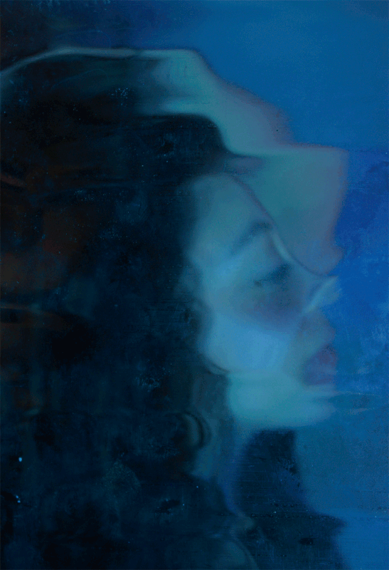
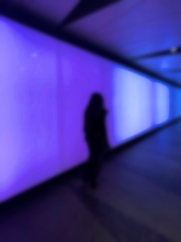
The subject I chose to photograph suited the theme as it included colours, blurry setting and silhouette. My composition helped to support my response to the theme by the blue wall paper as the background, a suitable colour that mixed well with the blue and the unfocused camera setting. I managed the exposure very well. My ISO 200, the shutter speed was 1/125 and aperture settings were was f2.8, big enough to make it blurry but not to blurry to make the facial features distinguishable. I prioritised aperture to manipulate depth of field and making it better blurry.
Next time I should go to a different location and think more about my composition so that I able to capture more colour and silhouette. Next time I will go to a location where there are lights but enough to allow there to be a silhouette.
